Saturday 20 December 2014

Book Review: CLOG: World Trade Center

CLOG: World Trade Center
CLOG, 2014
Paperback, 168 pages


No one needs to be reminded the the Twin Towers were destroyed in a terrorist attack on September 11, 2001, so the latest issue of CLOG is a welcoming thing, since it focuses on the pre-2001 existence of the towers and the other parts of the World Trade Center development in Lower Manhattan. Yet the fact they collapsed after being hit by jumbo jets appears to dictate a good deal of the issue's content, as structure is a major theme throughout. In addition to interviews with architects from Minoru Yamasaki's office, the editors of CLOG spoke with the structural engineers at LERA and they include numerous architectural and engineering drawings and construction photos of the project under construction, all pointing to the way architecture and structure melded in the design. Structure is not the only concern of the editors and the numerous contributors to the issue, but it is never far removed from whatever the content may be.


[Photo by Beija/Flickr, via WFUV.org]

Like other recent issues of CLOG (Rem in particular), the issue has many pages devoted to content generated by the editors rather than external contributors. These pieces, like the interviews with the architects and engineers, are often highlighted with yellow pages that match the cover. In addition to the interviews, drawings and photographs already mentioned, some highlights include a charting of the selection process (what the WTC might have become), a seven-page letter from Minoru Yamasaki to Ada Louise Huxtable after the latter's negative review in the New York Times in 1973 (Huxtable's one-page reply to Yamasaki is also reprinted), and visual analyses of the towers relative to recent skyscrapers and how the towers stood for New York City in films.


[Philippe Petit's walk on a wire between the Twin Towers in 1974, photo via screening the past]

Some highlights from external contributors include QR-code links to videos on YouTube, more discussions of structure (especially how the external columns looked identical, but were anything but, in terms of steel grade and thickness), and talk of their "twinness" and the space in-between the towers. If I would have gotten my act together and written something for the issue, I would have had a hard time getting away from writing about Philippe Petit's one-hour walk between the towers in 1974. But what could be written about this feat that hasn't already been said in articles, books and films? If the issue's deadline were a few months later, I would have compared Petit's walk to that of Nik Wallenda's two high-wire walks from and between Bertrand Goldberg's Marina City towers in Chicago in November. Petit's illegal walk (he was arrested after he finished his walk, but charges were later dropped) is the antithesis of Wallenda's high-publicity, live-televised walks, which says a little something about architecture, but a lot more about how things have changed since the Twin Towers were destroyed. But that would have been a digression from the pre-2001 existence of the World Trade Center, whose portrait is thoroughly portrayed in these pages.

Thursday 18 December 2014

Graphic Novel of the Moment

Walking past Greenlight Bookstore at lunchtime today a certain book called out to me:


Robert Moses: The Master Builder of New York City is a graphic novel by Pierre Christin and Olivier Balez, published by Nobrow. Here's a description of the book from the publisher, though I'd argue with the statement that Moses is "the architect who designed it all":
A new graphic biography by Pierre Christin and Olivier Balez recounts the achievements of one man who changed the the face of an entire city. Robert Moses: the mastermind of New York.

From the subway to the skyscraper, from Manhattan’s Financial District to the Long Island suburbs, every inch of New York tells the story of one man’s mind: Robert Moses, the architect who designed it all. Now, in Christin and Balez’s graphic biography, the rest of Robert’s story will be told.

[Photos inside book from Nobrow]


Available at Buy from Amazon.com

Wednesday 17 December 2014

Tuesday 16 December 2014

Stacked Casa del Fascio?

I can't be the only person who thinks the recently completed "Aufstockung und Generalsanierung Wohnhochhaus als Nullenergiehaus" designed by Freivogel-Architekten...


[Photo: Dietmar Strauß, via German-Architects]

looks like Giuseppe Terragni's Casa del Fascio...


stacked two high?


[Original photo of Casa del Fascio from here]

Not only do the (1) articulated grid, (2) deep-set openings and (3) expanse of flat wall surface on one side of the building in Pforzheim, Germany, bring to mind the 1936 building in Como, Italy, but the generous space in front of each building (a road and train tracks in the case of Freivogel-Architekten's refurbishment of the 9-story building, and a plaza in the case of the 4-story Casa del Fascio) allows their fronts to be seen like 2-dimensional elevations. The proportions may be different but the similarities are uncanny.

Monday 15 December 2014

Today's archidose #803

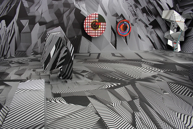
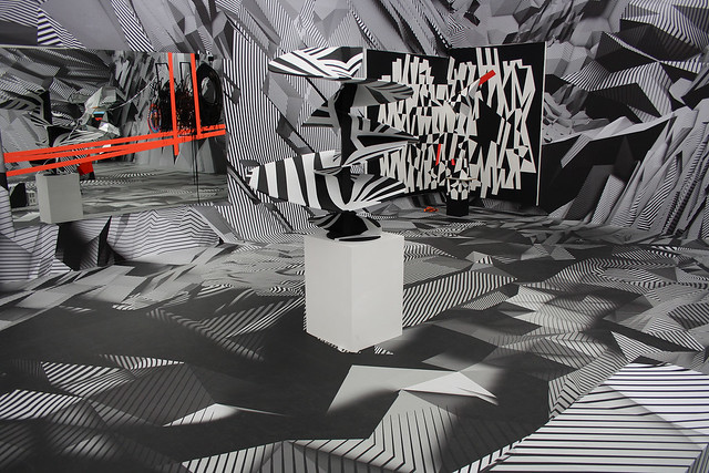
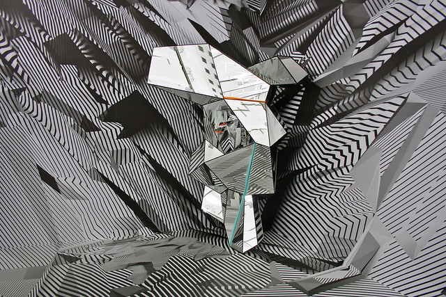
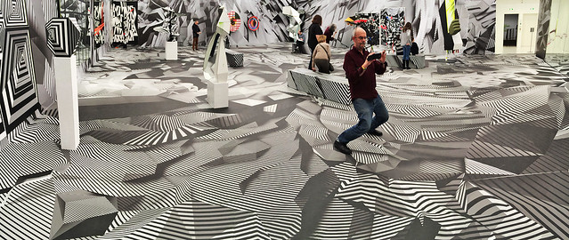
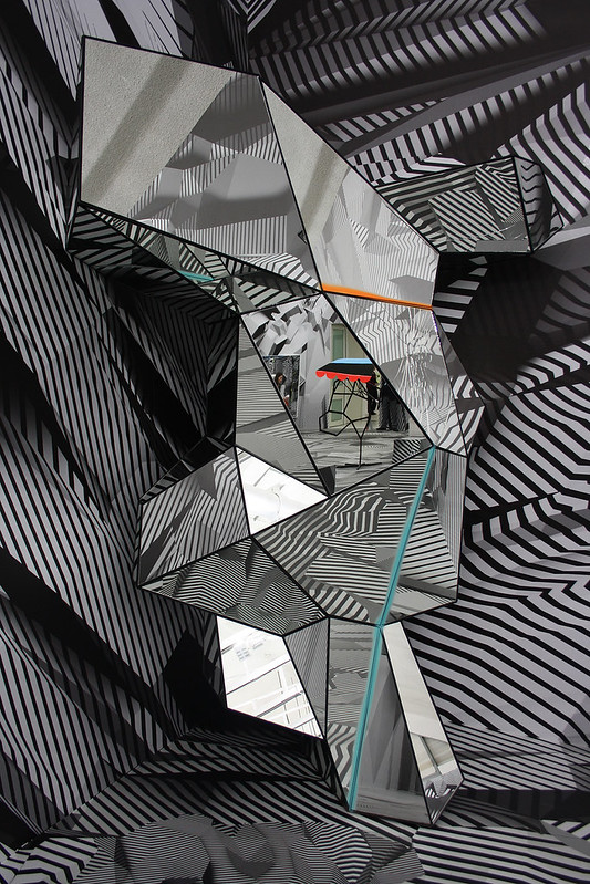
Here are some photos of Tobias Rehberger. Home and Away and Outside at the Shirn Kunsthalle Frankfurt (21 February – 11 May 2014), photographed by Frank Dinger (be sure to click the panoramas to see them larger at Flickr).

Tobias Rehberger at Schirn Frankfurt

Tobias Rehberger at Schirn Frankfurt

Tobias Rehberger at Schirn Frankfurt

Tobias Rehberger at Schirn Frankfurt

Tobias Rehberger at Schirn Frankfurt

Tobias Rehberger at Schirn Frankfurt

Tobias Rehberger at Schirn Frankfurt

To contribute your Flickr images for consideration, just:
:: Join and add photos to the archidose pool
To contribute your Instagram images for consideration, just:
:: Tag your photos #archidose

Sunday 14 December 2014

So You Want to Learn About: Bernard Tschumi

The "So You Want to Learn About" (SYW2LA) series highlights books focused on a particular theme: think "socially responsible architecture" and "phenomenology," rather than broad themes like "housing" or "theory." Therefore the series aims to be a resource for finding decent reading materials on certain topics, born of a desire to further define noticeable areas of interest in the books I review. And while I haven't reviewed every title, I am familiar with each one; these are not blind recommendations.

I went to undergraduate architecture school in the early- and mid-1990s, coming during the (albeit brief) rise of Deconstructivism and the waning of Postmodernism. Therefore, instead of architects like Venturi and Scott Brown, Charles Moore, James Stirling, and other PoMo architects, the primary influences on my architectural education – design studio and other classes – were architects like Morphosis, Coop Himmelb(l)au, Daniel Libeskind, Zaha Hadid and Bernard Tschumi. Of these, the greatest number of books in my library come from the last, Tschumi, whose printed output veers from projects like the well known Manhattan Transcripts to theoretical texts, monographs and exhibition catalogs. This SYW2LA installment focuses on the ideas in Tschumi's books by looking at the nine that are in my library.


1: The Manhattan Transcripts: Theoretical Projects, St. Martin’s Press / Academy Editions, 1995 (Amazon)
The 1970s are often seen as a decade when architects wrote rather than designing buildings, since commissions were few and far between, and conservative, historical styles in buildings were more and more prevalent, meaning avant-garde architects were left to write and teach. Architects like Tschumi experimented through writings, installations and exhibitions, creating projects that were architecture without being strictly buildings. The Manhattan Transcripts, which Tschumi created from 1977 to 1981 for four gallery shows in London and New York, is one of the most famous, up there with Rem Koolhaas's Delirious New York. In the project, told primarily through cinematic notations in black, gray and red (the last being the color that defines him to this day), Tschumi establishes the precedence of the event (distinct from function) and its juxtaposition with form, such that a football game can take place in a prison yard, for example. Or to put it in the context of architectural history, form does not follow function.

2: Architecture and Disjunction, MIT Press, 1996 (Amazon)
This book collects 13 articles Tschumi penned between 1975 and 1991, a period of time started with him teaching at the Architectural Association in London and the Institute for Architecture and Urban Studies (IAUS) in New York and moved to him winning the competition for the Parc de la Villette in Paris and becoming dean of Columbia GSAPP. The park commission, coming in 1982, can be seen as the hinge between Tschumi's theoretical projects of the 1970s, which established the main ideas of his architecture, and a focus on practice that would find expression in the Event-Cities monographs (four of them to date) and other books. The essays collected here are the clearest distillation of the former, of the theoretical basis for, among other things, the function-less folies that litter Parc de la Villette. The title of the book indicates that disjunction is on equal footing with architecture, such that Tschumi states, "the disjunction between space and event ... was characteristic of our contemporary condition." Architecture, then, "could also export its findings [via writings and other projects, not just buildings] into the production of culture." Tschumi's belief in the strength of architecture is clear and infectious at times.

3: Questions of Space, Architectural Association Publications, 1990 (Amazon)
A number of the articles from Architecture and Disjunction can be found in this handsome but harder-to-find book from the AA (reprinted in 1995). Given the overlap, Questions of Space (also the name of an article from 1975) serves the same purpose as Architecture and Disjunction, in encapsulating Tschumi's theoretical stance, but it also serves – inadvertently, I'd guess – as evidence of the importance of the Architectural Association under Alvin Boyarsky, who served as director from 1971 to 1990. Under Boyarsky, the AA became, in the words of Beatriz Colomina, "the first truly global school of architecture," and teachers like Rem Koolhaas and Tschumi, who traveled back and forth between the AA and the IAUS, helped to make it such, bringing students to the AA from around the world. Tschumi's articles published here may have been published outside of the AA, but the school was a place for the architect to develop his ideas, and therefore the AA's publication of his articles is a validation of the school's role in nurturing Tschumi's talent.

4: Index Architecture, MIT Press, 2003 (Amazon / Review)
If Questions of Space celebrates a school where Tschumi taught and the man he taught under, then Index Architecture inverts things by celebrating the school where Tschumi served as dean. From 1988 to 2003, Tschumi was dean of Columbia University's Graduate School of Architecture, Planning and Preservation, commonly known by its acronym, GSAPP. This books comes at the end of that 15-year run, serving as a number of things in parallel: A dictionary of architectural terms, a collection of student work, and a collection of faculty member's projects. The faculty under Tschumi are a who's who of contemporary architecture in NYC at the time, including Asymptote, Hanrahan + Meyers, Steven Holl, Greg Lynn, Reiser + Umemoto, and Mark Wigley, among others (Wigley would go on to serve as dean at GSAPP from 2003 until 2014). Tschumi's tenure came when the digital gained in importance – on par with the physical – and the book illustrates as much, in addition to other changes in architectural eduction at Columbia at the time.

5: SuperCrit #4: Parc de la Villette, Routledge, 2012 (Amazon / Review)
Tschumi's Parc de la Villette is the subject of the fourth "SuperCrit," which "puts projects that have 'changed the weather' of architectural history back in the studio for expert and public critical debate." Interestingly, Tschumi never had a traditional crit while a student at the ETH in Zurich; as he describes it in this book, students would mount their work in a room, where professors would spend a few days with them and then generate a grade. But students at most architecture schools are given the chance to verbally explain their project, answer questions, and engage in discussion/debate with jurors – the crit. That is what Tschumi did one October morning in 2005 with Paul Finch, Nigel Coates, Peter Cook and a roomful of other architects, professors and students. There are a number of books devoted to Tschumi's design for Parc de la Villette, but this one, in addition to explaining its background, is able to critically discuss its origin as well as its evolution three decades later.

6: Architecture Concepts: Red Is Not a Color, Rizzoli, 2012 (Amazon / Review)
Roughly every four or five years since 1994 Tschumi released an Event-Cities monograph. The beefy books find a suitable successor in Red is Not a Color, which collects Tschumi's many built projects and designs but also includes some of his theoretical projects and writings. The mix of buildings, articles and photo essays makes this book an expression of Tschumi's architectural project – project in the larger sense of the word – of affecting larger cultural change. As I wrote in my review, "This large book encapsulates the evolution of Tschumi's five-decade-long (and counting) career, making his thinking and architecture more accessible and understandable to a larger audience."

7: Notations: Diagrams and Sequences, Artifice Books on Architecture, 2014 (Amazon / Review)
For those who want a peek into Tschumi's design process, Notations is a great book, since it collects nearly 300 pages of drawings (Tschumi calls them "notations" rather than "sketches") that span from The Manhattan Transcripts to in-progress projects in Europe and Asia. Captions are minimal, which allows the drawings to speak for themselves. Yet along the way there are nice surprises, like a rought yet capable drawing of The Acropolis Museum in Athens with the caption: "Explaining the project while in a taxi."

8: Tschumi Parc de la Villette, Artifice Books on Architecture, 2014 (Amazon / Review)
The lasting significance of Tschumi's Parc de la Villette is evidence in the SuperCrit book discussed above and this title, which is a more image-heavy celebration of the project. Consisting of drawings, photographs and essays, the thematic chapters create a narrative of the project's ideas, which is suitable given the design's strong conceptual basis (Deconstruction, formal layering, un-programmed follies, etc.) embedded in the project. Many of the photos and drawings are without captions, so the book works well as an archive, like combing through drawers of materials devoted to one of the most influential projects of the late 20th century.

9: Bernard Tschumi, Architecture: concept & notation, Centre Pompidou, 2014 (Amazon)
Earlier this year the Centre Pompidou held a major career retrospective on Bernard Tschumi, following similar shows on Renzo Piano, Richard Rogers and Dominique Perrault. The exhibition and companion catalog argue, according to Tschumi, two points: "First, architecture must be made out of ideas and concepts before becoming form. Second, it cannot be dissociated from the events and movement of the bodies that inhabit it." I'd assert that the second point, while present to a lesser degree in his buildings now, was the emphasis of his early work, up to and including the Parc de la Villette. The first point is primarily what occupies Tschumi now, and it is another approach that aligns with my undergraduate education, since my professors stressed architectural design born from concepts. It was not enough to create a form on a school project; form needed to be based on an idea, a concept derived from context, program, literature, philosophy, art, whatever the case may be. This generously illustrated book paints a clear picture of Tschumi's conceptual approach. Much of the content is the same as Red Is Not a Color, but this catalog is unique in being both in English and in French, which makes sense given that Tschumi splits his time between New York and Paris.

Friday 12 December 2014

Book Review: Fairy Tales

Fairy Tales: When Architecture Tells a Story edited by Blank Space
Blank Space Publishing, 2014
Paperback, 256 pages


The subtitle of this book, which collects the winners and runners-up from the more than 300 entries to the first Blank Space Fairy Tales Competition, is a telling one. "When architecture tells a story" means that the story is most important and secondary is architecture; the latter serves the former, in other words, not the other way around. But in a number of the "fairy tales" in the book, architecture actually serves architecture. Story is either an afterthought to architectural imagery or something that is confused with architectural theory; in the case of the latter, and without pointing out any offenders, at times I found myself growing tired of pronouncements about architecture, which should be elsewhere but not here. A fairy tale, like poetry or other forms of narrative, gains its power as much from what it doesn't say than what it does say; and what it says should be clear, not muddled with high-sounding prose. Statements can be made in various ways, and the fairy tale format provides one that should depart from the architect's normal way of stating things. I would recommend that entrants to the Fairy Tales II competition heed my advice and simplify – let the architecture serve the story and let the story be where your imagination goes.


[2013 First Prize: "Chapter Thirteen" by Kevin (Pang-Hsin) Wang and Nicholas J. O'Leary]

I should say that the above criticism does not apply to every tale in the book, as some of the stories held my interest and transported me to the places their authors envisioned. Here, it's important to point out the importance of the visuals that accompany each story; these are not text-only stories (God forbid, this is architecture, after all!). In most cases the illustrations are more effective than the writing, and the best tales find a way to balance the drawn and the written. Given the strong visuals throughout, I found myself wanting larger images on the page – heck, larger pages even. The fairly standard, 5.5x8.5" page size that seems to be the default in our age of digital printing is a detriment to the beautiful drawings and the time it took to create them. A drawing from the winning fairy tale, above, is a good illustration of this: the drawing is more than twice as big on my laptop screen as on the printed page. Perhaps Blank Space will consider a larger page size, or they will devote more real estate on the page to images rather than, well, blank space.