Provocations: The Architecture and Design of Heatherwick Studio
Cooper Hewitt
June 24, 2015 - January 6, 2016
Thomas Heatherwick: Making by Thomas Heatherwick and Maisie Rowe
Monacelli Press, 2015 (Revised and expanded edition)
Paperback, 640 pages
On June 24 the third leg of the traveling exhibition Provocations: The Architecture and Design of Heatherwick Studio opened at the Cooper Hewitt in New York; the exhibition started at the Nasher Sculpture Center in Dallas last year and stopped off at the Hammer Museum in Los Angeles earlier this year. Coinciding roughly with the exhibition's opening at the Cooper Hewitt is a revised and expanded edition of Thomas Heatherwick: Making, published by Monacelli Press and released on July 7. This review takes a look at both the exhibition and book.

First I'll discuss the book, since I reviewed the first edition of the monograph in 2012. If the first Making were released closer in time to my 2011 post on architectural monographs (or vice versa, if I would have written that post later), I would have included it as an example of how monographs are not "an endangered species"; instead, it shows just how good a monograph can be when it has the right goal. It gives insight into the designer's thinking, as I wrote in my previous review: "Process is key, and it comes across both in the illustrations and the conversational descriptions that accompany the designs." The same applies here, since the monograph builds upon the previous editions (a second edition was a paperback released in 2013) by sticking with the same format, tone, and authorship; the last including Maisie Rowe, a landscape architect and Heatherwick's partner.
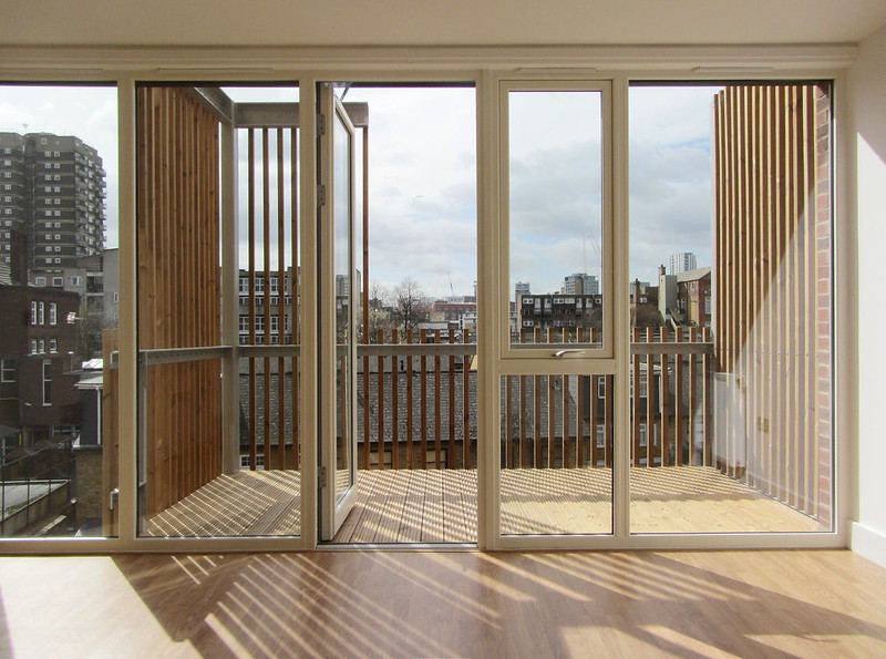
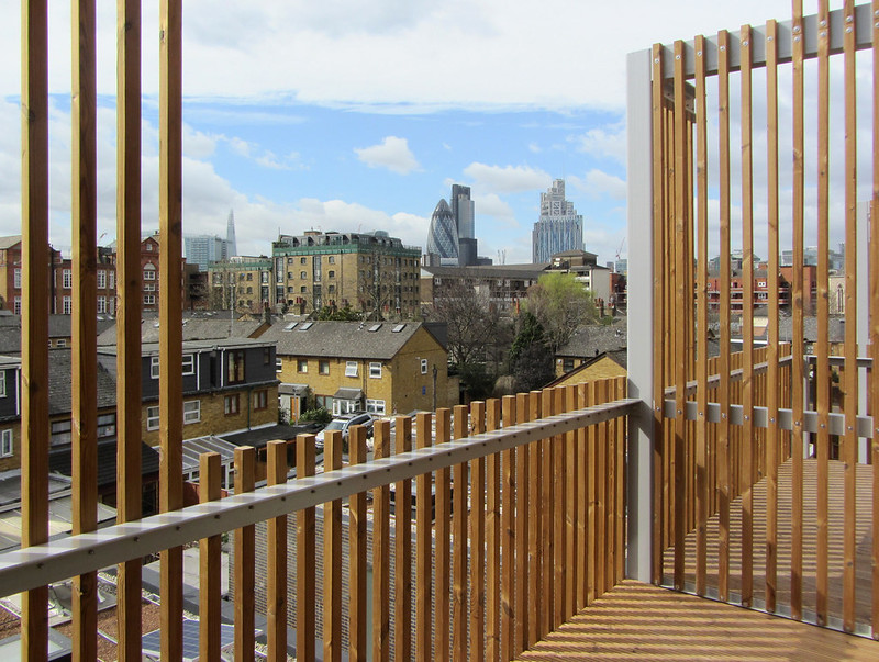
Just how much changed for Heatherwick Studio in only three short years can be grasped by looking at the covers of each edition: the first edition features the UK Pavilion at Expo 2010, a "hairy cube" of tens of thousands of seeds encased in acrylic rods, while the latter is graced by a detailed view of the recently completed Learning Hub at Nanyang Technological University in Singapore. The former is arguably a building – habitable but temporary and serving as a folly without any real function. The latter is definitely a building – housing circular classrooms around a central atrium. So in those few years the scale of his projects has increased, evidenced by a glance at the "Large" project category on his website: the Learning Hub, the Garden Bridge, Pier 55, Google's Mountain View Campus and Bombay Sapphire Distillery; these are the projects that have been recently completed or are occupying the studio's efforts these days.
Of these handful of projects (among numerous new ones in the book), the most controversial is the Garden Bridge, which is proposed to span the Thames River in London. It is the first project in the book's reverse-chronological order, and its location right after Heatherwick's "From I to We" introduction gives it some meaning, as if to convince opponents or doubters about the qualities of the bridge. The text does not directly address opponents, who tend to focus on the economics and politics rather than strictly the architecture, but it makes it seem as if the bridge and its design is a natural fit for its spot crossing the Thames. Such is the effectiveness of Heatherwick's book, its text and illustrations making us believe in his approach to architecture and design, which is based upon rethinking what something is, coming at it from a new direction.
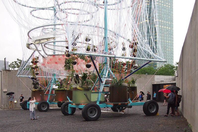
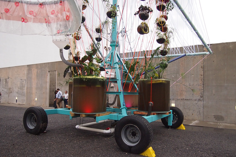
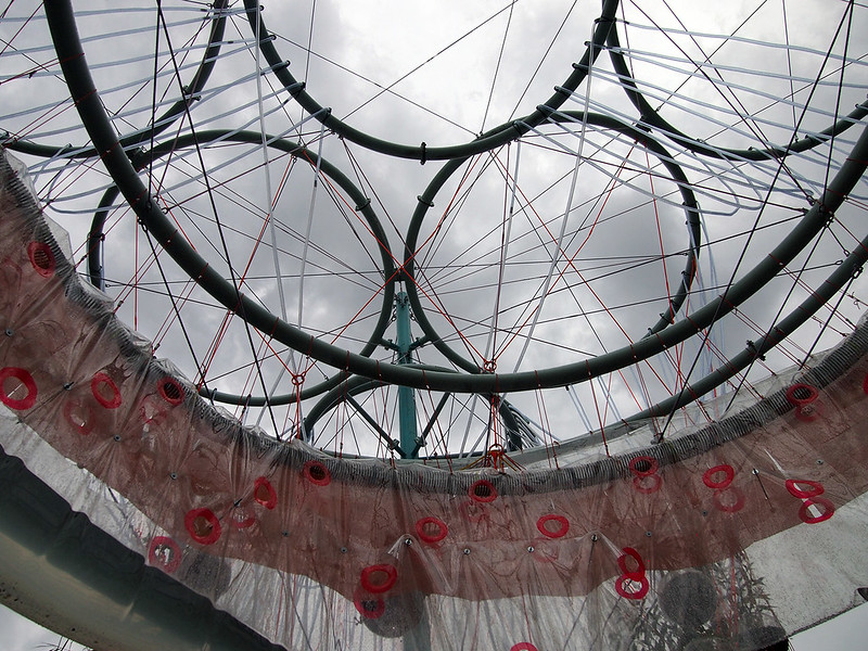
[All exhibition photographs by John Hill | See more in my Flickr set on the exhibition.]
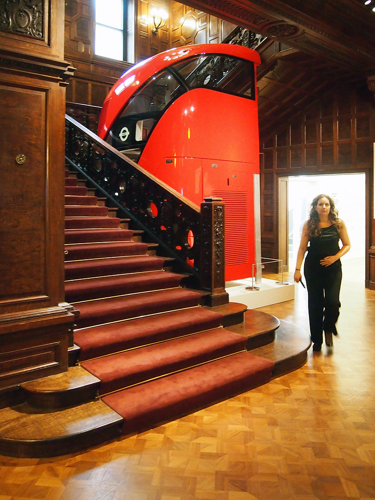
The exhibition does much of the same thing, yet with the experience of models and other three-dimensional artifacts – it's no wonder the exhibition started at the Nasher Sculpture Center, given the role of models in all aspects of Heatherwick Studio's creations, from Christmas cards to large pieces of infrastructure. Provocations is in the Cooper Hewitt's third-floor gallery, but the exhibition's presence is signaled much sooner: a full-scale section of the double-decker bus Heatherwick designed for London (800 are set to be rolled out by 2016) sits by the open stair adjacent to the ticket counter. Even though the interior of the bus is roped off, it's great to see the sliced-open bus and its Art Nouveau-esque stair, particularly in juxtaposition with the museum's grand old stair. The bus is a sure-fire way to get visitors excited for the exhibition.
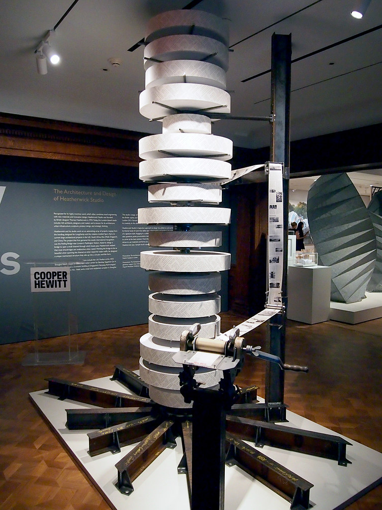
Once upstairs, visitors are confronted with an odd contraption made of steel and rolls of paper. A handle and a piece of plexiglass with the words "tear here" on it make it pretty clear what to do: turn the crank until the "tear here" on the paper lines up with the plexi: instant memento! The roughly one-meter length of paper gives a brief description of the exhibition followed by some selected projects, such as the Distillery and Garden Bridge. On the back of the paper are questions, the same ones that preface each project in the monograph: "Can a bridge be a place?" for the Garden Bridge, for example. It's common for museums and galleries to have a pamphlet or tear sheet for an exhibition, but Heatherwick provides a literal tear sheet that gets the visitor into the action. This somewhat overblown expression is aligned with the way Heatherwick reconsiders just about everything – but does he reconsider how to exhibit architecture and design?
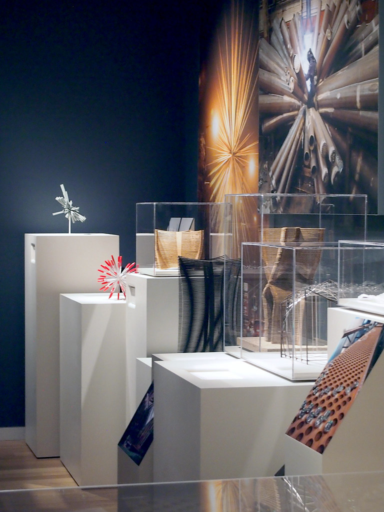
While I appreciate the layout in the museum's third floor galleries, I'd argue that the exhibition does not break any ground with displaying architecture and design. As the photo above indicates, the exhibition is made up of stands of varying heights for models, some of them in plexi cases. The walls are used almost exclusively for large-scale renderings and photographs. In essence the layout is limited to three-dimensional process atop the terrain of boxy stands and completed (or idealized, in the case of renderings) impressions on the walls. While not groundbreaking, it works fairly well – minus one thing: the Cooper Hewitt pen.
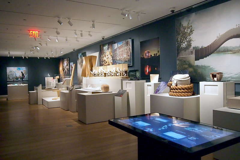
In the foreground of the photo above is one of the interactive tables sprinkled about the museum. Here visitors can use the pens they picked up at the entrance to "interact" with the exhibition and the museum's collection. Visitors take the pen and click the "+" on the back of it with a matching "+" by the piece they want the pen to remember for later. The problem at Provocations is that the interactive "+"s are limited to signs, like the one below, that lay out the plan of the exhibition but are found in only a few places around the exhibition. Therefore, one cannot click the pen when looking at a model or a photograph; it can only be done after finding the layout sign and then orienting oneself to the appropriate number.

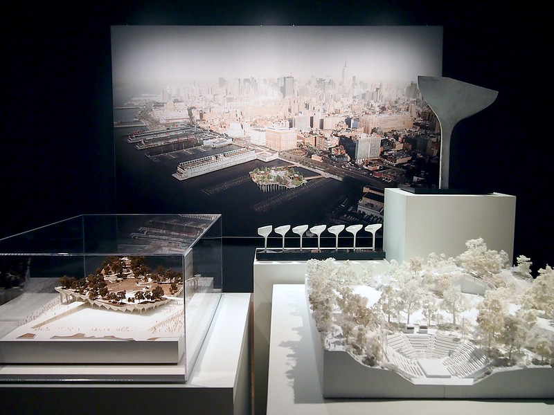
The pen problem aside, Provocations is a not-to-miss exhibition, especially for the models and the new projects; Pier 55, the last project in the counterclockwise layout is great to see. The book, on the other hand, is highly recommended for the words that Heatherwick and Rowe use to explain and persuade.
Cooper Hewitt
June 24, 2015 - January 6, 2016
Thomas Heatherwick: Making by Thomas Heatherwick and Maisie Rowe
Monacelli Press, 2015 (Revised and expanded edition)
Paperback, 640 pages
On June 24 the third leg of the traveling exhibition Provocations: The Architecture and Design of Heatherwick Studio opened at the Cooper Hewitt in New York; the exhibition started at the Nasher Sculpture Center in Dallas last year and stopped off at the Hammer Museum in Los Angeles earlier this year. Coinciding roughly with the exhibition's opening at the Cooper Hewitt is a revised and expanded edition of Thomas Heatherwick: Making, published by Monacelli Press and released on July 7. This review takes a look at both the exhibition and book.
First I'll discuss the book, since I reviewed the first edition of the monograph in 2012. If the first Making were released closer in time to my 2011 post on architectural monographs (or vice versa, if I would have written that post later), I would have included it as an example of how monographs are not "an endangered species"; instead, it shows just how good a monograph can be when it has the right goal. It gives insight into the designer's thinking, as I wrote in my previous review: "Process is key, and it comes across both in the illustrations and the conversational descriptions that accompany the designs." The same applies here, since the monograph builds upon the previous editions (a second edition was a paperback released in 2013) by sticking with the same format, tone, and authorship; the last including Maisie Rowe, a landscape architect and Heatherwick's partner.
Just how much changed for Heatherwick Studio in only three short years can be grasped by looking at the covers of each edition: the first edition features the UK Pavilion at Expo 2010, a "hairy cube" of tens of thousands of seeds encased in acrylic rods, while the latter is graced by a detailed view of the recently completed Learning Hub at Nanyang Technological University in Singapore. The former is arguably a building – habitable but temporary and serving as a folly without any real function. The latter is definitely a building – housing circular classrooms around a central atrium. So in those few years the scale of his projects has increased, evidenced by a glance at the "Large" project category on his website: the Learning Hub, the Garden Bridge, Pier 55, Google's Mountain View Campus and Bombay Sapphire Distillery; these are the projects that have been recently completed or are occupying the studio's efforts these days.
Of these handful of projects (among numerous new ones in the book), the most controversial is the Garden Bridge, which is proposed to span the Thames River in London. It is the first project in the book's reverse-chronological order, and its location right after Heatherwick's "From I to We" introduction gives it some meaning, as if to convince opponents or doubters about the qualities of the bridge. The text does not directly address opponents, who tend to focus on the economics and politics rather than strictly the architecture, but it makes it seem as if the bridge and its design is a natural fit for its spot crossing the Thames. Such is the effectiveness of Heatherwick's book, its text and illustrations making us believe in his approach to architecture and design, which is based upon rethinking what something is, coming at it from a new direction.
[All exhibition photographs by John Hill | See more in my Flickr set on the exhibition.]
The exhibition does much of the same thing, yet with the experience of models and other three-dimensional artifacts – it's no wonder the exhibition started at the Nasher Sculpture Center, given the role of models in all aspects of Heatherwick Studio's creations, from Christmas cards to large pieces of infrastructure. Provocations is in the Cooper Hewitt's third-floor gallery, but the exhibition's presence is signaled much sooner: a full-scale section of the double-decker bus Heatherwick designed for London (800 are set to be rolled out by 2016) sits by the open stair adjacent to the ticket counter. Even though the interior of the bus is roped off, it's great to see the sliced-open bus and its Art Nouveau-esque stair, particularly in juxtaposition with the museum's grand old stair. The bus is a sure-fire way to get visitors excited for the exhibition.
Once upstairs, visitors are confronted with an odd contraption made of steel and rolls of paper. A handle and a piece of plexiglass with the words "tear here" on it make it pretty clear what to do: turn the crank until the "tear here" on the paper lines up with the plexi: instant memento! The roughly one-meter length of paper gives a brief description of the exhibition followed by some selected projects, such as the Distillery and Garden Bridge. On the back of the paper are questions, the same ones that preface each project in the monograph: "Can a bridge be a place?" for the Garden Bridge, for example. It's common for museums and galleries to have a pamphlet or tear sheet for an exhibition, but Heatherwick provides a literal tear sheet that gets the visitor into the action. This somewhat overblown expression is aligned with the way Heatherwick reconsiders just about everything – but does he reconsider how to exhibit architecture and design?
While I appreciate the layout in the museum's third floor galleries, I'd argue that the exhibition does not break any ground with displaying architecture and design. As the photo above indicates, the exhibition is made up of stands of varying heights for models, some of them in plexi cases. The walls are used almost exclusively for large-scale renderings and photographs. In essence the layout is limited to three-dimensional process atop the terrain of boxy stands and completed (or idealized, in the case of renderings) impressions on the walls. While not groundbreaking, it works fairly well – minus one thing: the Cooper Hewitt pen.
In the foreground of the photo above is one of the interactive tables sprinkled about the museum. Here visitors can use the pens they picked up at the entrance to "interact" with the exhibition and the museum's collection. Visitors take the pen and click the "+" on the back of it with a matching "+" by the piece they want the pen to remember for later. The problem at Provocations is that the interactive "+"s are limited to signs, like the one below, that lay out the plan of the exhibition but are found in only a few places around the exhibition. Therefore, one cannot click the pen when looking at a model or a photograph; it can only be done after finding the layout sign and then orienting oneself to the appropriate number.
The pen problem aside, Provocations is a not-to-miss exhibition, especially for the models and the new projects; Pier 55, the last project in the counterclockwise layout is great to see. The book, on the other hand, is highly recommended for the words that Heatherwick and Rowe use to explain and persuade.