Monday 28 July 2014

St. Mark's New Home

St. Mark's Bookshop, a staple near Cooper Union since the late 70s, was in the news a few years ago when the school – its landlord – raised rent for the sizable space to over $20,000/month. The store successfully got a rent reduction, but it started looking for a new, smaller location shortly thereafter, according to DNAinfo. That new location is 136 East Third Street in the East Village, in a just-opened space designed by Clouds Architecture Office.


[Images courtesy of Clouds Architecture Office]

I haven't ventured to see the store in person, but the photos of the space make me want to head over there right away. White bookcases peel away and undulate in plan to contain a bathroom and office space on one side of the store (see plan at bottom) and free up space in the middle for events.


I especially like the section of the bookcases, which are angled at the bottom to allow for easier browsing by standing patrons.


I've updated my NYC Bookstores post to reflect the new location of St. Mark's Bookshop.

Saturday 26 July 2014

Galeria Melissa + SOFTlab

Yesterday I found myself in SoHo so I stopped by Brazilian shoemaker Melissa's store on Greene Street to check out a colorful installation by SOFTlab.

Galeria Melissa + SOFTlab

Called We Are Flowers, to coincide with a collection from Melissa of the same name, the installation consists of over 20,000 translucent flowers attached to a suspended frame (a mylar net) that billows from the front to the back of the store.

Galeria Melissa + SOFTlab

The translucent pieces overlap to blur any distinct blue, red, orange, green or yellow pieces, bringing the installation close to what SOFTlab describes as "the enchantment of a vibrant hanging garden."

Galeria Melissa + SOFTlab

In the middle of the store the arches stay above shoppers' heads, but at the back of the store it descends into the basement level.

Galeria Melissa + SOFTlab

Here it is like a vortex of color...

Galeria Melissa + SOFTlab

as if the (underused, I feel) elliptical yellow space is drawing all of the petals to the light at the bottom.

Galeria Melissa + SOFTlab

While the effect of being underneath a canopy of colorful flowers is nice...

Galeria Melissa + SOFTlab

the play of light and color and form on the white walls is a great effect that unites installation and store/wrapper*.

Galeria Melissa + SOFTlab

*Melissa's NYC flagship store was realized in 2012 by designer Domingos Pascali and Edson Matsuo in collaboration with MW Arquitetura and Eight Inc.

Friday 25 July 2014

Wednesday 23 July 2014

Book Review: Two Tschumi Titles

Notations: Diagrams and Sequences by Bernard Tschumi
Artifice Books on Architecture, 2014
Hardcover, 304 pages

Tschumi Parc de la Villette by Bernard Tschumi
Artifice Books on Architecture, 2014
Paperback, 240 pages


This summer appears to be a busy time for 70-year-old architect Bernard Tschumi, at least in terms of exhibitions and publications. He has a major retrospective at the Centre Pompidou in Paris (closing July 28), an exhibition at the FRAC Centre (until October 8), and no less than three books are being released, one of them from the Pompidou on the retrospective and two of them from the publisher Artifice Books on Architecture; the latter books are discussed here.


[Page from Notations on The Manhattan Transcripts]

In the preface to Notations, a collection of Tschumi's drawings on over 40 projects, the architect clearly states he never uses the word "sketch," only "notation." The difference may seem negligible, but it has as much to do with attitude as with semantics. For Tschumi sees his drawings – done with his sketchbook (notationbook?) balancing on his knee rather than flat on a table – as "a form of notating the mind's activity." The combination of drawing in a relaxed manner anytime and anywhere (in a taxi, on the subway, by the pool) and seeing drawings as a way to articulate thoughts (get them out of the mind and onto paper) leads to a prioritization of idea over aesthetics. Hence notation, like a shorthand for ideas and concepts, over sketches, often associated with envisioning what a piece of architecture looks like.


[Page from Notations on The Sequential House]

Of course Tschumi's choice of words applies most clearly and directly to his early projects, such as The Manhattan Transcripts (top image) and The Sequential House (image above), where their theoretical and not-to-be-built nature allowed some freedom in terms of form and representation. But things changed (in more ways than one) with Tschumi winning the 1982 competition for the Parc de la Villette in Paris. In terms of drawings, we see the notations describing the three-part concept of points, lines and surfaces, as well as how events unfold cinematically along the park's promenade (image below)...


[Page from Notations on Parc de la Villette]

But further elaboration, particularly in concern to the red folies that dot the park (image below), follows, and here we see Tschumi using drawings like other architects, to flesh out ideas of form and appearance. Tschumi is aware of this, as he states in the preface that the book "is not intended to celebrate the fetishism often associated with the architectural sketch, but rather to demonstrate the conceptual sequence that makes up the architectural project."

The more than 300 drawings that convey this conceptual sequence are arranged chronologically – by start date of each project, it should be noted. There is a consistent hand throughout the book, though it is a bit more relaxed in the later projects, perhaps inadvertently expressing the reliance on younger architects in Tschumi's New York/Paris offices to flesh out the architectonic details beyond the parti stage. Whatever the case, very few architects will have their sketches/notations put into book form, and this one is as strong an argument for hand drawing as any "fetishistic" account of the still important skill.


[Page from Notations on Parc de la Villette]

There are 40-odd more projects in Notations, but whatever buildings Tschumi has subsequently been able to pull off in his career, he will always be known for Parc de la Villette (is it any wonder red defines the architect, 
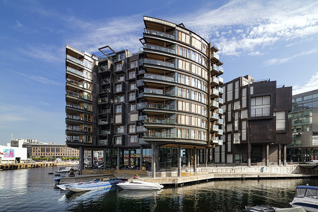
his website, his publications, etc.?). Completed in its entirety 16 years (!) after winning the competition in 1982, the park can be considered 15 years old or 30, depending on one's view. Tschumi's ideas, while harking back to Constructivist architecture, were definitely a departure from the Postmodernism prevalent at the time of the competition. But 16 years later the "style" of Deconstructivism and the influence of Jacques Derrida's Deconstruction had waned, making the park as much a relic of its time as a forward-thinking "urban park" for the late 20th century and beyond.


[Page from Parc de la Villette with winter photo]

The book, which takes on a large, square shape akin to the grid of the folies and the red panels that cover their surfaces, is arranged conceptually rather than chronologically. The book is not so much a story about the project's realization (there are no troubled politics or construction photos – well, only three small ones – to be found) but a narrative of its ideas. Chapters are, for example, "Points Lines Surfaces," "Systems and Superpositions," "Concept of the Folie," and "Cinematic Promenade."


[Page from Parc de la Villette with notations of points, lines and surfaces]

A good chunk of the book is devoted to the red folies – the points – each one labeled (L2, L3, etc.) and documented with a photograph, plans and elevations. Each one also includes information on how it is used, something that gets at the original Deconstruction-inspired idea of the park, where meaning (program) is not absolute. A given form does not have a given program (and vice versa) in Tschumi's park, so some of them evolve over time, such as N6, which initially served as a gardening center, and subsequently was used as a restaurant, children's workshop and now park offices.


[Page from Parc de la Villette with renderings of a couple folies]

The voluminous collection of drawings, renderings, photographs and essays (by Anthony Vidler and Jacques Derrida) makes the book a similar document to Notations. It "demonstrate[s] the conceptual sequence that makes up the architectural project," but in this case on one career-making and -defining project rather than many projects over a long career.


[Page from Parc de la Villette with fireworks designed by Tschumi]

Tuesday 22 July 2014

Monday 21 July 2014

Modular Construction in NYC

An Associated Press story embedded on Architectural Record's website reports that the "First Modular Apartment Building in NYC Opens." The building of focus is GLUCK+'s The Stack, located near Inwood Hill Park at the northern tip of Manhattan:

[The Stack | Photograph from GLUCK+ website]

The AP article also mentions nARCHITECTS' micro-dwellings at Kips Bay and SHoP's high-profile B2 BKLYN 32-story modular apartment building, the first tower in the Atlantic Yards development, now under construction:

[B2 BKLYN | Rendering from SHoP's website]

In the article's desire to label firsts ("first multistory, modular-built apartment building to open in the nation's apartment capital") is the omission of Nehemiah Spring Creek, what could be argued as the first modular housing in New York City. Designed by Alexander Gorlin, and completed in 2008 (Phase 1, with all 3 phases completed by 2013), the project in East New York, Brooklyn, used modular units to erect townhouses rather than stacked apartments:


[Nehemiah Spring Creek | Photographs courtesy of Alexander Gorlin Architects]

I think Nehemiah Spring Creek is often left out of discussions about modular residential construction in NYC because of aesthetics – it is not as contemporary looking as The Stack or B2 BKLYN or nARCHITECTS' micro-dwellilngs – and because of scale; it seems to straddle urban and suburban conditions in its size and site in East New York, a very low-income part of Brooklyn.

One area where Nehemiah Spring Creek beats The Stack (not in terms of firsts, mind you) is in the distance traveled from factory to site. The Stack's modular units were built by DeLuxe Building in Berwick, PA, 140 miles from the site in Inwood. On the other hand, Gorlin's design was built by Capsys in the Brooklyn Navy Yard, just over 7 miles from East New York. (Likewise, B2 is being built by the new company FC + Skanska Modular in the Navy Yard, less than 2 miles away.) These numbers are just as important as those cited in the AP article on The Stack (cost of construction, time saved versus conventional construction), as they get at the value of building modular in NYC, not just for NYC.

Sunday 20 July 2014

Book Review: Two Guides

Barcelona: Modern Architecture Guide by Manuel Gausa, Marta Cervelló, Maurici Pla, Ricardo Devesa
Actar, 2013, revised and upated
Paperback, 600 pages

La Défense, a dictionary: architecture / politics, history / territory edited by Pierre Chabard, Virginie Picon-Lefebvre
Edition Parenthèses, 2013
Paperback, 320 pages


When it comes to making a guidebook, a number of factors go into impacting its usability, such as size, layout, and navigation. One area that comes to mind when looking at these two guides side by side is structure, or how the entries (buildings) are organized. In the case of Actar's guide to modern architecture in Barcelona, the many projects are grouped historically/geographically/chronologically. For its guide to Paris's La Défense district, Edition Parenthèses opted for a dictionary format, an alphabetical listing of places, architects and other topics.

The histo-geo-chrono format of Barcelona is evident in the spread below that displays the book's 22 chapters, A through V. According to the editors these chapters follow "a combination of historical, geographical and cultural criteria," such that there is plenty of chronological overlap that occurs. Chapter H, for example, is titled "Rationalist-Style Architectures" and Chapter S (one of the updates to the first edition from 2002) is titled "Urban Recycling and Functional Complexity." These thematic titles attempt to make sense of the architecture as well as the urban plans impacting developments in certain periods.


[Barcelona: Modern Architecture Guide spread courtesy of Actar]

Within each chapter buildings are numbered and given either a half-page, a full-page, or a two-page spread as in Gaudi's Sagradia Familia, below. All of these entries have data (architect, address, etc.), text and a photograph, but the full-page entries also have a drawing, and the two-page spreads have more of each. In addition to these entries, many are presented four to page with just the data and a photograph. This rational organization within the chapters creates an obvious hierarchy, with important projects getting more space. All of the entries are keyed to maps that are followed by an architects index and bibliography at the back of the book.


[Barcelona: Modern Architecture Guide spread courtesy of Actar]

The structure and layout make for a thorough guide that is packed with hundreds of buildings and a good deal of insight on the physical evolution of Barcelona. The book makes me want to visit the Catalan city even more, but it would do an even better job of doing so for lots more people if Actar splurged on a four-color printing rather than just black and white. Not only would the photographs of the buildings look that much better (some are overly dark, it should be noted), so would the many regional and urban plans (spread below) that should help explain each chapter; as grays, those plans look confusing rather than helpful. Otherwise the book is an excellent (if thick, at 600 pages) guide for architects and architecture lovers heading to Barcelona.


[Barcelona: Modern Architecture Guide spread courtesy of Actar]

While Actar's guide to Barclona is meant to be held while traversing the city, the larger "dictionary" of La Défense is a guide that can be enjoyed at a distance. Rather than discussing the place's history, architecture, landscape, and politics in a geographical or manner suited to "on-the-ground" guides, the dictionary format brings it closer to Wikipedia. This comparison goes beyond the book's format or structure, as each entry is cross-referenced with other entries, allowing ever-expanding thematic readings throughout the book. One may start with the well known "Grande Arche," (first spread below) then move on to "Axis" (second spread below) then "Zone A," and so forth.


[La Défense: A Dictionary courtesy of Edition Parenthèses]

The cross-referencing enables for readings that jump around the book, rather than prioritizing a front-to-back reading of the book. Like a dictionary, the book is in alphabetical order, and like a dictionary this is to organize entries and make information easy to find. But unlike a dictionary, the entries in La Défense range from the brief to the lengthy, using text and images to paint a highly detailed picture of one of the most interesting, if least understood, parts of Paris. So much unlike the Paris that people think of when they think of Paris (and tied to that part of Paris through an invisible axis that extends to the Louvre and is bisected by the Arc de Triomphe), La Défense is ripe for a guidebook, if anything to see how it has evolved in 50 years.


[La Défense: A Dictionary courtesy of Edition Parenthèses]

The dictionary format also allows the book to be about more than just buildings. As its subtitle indicates, this is hardly a strict architecture guidebook, though the buildings and architects of La Défense play a large part in the place's evolution. The place's politics, history and territory (landscape, planning, etc.) are also explained, but so it popular culture, sociology, economics, and art. The format creates a broad canvas for what I referred to as a painting of La Défense. (It makes me wonder what other urban districts deserve a dictionary: Rome's EUR comes to mind, as does Brasilia and the lost Kowloon Walled City.) It's not surprising that of the few Edition Parenthèses books translated from French to English, this is one of them.


[La Défense: A Dictionary courtesy of Edition Parenthèses]