Showing posts with label book-review. Show all posts

Wednesday 15 April 2015

Book Review: Urban Literacy

Urban Literacy: Reading and Writing Architecture by Klaske Havik
nai010 Publishers, 2014
Paperback, 256 pages


Well known architect and author Juhani Pallasmaa supplies the foreword to this book by Klaske Havik, a professor at Delft University of Technology and contributing editor of OASE. The choice is not surprising, since I've read interviews with Pallasmaa where he recommends that architecture students read fiction instead of books on architecture. Within fiction are found "truths" about how individuals interact with their surroundings, exhibiting the fusion between internal states and the settings of stories. For Havik, fiction is key to creating a new approach for architecture – a literary approach – that takes advantages of the descriptions of places and spaces in novels toward improving the design of the same. It's a provocative thesis that is explained through a triad of interrelated concepts: description, transcription, and prescription.

Actually, the rule of three is taken to the extreme in the book, as it is a means of structuring the book into three sections reflecting the three concepts, each broken down into three chapters that look at the concepts in literature, theory, and practice. This approach is born from a "reading" of the triple bridge Tromostovje in Ljubljana, which Havik describes in the beginning of the book as something that acts as unity but encompasses different directions. This metaphor is applied stringently to the book, but it is extremely helpful in elucidating Havik's thesis of using reading and writing in architecture via description, transcription and prescription, and in applying language to something more inherently visual.


[Triple bridge Tromostovje in Ljubljana | Image source]

Gaining "urban literacy" comes across in each section in the chapters on literature, architectural and other theory, and the analysis of individual architects – Steven Holl for description, Bernard Tschumi for transcription, and Rem Koolhaas for prescription. These architects are fairly obvious choices – Tschumi's "Manhattan Transcripts" is a highlight of architectural investigations carried out through transcription, for example – but they exist within an overlapping gradient, where the architects' work reaches into the other areas, which themselves overlap. In other words, there is no one descriptive approach to urban literacy, for example, even though Havik's analysis of phenomenology in that section is a highlight of the book. Therefore a literary approach to design – incorporating narrative or fiction in the practical methods Havik describes at the back of the book, for example – would become just one part of an architect's arsenal, ideally elevating considerations of experience from the scale of the door handle to sections of a city.

The book started as a dissertation and reads as such at times – dense at times, sure, but too much of "this section will analyze..." and the like – meaning the book could be a bit shorter without losing any of the author's message or meaning. It also uses many familiar sources (Walter Benjamin, Italo Calvino, Henri Lefebvre, Juhani Pallasmaa, Georges Perec, etc.), all gathered in the lengthy bibliography (but no index, unfortunately) that thankfully balances the familiar sources with more obscure sources from The Netherlands, many from her work with the OASE journal.

The weakest section is the one at the end, where Havik explains ways of applying the literary method to education, research, and design practice. It is weak because the incorporation of narrative and fiction into design is marginal and fairly new (some examples include Beyond, edited by Pedro Gadanho, and Fairy Tales), so while the theory around it can be convincing the means of making the bridge to something physical exhibits the difficulties an infant would have in, say, walking. It should only be a matter of time that willing architects and designers incorporate the method into their work, so the value in Havik's book can be found in convincing them to take a chance on it now.

Wednesday 8 April 2015

Book Review: Learning Through Practice

Learning Through Practice by Rob Rogers, edited by Isabelle Moutaud
ORO Editions, 2015
Hardcover, 220 pages


Although I don't review monographs as much as other books on this blog, I've written about the book typology a number of times, most notably in 2011 when I responded to Martin Filler's question, "Is the architectural monograph our latest endangered species"? In that post I highlighted ten post-S,M,L,XL monographs that are notable for veering from the norm in some way, be it by incorporating lots of technical data or adopting the comic book format, as two examples. To this day I appreciate monographs that do something besides the plain old one-after-the-other presentation of projects with a few words, lots of photographs, and scant drawings. This book by Rob Rogers on Rogers Partners Architects+Urban Designers (a successor firm to Rogers Marvel Architects, whose 2011 monograph I mentioned here) does just that by focusing on storytelling and thereby making the book a revealing insight into Rogers and his practice.


[One of the research pages from the book. | Image courtesy of Rogers Partners]

Per the table of contents, the book is split into seven chapters, but really it's structured into two halves. First, following a foreword by Sarah Whiting and an introduction by Rogers, are the sections that tell the stories of the various projects (some projects are featured in multiple sections) grouped by themes like "delight," "authenticity" and "we open spaces"; second is page after page of full-bleed photographs and renderings, what is the usual content of a monograph but cut free from their usual location within standard project presentations. Each of the six storytelling sections – more text than images – is book-ended by research pages, one visual, like the one above, and the other with captions to the images. This was a bit confusing on reading the first chapter, since the numbers don't show up in the text that follows, but with each subsequent chapter it made more sense. The research pages do a couple things: they offer another reading of the book, above and beyond the insightful text by Rogers and his editor Isabelle Moutaud; and they invite the reader to physically hold the book a certain way, with the left hand holding the images page, the right hand holding the captions page and flipping in between, thereby allowing the reader to focus on the ideas in one chapter rather than just on one project or on the whole book.


[Henderson-Hopkins School | Photo: Albert Vecerka/Esto]

I'm not sure if Rogers and Moutaud intended the above sort of approach to reading the book, but I'm pretty sure they wanted something that spoke to the reader – in a conversational way rather from a position of authority. Reading the book is like having a chat with Rogers, hearing him explain the how and why of each project. In the Henderson-Hopkins School – a great project that was one of the 2014 Buildings of the Year at World-Architects, where I'm an editor – in one chapter he explains the initial idea of maintaining the edges of the two-block Baltimore site, but then, more importantly, describes how "to remain true to this initial concept, we made every subsequent choice based on economy." These and other statements are simple ones (no architectural jargon) that make clear the architect's position relative to the usual considerations: site, program, client, budget, etc.

The stories unfold across the chapters to paint a picture of an architectural office that is commendably focused on the public realm. Many projects are just that, public spaces that are free to occupy. But even in projects like the Henderson-Hopkins School, which many nearby residents may never enter, there is a concerted effort to make it part of its context, to make it a suitable addition to the public realm. Which brings me to the quote that is found on the cover of the partial dustjacket: "It's not about doing things over and over; it's about doing things for the first time, really well." At first I didn't get that quote (and perhaps I still don't get it fully), but after reading the monograph I think I understand why it flies in the face of the conventional wisdom of "at first you don't succeed, try and try again." Doing something, anything requires a particular approach, be it a theory, a concept or some other position. One such approach is focusing on institutional and public work, for example, while another is designing with certain things in mind, like delight and authenticity. Doing something well requires a good starting point, and Rogers Partners certainly has that.

Tuesday 31 March 2015

Book Review: Paradigms in Computing

Paradigms in Computing: Making, Machines, and Models for Design Agency in Architecture edited by Dr. David Jason Gerber and Mariana Ibañez
eVolo Press, 2014
Hardcover, 400 pages


One key to the direction computation in architecture is taking can found in this book in an unlikely place, tucked underneath the long bio of architect and theorist Neil Leach: "He is currently working on a research project sponsored by NASA to develop a robotic fabrication technology to print structures on the Moon and Mars." Considered with a news item like Norman Foster's involvement in a European consortium to "explore the possibilities of 3D printing to construct lunar habitations," and to a lesser degree Turkish architect Gulay Yedekci's design of "an entire extraterrestrial community which could one day be home to human beings on Mars," there are signs of a trend toward using the new forms of architecture generated and built through the use of computers for environments beyond earth.

An extraterrestrial trend certainly isn't a shared belief by all architects of the computational ilk – or those contributing to this volume published by eVolo, known for the annual Skyscraper Competition, where some entries would be at home on other planets (the 2015 results have just been released) – but this apparent trend points to the importance of margins in the adoption of computer technologies in design and fabrication. When somebody works within the environment of a piece of software or other technology, rather than, say, the realm of the pencil or the hand-built model, the software's rules are exploited toward the discovery of whatever can be accomplished. "Blobitecture" came about in the 1990s as architects played around with Rhino before anybody could figure out how to build the NURBs and other geometries and surfaces. Today blobs can be built at various scales, and 3d printing is pointing the way to realizing just about anything that can be imagined and modeled. And, moving forward, what is the most significant human margin? I'd say the atmosphere (or perhaps death, but that is less architectural). So it's no wonder that some architects are dreaming of ways to burst through the atmosphere to realize new environments for human habitation.

While I doubt that Gerber and Ibañez intended such a reading with their collection of essays (with contributions generated by a call for submissions "for positions from industry and academy thought leaders for their sensibility and production of computationally influenced practice and research"), their assertion in the book's introduction lends some gravitas to what they compiled: "There was a sense of a parallel to the Precambrian explosion." They are referring to the exponential growth of technology and its related design tools in the last few decades, but equating it with the diversification of life over 500 million years ago to more complex creatures is telling. Beyond more complex architectural forms, combined with the technology needed to build them, there is what they describe as "a rapid diversification and an explosion of creative capability." One segment of this diversification includes building on other planets, but this collection shows it consists of many more avenues that share equally high levels of ambition, optimism and belief in pushing on the margins until they bend or break.

Sunday 22 March 2015

Book Review: The Future of Architecture in 100 Buildings

The Future of Architecture in 100 Buildings by Marc Kushner
Simon & Schuster/TED Books, 2015
Hardcover, 164 pages


The Future of Architecture in 100 Buildings is based on a March 2014 TED Talk, "Why the buildings of the future will be shaped by ... you," given by HWKN partner and Architizer co-founder Marc Kushner. In both the 18-minute talk and the roughly 150-page book Kushner argues, "we’re entering a new age in architecture – one where we expect our buildings to deliver far more than just shelter," as he puts it in a TED Ideas blog post. He does this in the talk by giving a quick tour of the last 30 years of architecture, while in the book he focuses on the immediate past through a selection and presentation of 100 projects – most of them built but some of them unbuilt proposals. Key to both the talk and the book is Kushner's optimism and media, social media, not surprising given his position at Architizer, a website that gives any architect the potential to upload projects and share them with the site's millions of visitors.

Focusing squarely on the book, Kushner presents the 100 buildings in bite-sized chunks, typically one or two per spread, with one photo, a description and a question in red type. Culled from Architizer A+ Award entries, the buildings are numbered and grouped under themes like "Shape-Shifters" and "Social Catalysts." But in the rapid-fire presentation and focus on innovative contemporary architecture the ordering and grouping of the projects doesn't really matter; they could be in any order and achieve the same goal, which is to interest a general audience in the work architects are doing, be it a small pavilion, an opera house, a park, a house or even a McDonald's.


[Spread from The Future of Architecture in 100 Buildings with HWKN's Wendy installation at MoMA PS1]

Kushner's populist approach jibes with his comments elsewhere (such as a panel discussion I observed at the Center for Architecture) that evince a frustration with architects talking to each other rather than to a broader public. Architizer, his TED Talk, and its book offshoot attempt to involve more people in conversations about architecture and to respond to how they "consume architecture." But is the book successful in doing so? What is it telling readers about architecture?

I'd argue that in its cursory glances at some significant and not-so-significant buildings, the book prioritizes superficial gazes at visually striking buildings rather than an embrace of their poetics as containers of our lives, even if Kushner's words here and elsewhere point to the latter. It also equates architecture with the consumption of images over the social interaction of bodies in space. He isn't the first to do so, but the inexpensive and image-rich book aimed at a general audience continues such an approach, for better or worse.

This superficial presentation of architecture is reinforced by the questions in red that preface each project, acting like convenient, businessese-like shorthands that highlight each building's "takeaway." In a number of cases I wanted to answer many of the rhetorical questions with a "no, but..." finished by the sentence in red that follows the description: "#10: Can we live on the moon?" No, but, "architectural ingenuity isn't earthbound."

Yet these critiques of the book's format and content are coming from an architect/writer about architecture, making the words ring a little hollow. After all, would a book for a general audience that takes a more nuanced approach to discussing the poetic qualities of architecture, say, or one exploring fewer buildings in more depth, make architecture less accessible and become another instance of "architects talking to architects"? That's a strong possibility, since the ideal means of explaining architecture to non-architects has yet to be found, but not for a lack of trying. While I have issues with how Kushner presents his selection of 100 buildings, I can't fault him for trying to break through that wall that separates architects from the people who interact and "consume" the buildings they design.

Thursday 19 March 2015

Book Review: Lessons from Modernism

Lessons from Modernism: Environmental Design Strategies in Architecture, 1925-1970 edited by Kevin Bone with Steven Hillyer and Sunnie Joh
Monacelli Press, 2014
Hardcover, 224 pages


A common view of modernist architecture sees it as anything but environmental, based on the notion that International Style modernism sought a universal style that ignored climate. Lots of single-pane glazing, hermetically sealed buildings and a lack of solar shading created the need for a good deal of mechanical heating and/or cooling and, decades later, retrofits with insulated glazing and other fixes, if not just outright demolition. This view, though, prioritizes a particular strand of modernism at the expense of much of the modern architecture that consciously addressed place and climate while maintaining modern stylings.


[Exhibition Installation View | Photographs courtesy of The Cooper Union]

Lessons from Modernism, born from a 2013 exhibition of the same name at The Cooper Union, collects 25 projects designed in the years 1925 to 1970, from Le Corbusier and Pierre Jeanneret's New Dwellings for Bordeaux (gracing the cover) to Constantinos Decavallas's Vacation House on Aegina. These projects all exhibit considerations of climate, even as their formal responses and geographic locales are diverse; a map at the beginning of the book illustrates the geographic dispersal of the projects overlaid with the different climatic zones across the globe. The thorough documentation of each project is aided by the work the Cooper students produced for the exhibition, which consists of models, drawings and diagrams. Spearheading the exhibition and book is Kevin Bone, architect and director of the Institute for Sustainable Design at The Cooper Union.


[Housing at Sunila Pulp Mill - Alvar Aalto, 1936]

In addition to the 25 projects, the book features a timeline with many more projects with a similar approach, and four academic essays that analyze the results of the research and exhibition. But it's the 25 projects that are the meat of the book and the most rewarding aspect of it. So the projects, built or unbuilt, can be compared to each other, a consistent format is used, most evident in the pages highlighting the "primary solar paths and corresponding sections." These drawings show orientation and prevailing winds, but they are all about the sun, how it moves across the sky, how much enters the buildings spaces and how it is controlled. Given that drawings illustrating natural ventilation, for example, are included only sporadically, there's a clear emphasis on environmental design equaling solar design.


[Exhibition Installation View]

The well honed focus on solar design is evident in Daniel A. Barber's essay at the end of the book, "Lessons from Lessons from Modernism," where he states that the book/exhibition "can be seen as a re-presentation of the second half of Victor and Aladar Olgyay's Solar Control and Shading Devices published in 1957." I'm not familiar with that book, which sounds like a design manual, but Bone's book can be seen as trying to rewrite history by elevating the environmentally conscious designs of modernism. I'll admit that I wasn't familiar with a number of the projects or architects in the book. Along these lines, there is definitely value in broadening ones exposure to historical precedents where solar design merges with beauty and thoughtful considerations of scale and site.


[Cocoon House: Paul Rudolph with Ralph Twitchell, 1951]

Monday 16 March 2015

Book Review: Skyscrapers

Skyscrapers: A History of the World's Most Extraordinary Buildings by Judith Dupré
Black Do & Leventhal Publishers, 2013 (revised and updated)
Hardcover, 176 pages


Over at World-Architects I posted a roundup of 10 supertall towers either recently completed or under construction – most under construction and to be completed in the next few years. I used a few references when putting the piece together, mainly the architects' own web pages, The Skyscraper Center from CTBUH, and this book by Judith Dupré. I'll admit that the last, with its most recent update coming at the end of 2013, is already a little bit dated when it comes to the insatiable race to build taller, but it hits on the important notes regarding supertall and even megatall skyscrapers: China is building the tallest buildings at the fastest pace, AS+GG's kilometer-high Kingdom Tower will be the tallest skyscraper when it's done in 2018, and tall buildings are being designed with increasing sustainability, important considering that more and more towers are being built each year. Dupré's tall book (18" high by 9" wide) is a good historical and contemporary view of skyscrapers that celebrates this race to the top but also puts today's boom into context.

Two SOM towers grace the book's dustjacket: the Burj Khalifa is on the front, and their One World Trade Center is on the back. Respectively these are the tallest building in the world and one built atop the site of the worst terrorist attack on American soil, an attack that took down two skyscrapers. The front cover is obvious, but the back cover, which could just as easily been Kingdom Tower, the next record holder, is symbolic of overcoming fear, of denying the initial response to the attacks to not build tall. Yet although 1WTC is the tallest building in the Western Hemisphere, it is nowhere close to the height of the towers being erected in the Middle East and East Asia. What started as an American phenomenon – marked here by the first entry in the book, the 19th century Home Insurance Building by Daniel Burnham – that took place basically simultaneously in Chicago and New York, has become a global one, with different cities and countries vying for the tallest title.

In Dupré's book there is another important building: the Empire State Building. The roughly 75 buildings are presented chronologically, each with a two-page spread that includes a full-bleed photograph on the right accompanied by a diagram showing the tower relative to the Burj Khalifa and the Empire State Building. This makes sense, considering that the Burj Khalifa is so much taller than anything that came before it (twice as tall as the ESB), so we need another reference to really understand how other towers compare. Yet, it's not all about height, such that the relatively squat CCTV HQ by OMA is included (rightly so, given its daring cantilever and "hole"), and the author's discussions of each tower delve into other matters that are as, or more, important. The book is an obvious must-have for fans of tall buildings, but it is also a good one for people, like me, who don't consider building tall a goal in and of itself yet acknowledge the power and wonder that comes with reaching for the sky.

Wednesday 4 March 2015

Book Review: Forty Ways to Think About Architecture

Forty Ways to Think About Architecture: Architectural history and theory today edited by Iaian Borden, Murray Fraser, Barbara Penner
Wiley, 2014
Paperback, 280 pages


What at first glance appears to be a collection of forty essays on architectural history and theory is actually more focused, since the "Forty" in the title also refers to Adrian Forty, Emeritus Professor of the History of Architecture at The Bartlett School of Architecture, University College London (UCL). Called "the UK's leading academic in the discipline," I'm ashamed to admit I have not read one of Forty's books. Of course, this may be excusable given that he's only written three books since 1986, when Objects of Desire: Design and Society 1750-1980 was released: Words and Buildings: A Vocabulary of Modern Architecture, his most popular book, published in 2000, and 2012's Concrete and Culture: A Material History. The forty contributors – academics, old students, architects, historians and critics – follow in the broad interests evident in these three books: the appreciation and understanding of design in a general sense of the word, the strong relationship between architecture and writing, and the material reality of architecture.


But before the editors present the forty essays – ordered A-Z by first name, something I found curious at first but grew to appreciate in its informality – they feature a lecture that Forty gave at the UCL in 2000. That the lecture happened 14 years before the book's publication may seem odd, but it is really not that important since, as we learn in the book, Forty is very careful with the way he articulates his ideas, be they in book form or in a lecture. He takes his time with things, such that his takes on things are thoughtful and deep and his words then become more lasting, which is certainly important for a historian. The lecture was probably chosen since it was the first inaugural lecture in architectural history at The Bartlett since 1970, when his teacher Reyner Banham gave one called "At Shoo Fly Landing." Forty's lecture, "Future Imperfect," honestly exposes his interests and approach to history, making it a perfect preface for the forty short essays that follow.

As can be expected with so many essays, the contributions are a hodgepodge in terms of subject and how the contributors chose to address Forty's forty years of teaching (yes, another play on that word/number!), though, not surprisingly, the whole leans to the UK. The highlights tend to be from contributors who discuss Forty directly in some manner, such as Andrew Saint's piece, "How to Write About Buildings?", Briony Fer's part-visual essay on Forty's photography, Murray Fraser's piece on Reyner Banham's cowboy hat, and Tony Fretton's response to Words and Buildings; or those that take a parallel approach to Forty, as in Eleanor Young's take on Colin St. John Wilson's British Library fifteen years after it opened. The essays that stake their own ground outside of any obvious relation to Forty are less appealing, since they could find their way into just about any other book rather than this one. Regardless, the short essays add up to a solid collection that, if anything, emphasizes the importance of Forty's teaching and writing and makes me want to grab one of his books and delve deeper into his ideas.

Wednesday 25 February 2015

Book Review: Workforce

Workforce: A Better Place to Work edited by Aurora Fernádez Per, Javier Mozas
a+t, 2014
Paperback, 160 pages


[All images courtesy of a+t]

Recently I picked up a couple used books that are all about work: Nikil Saval's Cubed: The Secret History of the Workplace, published last spring, and Studs Terkel's 1972 classic Working. These two books, combined with a+t's first installment in its Workforce Series, paint a picture of how work and the workplace itself has changed over the last century or so. Being that this is a blog about contemporary architecture, I'm therefore focusing on a+t's collection of recent workplace designs, but I think the book is a bit more meaningful in my mind thanks to reading parts of these other books simultaneously. Overlap can be found, for example, between Workforce and Cubed in the former's "A short history of the development of the office" by Caruso St. John Architects; in brief text and floor plans it parallels the social history that Saval delves into at length. Both books also bring us to a situation today that is much different than the one covered in Terkel's book, which is varied in trade and venue (from farmers and nuns to auditors and baseball players), but which echoes from a time when the white-collar workforce and workplace were narrower and more well defined. Now we work from home, co-work in shared spaces and work in other less traditional ways thanks to technology, increased freelancing and the rise of the creative class. This is the context that a+t tackles in Workforce.


Like other a+t books, the meat of the issue is the projects, in this case 25 office spaces designed by 18 firms. Most of the projects are in mainland Europe and the UK, but some are found in the United States (San Francisco and New York City, not surprisingly) and there is one each in Japan and Australia. But outside a fairly wide if Eurocentric geography, the projects share many traits in common. First, they are exclusively interiors projects, not buildings (perhaps a future installment in a+t's series will feature buildings). Second, many of the buildings/containers are old and formerly industrial, with the architects choosing to leave the "old bones" exposed. Third, there is a focus on the fun or casual, such that the workplaces often feel home-like and unlike traditional office environments of the 20th century (the cover photo is a clear indication of this shared trait); no wonder that the a+t editors call this section of the book "Workspaces: from fun to focus." And fourth, shared, or common spaces are more important than the individual workspaces and often the shared spaces are the locus for the fun and casual.


The shift to environments that are fun, casual and more home-like reflects the trends that are shaping work today, most of them coming about thanks to telecommunications. Laptops and smartphones enable work to take place anywhere, so instead of intense eight-hour days (four in the morning, four after lunch), the workday is longer, less intense and dispersed. As Javier Mozas explains in the critical history that introduces the issue, "The liquid nature of the workplace," companies are responding to the implications of technology by creating spaces that put people at ease and therefore keep them in the office longer. Companies, always aware of the bottom-line, are also devoting more space for common uses (leisure, dining, circulation) and thereby shrinking workers' own desks. Common space is seen nowadays as a space of interaction, which has been elevated to an almost absurdly high status, as it is seen as the place where innovation and creativity occurs. The design of schools, with more attention given to circulation than classrooms, echoes this approach, and one could see the design of public spaces in cities today, with pop-up spaces and the like, as an extension of this thinking. Where work was, in Terkel's day, a task segmented in time and space, it is increasingly one that is fluid, leaking through the borders that have become more and more porous over the years, such that work encompasses more and more of our waking lives. It's only appropriate that architects have responded in kind to create spaces that, if anything, don't remind us of this fact.


Sunday 15 February 2015

Book Review: BIG. HOT TO COLD

BIG. HOT TO COLD. An Odyssey of Architectural Adaptation by Bjarke Ingels
Taschen, 2015
Paperback, 712 pages


[Wraparound cover – All images courtesy of Taschen]

If Bjarke Ingels' Yes Is More from 2009 didn't reinvent the monograph, it at least injected some new life into it. The BIG helmsman used a comic book format to explain the Danish firm's projects, particularly how those mountainous and curling forms came about. Much has happened in the six years since – BIG has expanded to New York and other offices; Ingels has become a common name and face, given appearances on CNN, TED and other venues with a wide audience; and the firm has produced lots of works, some of it built, some under construction, and some to never be. So 2015 is a fitting time for BIG to put out another monograph, one that accompanies their first U.S. exhibition, also called HOT TO COLD, now at the National Building Museum in Washington, DC.


[W57 "courtscraper" in Manhattan]

Those expecting Yes Is More v2 will be a bit disappointed, since Ingels ditches the "archicomic" format in favor of something more straightforward. But he does not abandon the idea behind the previous book entirely, as the spread from the W57 "courtscraper" project below illustrates. Although Ingels does not pop up on the page accompanied by a speech bubble, the white-on-black captions that overlap the images clearly explain what we are looking at. This quasi-comic approach (quasi in that the captions appear over the images rather than underneath or to the side) makes two things particularly important: the ordering of the images and the words in each caption. In the case of the former, the images – be they renderings, diagrams or floor plans – function much like the step-by-step diagrams that BIG is known for, moving from general to specific, diagrammatic to detailed. And in the case of the captions, they read like a story, a story that Ingels is telling the reader directly. The text is primarily free of archi-jargon, favoring metaphor to explain forms and honesty when explaining how a project came about, or in some cases how it fizzled.


[Spread from W57 project]

[Global hot-to-cold map of the ~60 projects in the book and exhibition]

As the HOT TO COLD name of the book and exhibition indicate, the projects are ordered in terms of climate, moving from the Middle East to the firm's native Copenhagen. At the National Building Museum, this movement happens on the second-story arcade that rings the huge atrium, but in the book it happens, appropriately, from cover to cover, with hot at the beginning and cold at the end. The strong colored border on each spread translates to a rainbow on the edges of the pages, making for a considered design from any angle. One difference between the exhibition and the book is the way the built projects are integrated into the hot-to-cold spectrum in the book, while they are (re)moved to a side gallery in the exhibition.


[Book sans dustjacket, which doubles as a map to the exhibition on the reverse side]

[The first "hot" project in the book]

If Yes Is More clarified Ingels' ambitions, adopting and reworking an expression ("less is more") attributed to one of the greatest architects of the 20th century (Mies van der Rohe) for the 21st century, then HOT TO COLD documents his attempts at turning that ambition into a global reality. Through a combination of striking form-making justified through diagrams, an omnipresence in various media, and a design approach that finds a unique twist in the given circumstances (climate, built context, economics, etc.), BIG's brand of architecture has taken off to just about every bit of land on the globe. Not that many firms could fit 60 projects into a global spectrum the way BIG has done; this is a testament to their appeal and their savvy, yet also their willingness to let the characteristics of a place take part in making attention-getting contemporary architecture.


[The last "cold" project in the book]

Monday 9 February 2015

Book Review: Shape of Sound

Shape of Sound by Victoria Meyers
Artifice Books on Architecture, 2014
Hardcover, 144 pages


On my first encounter with the title phrase "shape of sound" my thoughts did not go to, say, how the shape of a room makes sounds reverberate, or some other architectural thought. Instead I was reminded of a couple scenes from 1993's Thirty Two Short Films About Glenn Gould, a great film about the Canadian pianist who died in 1982 at only 50 years old. The scenes – "Truck Stop" and "The Idea of North" – come back-to-back roughly in the middle of the film and are appropriately related to each other (the embedded YouTube clip below is set to play the two scenes). In the first scene we see Gould enter a truck stop diner and selectively hear conversations within the noisy space; and in the second one he moves about a sound studio and gestures as if to conduct the recorded voices that overlap each other. In each scenario space is mundane yet important: The conversations surround Gould in the diner to shape the space more than the walls and windows, and in the radio recording he creates a space of sound through the layering of voices.


Although these scenes do not directly apply to architect Victoria Meyers' book on sound and architecture, I find a similar approach to sound in that she considers it in a general manner, designing some buildings for maximum reverberation, others for silence, and even one as a piece of sonic interaction. Therefore the projects in Shape of Sound, be they designed by hanrahan Meyers architects (hMa) or some other studio, are diverse in how they approach sound as an integral part of existence and experience. In other words, the book is not a collection of concert halls, recording studios and sound installations, though these types are not necessarily excluded for the sake of others.

Digital Water Pavilion
[Digital Water Pavilion | Photo by John Hill]

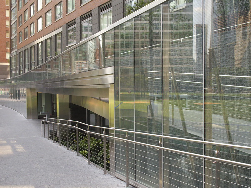
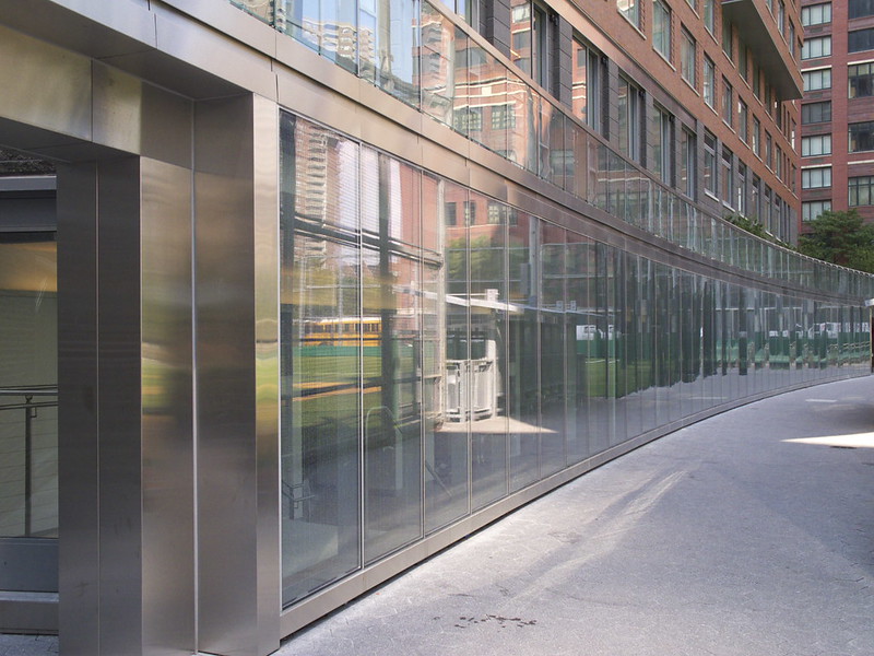
One of the hMa buildings, the one that graces the cover and is shown here, is the Digital Water i-Pavilion (DWiP), which houses recreational facilities and overlooks One World Trade Center in Lower Manhattan. As one of the last elements in Battery Park City, the pavilion adds some much-needed open space and low-scale building to the neighborhood built upon landfill. It also incorporates a sound piece by composer Michael J. Schumacher. "Where is it?" you may ask. It is located on the long glass facade that arcs from one street to the next and fronts a playing field on the east. The composition, called WaTER, is "found" in the frit pattern that covers the glass (also acting as a means of filtering direct sunlight) and then "played" with a smartphone app. It is just one manner of making a relationship between sound and architecture, in this case via technology and architectural materials.

Digital Water Pavilion
[Digital Water Pavilion | Photo by John Hill]

Meyers examines sound through eight chapters: Form, Materiality, Windows, Sound Urbanism, Reflection, Virtuality, Sound Art, and Silence. The buildings of hMa are found within each chapter, but they are accompanied by other architects' projects as diverse as a Le Corbusier church built after he died and a sound/light installation created for the 2004 Olympics. Considering that the hMa projects are found in multiple chapters (DWiP is in Sound Urbanism and Virtuality, for example), the book reads like something between a monograph and a treatise. It's a commendable approach that firmly anchors Meyers' work into a particular way of thinking about architecture, while also being generously open to other voices and positions. So come to think of it, maybe the book is like the Glenn Gould scenes after all, since they both embrace the cacophony of sounds around to create something special.

Thursday 29 January 2015

Book Review: Trilogy: SCI-Arc Pavilions

Trilogy: SCI-Arc Pavilions by Oyler Wu Collaborative
SCI-Arc Press, 2014
Paperback, 144 pages


This book presents three pavilions designed by Oyler Wu Collaborative for SCI-Arc, where husband-and-wife partners Dwayne Oyler and Jenny Wu teach. This situation is certainly a unique one, since the school has acted as client for the duo's design proposals not once, but on three consecutive occasions, from 2011 to 2013. They were asked each year to create a shelter for about 900 people for the graduation ceremonies taking place in the school's parking lot each September. The first pavilion was dubbed Netscape, an appropriate name given the 45,000 linear feet of knitted rope strung between the tube-steel trusses. Netscape survived into the following year, so Oyler Wu were given the opportunity to add a stage structure, in effect improving the experience of the ceremony while exploring more means of design and construction in the smaller project. Stormcloud, the 2013 pavilion celebrating SCI-Arc's 40th anniversary, reused the Netscape structure, but for various reasons the architects opted for fabric rather than rope, giving the pavilion a much different character than the previous iteration.


[SCI-Arc Graduation Pavilion by Oyler Wu Collaborative, 2011]

Yet even as the book does an excellent job of documenting these three SCI-Arc pavilions through drawings, models, construction photos and the words of Oyler and Wu, the reader does not confront them until page 70, at the halfway point of the book. Preceding the "trilogy" are comments from fellow SCI-Arc faculty: Dora Epstein Jones puts down some dense theoretical prose to situate the duo's work in a historical context; soon-to-be Director Hernan Diaz Alonso sees Oyler Wu's work in relation to his own primarily unbuilt designs; and John Enright grasps the learning process embedded in the prototype designs of the three pavilions. Following those introductory remarks is a transcribed lecture of Oyler and Wu speaking at SCI-Arc in January 2013. The lecture is similar to one I attended in 2012 in which the couple explained clearly how lessons learned from one project – be it in design and/or realization, the latter often by themselves – were carried over into another, much as they were in the three SCI-Arc pavilions.


[Sketch by Dwayne Oyler]

"Lineworks" is the name of the January 2013 lecture, and it is an appropriate title, given that lines define much of what they have designed and built to date. They can be found in pieces as early as Oyler's undergraduate projects, which I was privy to as a classmate in undergraduae architecture school, but it's his ongoing sketchbooks full of pages of layered and knotted lines that are most extraordinary. A carryover from Oyler's experience working with Lebbeus Woods (check out Woods's sketchbook pages to see the similarity), the 15 years worth of drawings display an increasing complexity and sureness of hand in creating what he refers to as "spatial fields." The spaces depicted are thick, dense with lines that interact with each other to create even thicker lines and nodes of hierarchy. Even as these spatial fields defy realization, it's pretty easy to see the relationship between these drawings and projects like Screenplay and The Cube.


[Stormcloud installation at SCI-Arc, 2013]

Publication of this little book (about the same size but a bit longer than their previous book, Pendulum Plane) coincides not only with the completion of the three SCI-Arc pavilions, but also with some new directions for the collaborative. Most notably, their design for a 16-story residential building in Taipei is now under construction (on the site of the Sales Center they built for it), their Screenplay installation created for Dwell on Design in 2012 was recently added to the SFMOMA permanent collection, and Jenny Wu launched LACE, a line of 3D printed jewelry, mainly rings and necklaces. Even as Oyler and Wu are venturing into larger and more diverse realms and being recognized for their work, their root explorations remain. Just look at LACE, which utilizes 3D printing technology and therefore could be just about anything, could take any form. But the duo's "linework" remains, evidently serving as a means of making decisions about form and creating things that are downright appealing.


[LACE by Jenny Wu, Catena Necklace]

Tuesday 27 January 2015

Book Review: Sand and Golf

Sand and Golf: How Terrain Shapes the Game by George Waters
Goff Books, 2013
Hardcover, 140 pages


Just like architecture and landscape architecture have reoriented their practices in part toward sustainable ends – designing buildings and landscapes that use less energy and respond to their local contexts – so has golf course architecture. What can be seen as a subset of landscape architecture, golf course architecture has often been held in less regard, since many courses, especially in the United States, are not open to the public and they have a heavy need for irrigation and pesticides, branding courses as resource hogs that do more damage than good. But recent years have seen the creation of golf courses that resemble their natural origins in the British Isles more than the modern courses that litter the U.S. and other parts of the world. Courses like those on the cover of George Waters' book Sand and Golf (Pacific Grove Municipal in California) point toward a way of designing according to a site's characteristics rather than importing a particular type of course to any location.


[The 16th Green at North Berwick | Photo: George Waters]

According to Waters, a golf course architect who has worked with Tom Doak, Bill Coore, Ben Crenshaw, and other designers that share an appreciation of links courses, the key to designing a course that is "green" and follows the game's origins is sand; not sand in the sense of bunkers (just about all courses have them, regardless of where the courses are located and how they're designed), but sand as the base material that the course sits upon. It's no wonder that golf blossomed in places like Scotland and Ireland, where dunes evolved over time to create suitable landscapes for animal grazing as well as for a social game that involved hitting a ball with a club. But in the 20th century golf bloomed and courses were built on all types of soils, not all appropriate for the game as it was traditionally played or for the best grasses to play upon and maintain. And as golf's popularity grew so did technology, not only for moving earth but for the making of clubs and balls, meaning that golfers could hit farther and higher, which influenced the design of courses from a game played as much "on the ground" as "in the air," to one where the latter predominated. While to this day technology's influence has not subsided, the need to be more environmentally responsible has increased, accompanied by an appreciation of links courses by a number of designers and their desire to create courses for all abilities, not just scratch golfers.


[Pacific Grove Municipal | Photo: George Waters]

Waters' book is a strong argument for finding the right sandy sites for building golf courses, both inland and coastal, and then designing with the land rather than imposing one's will upon it. Sandy sites offer the greatest opportunities for moving the least amount of earth during construction and for using the least amount of energy in maintaining the courses over time. Yet in addition to these benefits, and the fact that links courses with their distinctive contours offer as much pleasure to high handicappers as low handicappers, Waters' words on the evolution of sites are particularly interesting. There is a tendency to see courses as static designs rather than dynamic pieces of dynamic landscapes; a hole is seen to have a certain form that needs to be maintained over time. But since a course is part of a landscape, it influences its surroundings, which in turn affect the course. This reciprocity can negatively impact certain holes, but it can also offer the opportunity for creative responses to change, be it in redesigned holes or completely new ones. Whatever the case, it stems from a thinking that acknowledges the naturalness of courses and the idiosyncratic characteristics that arise from being located in a particular part of the world.


[The 10th at Swinley Forest | Photo: George Waters]

Tuesday 20 January 2015

Book Review: Performative Skyscraper

Performative Skyscraper: Tall Building Design Now by Scott Johnson
Balcony Press, 2014
Paperback, 164 pages


When in Chicago last fall I stopped by the office of Adrian Smith + Gordon Gill Architecture (AS+GG) to do a studio visit for World-Architects. If any firm is known for tall buildings, it is AS+GG. Sure, there are bigger firms like SOM, KPF, and Gensler that are designing and building this century’s skyscrapers, but they lack the sharp environmental focus of AS+GG. Known primarily for the supertall Kingdom Come Tower, what will be, barring any surprises, the tallest building in the world when completed in a few years, the most striking project I saw on my visit was FKI Tower in Seoul. Its serrated exterior is not just a formal flourish; it is a means of integrating solar PVs into the façade to optimize the generation of solar power. AS+GG is not alone in using form, material and technology together to create more sustainable high-rise buildings, but the FKI Tower is illustrative of an approach where building form/expression and environmental performance become one.

Other AS+GG projects make similarly overt gestures and many of those are included in architect Scott Johnson’s book on what he calls the “performative skyscraper.” Just saying a skyscraper is “green” or “sustainable” is not enough these days; those words have been watered down by overuse and they don’t speak to particular approaches. “Performative,” on the other hands, clearly points to making tall buildings perform better, be it in generating energy, decreasing how much energy is used, or some other means of gauging a building’s positive contribution. The term also points to measurement as an integral part of the design process.


[AS+GG's FKI Tower | Photo: Namgoong Sun, via American-Architects]

Johnson’s book, which gathers many recent built, in-progress and unbuilt projects but doesn’t read like a collection of typological precedents, is organized into five chapters that build in scale and ambition, moving from internal environments to urban contexts: Performative Ecologies, Performative Skins, Performative Parametrics, Performative Neighborhoods, and Performative Cities. If my assertion that the middle section of a book says more about it than the rest, then the chapter on parametrics is key to Johnson’s argument for building better-performing skyscrapers. The first two chapters deal with a building’s skin and its internal environment, while the latter two chapters move beyond a tower’s enclosure and footprint. This leaves the middle chapter to focus on form and the process of realizing it.

Parametric modeling is often seen as a means of creating ever-more complex forms – blobs – that turn cities into playgrounds of odd forms vying for our attention. But this antagonistic view of the implementation of software for architects ignores the benefits of performance that are also a part of them. Sure, parametric modeling enables architects to create malleable forms in the computer, but they can also have measurable data tied to them. Architects can then, for example, analyze a form’s wind resistance or gauge how much daylight is transmitted over the course of a day, month, or year. This process does not have to result in curving towers that look out of place in some contexts, as should be apparent in AS+GG’s FKI Tower, which is basically a modern box with ridged edges.


[Detail of AS+GG's FKI Tower | Photo: Namgoong Sun, via American-Architects]

Even with parametricism at the book’s core, the last two chapters made me most optimistic about Johnson’s approach, since he looks at a larger canvas. He examines how tall buildings, in and of themselves or in concert with other buildings in a single project, can contain whole neighborhoods. This is not new (think of Chicago’s John Hancock Center or Marina City – the name says it all!), but it is happening at an increasing clip, so it is important to focus on the social life of tall buildings. He also examines how tall buildings work in urban assemblages, creating districts and even whole cities that perform better in various ways. Again, this is not new (New York likes to take credit for being traditionally “green” thanks to its density and prevalent public transportation), but if any century is the “century of the city” it’s the 21st, so considerations of urban performance should be part of the decision-making process.

That said, it pained me to discover in Joseph Giovannini’s preface that Johnson’s firm, Los Angeles's Johnson Fain, is responsible for Museum Tower, the controversial residential building in Dallas. The building was in the news in 2012 and 2013 for deflecting the sun’s rays into the north-facing skylights of the Nasher, the low-slung and much-celebrated museum designed by Renzo Piano. Like the “Walkie Talkie” building Rafael Viñoly designed for London, whose concave glass façade melted plastic on cars blocks away, considerations of context did not extend far enough when Johnson designed Museum Tower. This blemish contradicts the general idea of thinking of a skyscraper’s performance beyond its internal environment and its exterior curtain wall. In this case the curtain wall most likely benefits those living inside, but at the expense of a prized institution across the street. Regardless, this instance does not directly detract from the arguments that Johnson lays out ever so persuasively, but it does make me wish he would practice what he preaches.

Monday 5 January 2015

Book Review: LEGO Architecture

LEGO Architecture: The Visual Guide
DK, 2014
Hardcover with slipcase, 232 pages


On a weekday between Christmas and New Year's, three generations of Hills visited Legoland Florida. It rained on and off that day, and it was cool by Florida standards, but the park was crowded, requiring long waits for the various rides (the ones that were open, that is, with a number of them closed due to the light rain) and for getting to see and do things in other parts of the theme park. A few weeks before that my wife and I tried to take our six-year-old daughter to the Lego store at Rockefeller Center, but the line was just too long, so we opted for the new Madison Square location, which should have similar crowds in the future when more people know it exists.

These Lego experiences are two ways of realizing and expressing just how popular Lego is today, even though ten years ago they were "almost bankrupt," according to a quote from the company at Wikipedia. There are a number of reasons for Lego's resurgence, and one of those is tapping into a grown-up market through the Lego Architecture series, which started in 2008 and has been celebrated in a new coffee table book from DK.


[Spreads courtesy of DK]

Before delving into the book, I feel like I should mention a couple things: First, I don't own any of the Lego Architecture sets, due mainly to the fact that I see them as gifts to get others rather than as (grown-up) toys to buy for myself. To date, nobody has given me a Lego Architecture set, so therefore I can't really comment in this review on how the book relates directly to the sets, or how the sets are physically.

Two, I went to architecture school with the mastermind behind the series, Adam Reed Tucker (actually, we even went to the same high school, but being different ages we didn't meet until college). My memories of Adam in studio are of someone obsessed with making models. His tastes veered toward Gaudi and Calatrava, and he could pull off well crafted models that weren't just orthogonal boxes or angular forms like the rest of us. That said, even with his penchant for model making, I doubt I or any of my fellow students would have figured he'd become a Lego master builder, or "Lego artist," as he's called in this book. But in retrospect, it all makes sense.


The book documents the 22 Lego Architecture sets that have been released from 2008 and SOM's Sears Tower (called the Willis Tower since 2009) to 2014 and Moshe Safdie's Marina Bay Sands. Most of the sets are credited to Lego artist Adam Reed Tucker and Lego builder Steen Sig Anderson, though other artists and builders have been involved on certain sets and are credited accordingly. There are certain buildings that lend themselves to being built in Lego, such as Safdie's Lego-inspired Habitat 67, which has not been made into a set, or Frank Lloyd Wright's Fallingwater, which has and whose spreads here show what sort of information is provided for each set: Photos of model relative to original, information on the building, stats on the set, side and top views of the model, and sometimes an exploded axonometric of the assembly.

My favorite imagery are the exploded axons, which better reveal the complexity of the models while showing how they are put together; they are clear and detailed enough that somebody with their own extensive collection of bricks could create these buildings without the sets. Unfortunately, the exploded axons are not included for every set.


[Spread rotated 90 degrees counterclockwise]

As mentioned, certain buildings lend themselves to Lego Architecture sets more than others. With that in mind, and given my acknowledged lack owning a set, to me the most successful sets are the ones where the differences between full-scale reality and small-scale model are reduced. These include the bundled-square-tube Willis Tower, but not the Hancock, whose angled profile becomes stepped and omits the distinctive diagonal bracing; Fallingwater, which is my favorite set for the way the Lego bricks are used for house, landscape and water; the Empire State Building and Rockefeller Center, whose stepped profiles, like the Willis Tower, work well with Legos; and the Burj Khalifa, which is simply and beautifully executed almost exclusively with round pieces.

Even though everybody has their own favorites that are most likely different than my choices, I'd wager that people with one or more sets will find much more to enjoy in this book. After all, it is a celebration of the Lego models as much as it is a celebration of the original buildings, or of architecture in general. Seeing all of the sets documented in one place makes me appreciate the work Tucker and his fellow Lego artists and builders have done to date, but it makes me more excited about what buildings will be added to the series in the future. Will Adam be able to pull off a Calatrava building in Lego?

Saturday 20 December 2014

Book Review: CLOG: World Trade Center

CLOG: World Trade Center
CLOG, 2014
Paperback, 168 pages


No one needs to be reminded the the Twin Towers were destroyed in a terrorist attack on September 11, 2001, so the latest issue of CLOG is a welcoming thing, since it focuses on the pre-2001 existence of the towers and the other parts of the World Trade Center development in Lower Manhattan. Yet the fact they collapsed after being hit by jumbo jets appears to dictate a good deal of the issue's content, as structure is a major theme throughout. In addition to interviews with architects from Minoru Yamasaki's office, the editors of CLOG spoke with the structural engineers at LERA and they include numerous architectural and engineering drawings and construction photos of the project under construction, all pointing to the way architecture and structure melded in the design. Structure is not the only concern of the editors and the numerous contributors to the issue, but it is never far removed from whatever the content may be.


[Photo by Beija/Flickr, via WFUV.org]

Like other recent issues of CLOG (Rem in particular), the issue has many pages devoted to content generated by the editors rather than external contributors. These pieces, like the interviews with the architects and engineers, are often highlighted with yellow pages that match the cover. In addition to the interviews, drawings and photographs already mentioned, some highlights include a charting of the selection process (what the WTC might have become), a seven-page letter from Minoru Yamasaki to Ada Louise Huxtable after the latter's negative review in the New York Times in 1973 (Huxtable's one-page reply to Yamasaki is also reprinted), and visual analyses of the towers relative to recent skyscrapers and how the towers stood for New York City in films.


[Philippe Petit's walk on a wire between the Twin Towers in 1974, photo via screening the past]

Some highlights from external contributors include QR-code links to videos on YouTube, more discussions of structure (especially how the external columns looked identical, but were anything but, in terms of steel grade and thickness), and talk of their "twinness" and the space in-between the towers. If I would have gotten my act together and written something for the issue, I would have had a hard time getting away from writing about Philippe Petit's one-hour walk between the towers in 1974. But what could be written about this feat that hasn't already been said in articles, books and films? If the issue's deadline were a few months later, I would have compared Petit's walk to that of Nik Wallenda's two high-wire walks from and between Bertrand Goldberg's Marina City towers in Chicago in November. Petit's illegal walk (he was arrested after he finished his walk, but charges were later dropped) is the antithesis of Wallenda's high-publicity, live-televised walks, which says a little something about architecture, but a lot more about how things have changed since the Twin Towers were destroyed. But that would have been a digression from the pre-2001 existence of the World Trade Center, whose portrait is thoroughly portrayed in these pages.

Friday 12 December 2014

Book Review: Fairy Tales

Fairy Tales: When Architecture Tells a Story edited by Blank Space
Blank Space Publishing, 2014
Paperback, 256 pages


The subtitle of this book, which collects the winners and runners-up from the more than 300 entries to the first Blank Space Fairy Tales Competition, is a telling one. "When architecture tells a story" means that the story is most important and secondary is architecture; the latter serves the former, in other words, not the other way around. But in a number of the "fairy tales" in the book, architecture actually serves architecture. Story is either an afterthought to architectural imagery or something that is confused with architectural theory; in the case of the latter, and without pointing out any offenders, at times I found myself growing tired of pronouncements about architecture, which should be elsewhere but not here. A fairy tale, like poetry or other forms of narrative, gains its power as much from what it doesn't say than what it does say; and what it says should be clear, not muddled with high-sounding prose. Statements can be made in various ways, and the fairy tale format provides one that should depart from the architect's normal way of stating things. I would recommend that entrants to the Fairy Tales II competition heed my advice and simplify – let the architecture serve the story and let the story be where your imagination goes.


[2013 First Prize: "Chapter Thirteen" by Kevin (Pang-Hsin) Wang and Nicholas J. O'Leary]

I should say that the above criticism does not apply to every tale in the book, as some of the stories held my interest and transported me to the places their authors envisioned. Here, it's important to point out the importance of the visuals that accompany each story; these are not text-only stories (God forbid, this is architecture, after all!). In most cases the illustrations are more effective than the writing, and the best tales find a way to balance the drawn and the written. Given the strong visuals throughout, I found myself wanting larger images on the page – heck, larger pages even. The fairly standard, 5.5x8.5" page size that seems to be the default in our age of digital printing is a detriment to the beautiful drawings and the time it took to create them. A drawing from the winning fairy tale, above, is a good illustration of this: the drawing is more than twice as big on my laptop screen as on the printed page. Perhaps Blank Space will consider a larger page size, or they will devote more real estate on the page to images rather than, well, blank space.