The Landscape Imagination: The Collected Essays of James Corner 1990-2010 edited by James Corner and Alison Hirsch
Princeton Architectural Press, 2014
Hardcover, 320 pages

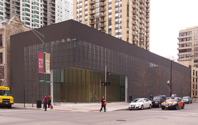
Recently I visited the office of James Corner Field Operations to do a studio visit for World-Architects. Like other studio visit features, I carried out a little bit of research beforehand to get in the right frame of mind and have the foundation for a better conversation, in this case with Mr. Corner himself. One part of my research consisted of reading some of his essays collected in this handsome book released earlier this year. Previous to this I had read Corner's Taking Measures Across the American Landscape (with photographer Alex S. MacLean) as well as essays in The Landscape Urbanism Reader and other collections. So I had some familiarity with Corner's writings, particularly when it came to aerial representation and landscape urbanism, but I soon discovered these areas are just a small part of his writing output.
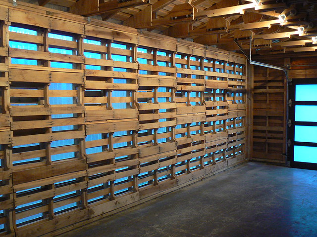
[High Line at the Rail Yards | Photo: John Hill]
As I explained in the studio visit, "Corner came to professional practice in a deliberate way by combining teaching and writing with practice as a means of advancing a particular approach to landscape architecture and urban design." To put it another way, he did not dive into practice, churning out one residential landscape after another or, as he put it to me, "just planting beds around buildings." He used writing, hand-in-hand with teaching, to create an intellectual foundation for his practice and define a way forward for his practice and the larger profession. It's no wonder that he became one of landscape urbanism's strongest proponents, since it requires a particular way of thinking – a theory – about the city, industry, ecology, and landscape; this theory was developed through essays and books that came at a time when landscape architecture was lacking in them.

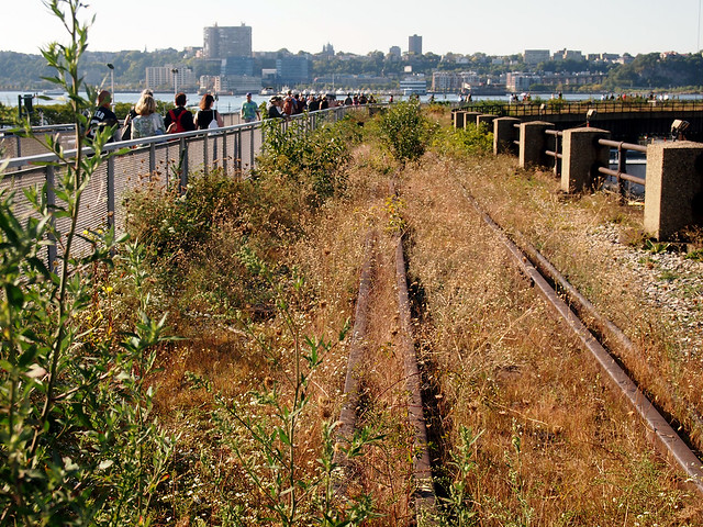
[High Line at the Rail Yards | Photo: John Hill]
The foundations of Corner's positions are found the in the first section of the book, Theory, which is followed by three more that take a roughly chronological path through his career so far: Representation and Creativity, Landscape Urbanism, and Practice. I found the second and fourth sections the most interesting, as the aerial and other representations are extremely interesting to me, and Corner's writings on practice are the most recent and therefore the most pertinent to projects like the High Line, Fresh Kills, and the many others just completed or underway. For those interested in his writings but not sure where to start, Alison Hirsch's lengthy but very clear introduction takes the reader step by step through these phases of Corner's writings. And it's clear from the book's subtitle (the essays end in 2010, four years before publication) that these writings may have reached some sort of resolution. For with Field Operations busy and growing, and more of Corner's time devoted to practice, writing essays has been sidelined. These essays then serve as a good example, among other things, of how writing can inform practice by being an important part of it.
Princeton Architectural Press, 2014
Hardcover, 320 pages
Recently I visited the office of James Corner Field Operations to do a studio visit for World-Architects. Like other studio visit features, I carried out a little bit of research beforehand to get in the right frame of mind and have the foundation for a better conversation, in this case with Mr. Corner himself. One part of my research consisted of reading some of his essays collected in this handsome book released earlier this year. Previous to this I had read Corner's Taking Measures Across the American Landscape (with photographer Alex S. MacLean) as well as essays in The Landscape Urbanism Reader and other collections. So I had some familiarity with Corner's writings, particularly when it came to aerial representation and landscape urbanism, but I soon discovered these areas are just a small part of his writing output.
[High Line at the Rail Yards | Photo: John Hill]
As I explained in the studio visit, "Corner came to professional practice in a deliberate way by combining teaching and writing with practice as a means of advancing a particular approach to landscape architecture and urban design." To put it another way, he did not dive into practice, churning out one residential landscape after another or, as he put it to me, "just planting beds around buildings." He used writing, hand-in-hand with teaching, to create an intellectual foundation for his practice and define a way forward for his practice and the larger profession. It's no wonder that he became one of landscape urbanism's strongest proponents, since it requires a particular way of thinking – a theory – about the city, industry, ecology, and landscape; this theory was developed through essays and books that came at a time when landscape architecture was lacking in them.
[High Line at the Rail Yards | Photo: John Hill]
The foundations of Corner's positions are found the in the first section of the book, Theory, which is followed by three more that take a roughly chronological path through his career so far: Representation and Creativity, Landscape Urbanism, and Practice. I found the second and fourth sections the most interesting, as the aerial and other representations are extremely interesting to me, and Corner's writings on practice are the most recent and therefore the most pertinent to projects like the High Line, Fresh Kills, and the many others just completed or underway. For those interested in his writings but not sure where to start, Alison Hirsch's lengthy but very clear introduction takes the reader step by step through these phases of Corner's writings. And it's clear from the book's subtitle (the essays end in 2010, four years before publication) that these writings may have reached some sort of resolution. For with Field Operations busy and growing, and more of Corner's time devoted to practice, writing essays has been sidelined. These essays then serve as a good example, among other things, of how writing can inform practice by being an important part of it.