Showing posts with label architectural element. Show all posts

Wednesday 27 May 2015

AE32: Climbing Nets

No less than three projects featuring nets – at least two for climbing – were featured in today's email from Arch Daily.

OB Kindergarten and Nursery by HIBINOSEKKEI + Youji no Shiro:

[Photo: Studio Bauhaus, Ryuji Inoue]

Garrison Treehouse by Sharon Davis Design:

[Photo: Elizabeth Felicella]

Saigon House by a21studio:

[Photo: Quang Tran]

Add to those projects a few more...

Brazil Pavilion at Expo Milano 2015 by  Studio Arthur Casas + Atelier Marko Brajovic:

[Photo: Iñigo Bujedo Aguirre]

Net by Numen:

[Photo: Courtesy of Numen]

In Orbit by Tomás Saraceno:

[Photo: Studio Tomás Saraceno]

...And it looks like we have ourselves a new – or at least trendy – architectural element, with porous, malleable, playful surfaces bridging the realms of art and architecture.

Tuesday 3 February 2015

AE31: Supershades

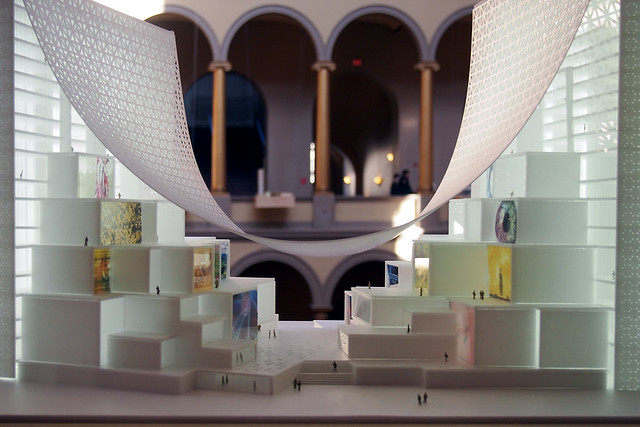
One of the standout projects in BIG's HOT TO COLD exhibition now at the National Building Museum in Washington, DC, is what the firm calls "Magic Carpet," a media headquarters for the Middle East. The project stands out partly because it is located right at the start of the exhibition, which rings the NBM's huge four-story atrium, and because the draped "carpet" that covers a series of stacked boxes between two towers is a really interesting way of creating an outdoor shelter in a dry and hot climate. But it's not the first instance of the architectural element I'm calling "Supershades." This post looks at a few more projects that use expansive covers, most of them perforated and all of them in warm climates, to shelter exterior and interior spaces.

BIG's Magic Carpet:
HOT TO COLD


(Top photo: John Hill, renderings via Design Boom)

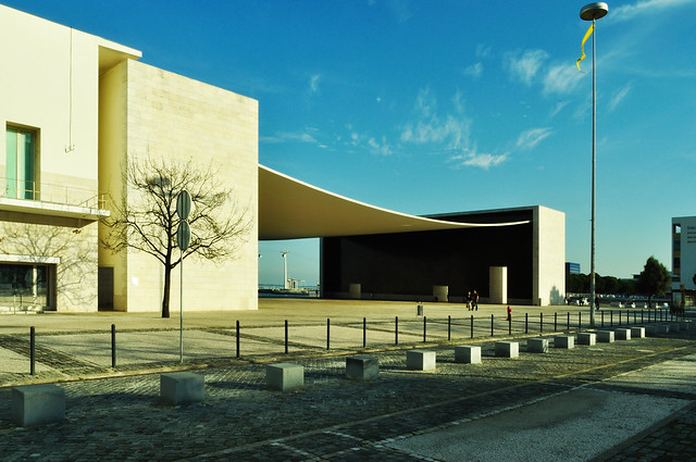
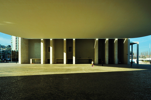
The first project that springs to mind, mainly because of a similar draping of super-thin concrete, is Alvaro Siza's pavilion for Expo 98 in Lisbon, Portugal. Expos are often venues for temporary architecture, but Siza's pavilion remains to this day. Perhaps this is because it represented the home country, but I like to think it is due to the simple yet mind-boggling (still!) design of the suspended concrete roof.

Alvaro Siza's Portuguese Pavilion for Expo 98:
Pavilhão de Portugal
(Photos: Flavio/Flickr)

A project that came three years after Expo 98, but was never realized, is OMA's design for LACMA, which is now being carried out by Peter Zumthor in a much different manner. Koolhaas and the Gang proposed a huge translucent roof over LACMA's jumble of existing buildings. OMA treated the existing as a "Pompeian Base" with new layers over it, rather than simply adding more buildings or demolishing them to make way for something new, as Zumthor is doing. 

OMA's LACMA Extension:


(Images via oma.eu)

A project that is being realized, and is one of the most anticipated openings of 2015, is Jean Nouvel's design for the Louvre Abu Dhabi. His design, which dates back to 2007, puts about 250,000 square feet of exhibition space and other functions under a lattice-like dome that will create "a haven of coolness." The building is located on Saaydiyat Island, which will be home to more cultural institutions by big-name architects; the flattened dome makes a statement from the water. But it's the space underneath that is most amazing, with dappled light and cooling breezes coming across the water.

Jean Nouvel's Louvre Abu Dhabi:


(Renderings via Louvre Abu Dhabi website, construction photo via gulfbusiness.com)

The last two Supershade projects have been completed within the last five years. First is Michel Rojkind's project for the National Film Archive and Film Institute of Mexico, which is made up of old and new buildings and a plaza capped by a larger perforated canopy. The outdoor space functions like a lobby and a shelter for other programs (concerts, theater, exhibitions, etc.).

Rojkind Arquitectos's Cineteca Nacional Siglo XXI:


(Photos: Paul Rivera)

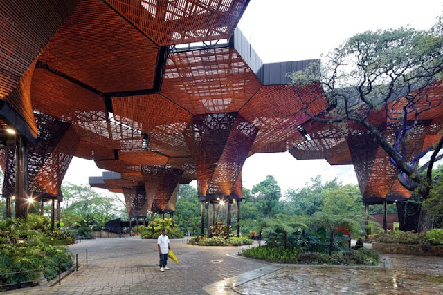
Last but not least is the New Orquideorama for Medellin´s Botanical Garden, designed by PLAN:B and JPRCR. Their design of the wood-slat canopy echoes the surrounding trees, rising from "trunks" and branching out in hexagonal pieces that shelter visitors.

PLAN:B Arquitectos' + JPRCR Arquitectos' Orquideorama:


(Photos: Cristobal Palma)

Sunday 11 May 2014

AE30: Wood Masonry

Back in 2011 I included logs as an installment in the "architectural element" series. In that post I looked at buildings, like Piet Hein Eek's study for Hans Liberg, that turned logs 90 degrees from what we usually think of in terms of log cabins. Therefore the exterior walls were made up of the center cuts of logs rather than their bark exteriors.


[Piet Hein Eek's study for Hans Liberg | Photo by Thomas Mayer]

In that post I also mentioned traditional stovewood (or stackwood or cordwood) buildings, where roughly one-foot-long logs were stacked, and the in-between space filled with lime mortar. The main difference between the study above and the more traditional building on the cover of Cordwood Building: The State of the Art by Rob Roy is the presence of mortar. While the study's logs are held in place in front of the steel frame with glue and copper brackets, the wood and masonry of cordwood buildings act together to create monolithic walls; they may not be structural but they bear their own weight.


The distinction can be seen in two more recent projects, one completed and one under construction.
Bert Haller's Seven Easy uses wood logs in a contemporary vein, as a means of creating an image and texture. This is befitting an interior application, where keeping out water, air and bugs is not necessary. The wood wall seen below separates the dining room from the bathrooms.


[Bert Haller, Seven Easy]

The second project is Studio Gang's Arcus Center for Social Justice Leadership at Kalamazoo College in Michigan, now under construction. The building is a "Y" shape in plan with curved walls spanning between the large apertures that are found at the end of each wing.


[Arcus Center | Renderings from Studio Gang website]

As can be seen in the top rendering, the walls sometimes peel in to allow for access to the building, and in other cases openings are created through slits in the wall (above) or with round openings sized similarly to the logs. The construction photo below reveals how the wood masonry basically functions like a brick wall, sitting in front of a wall that has insulation, waterproofing, and vapor barrier.


[Photo by Mark Bugnaski | MLive.com)

This photo of the construction reveals a lot about how the logs and mortar work together. According to Studio Gang, the "wood masonry [is] a low-carbon, highly insulating building method traditional to the surrounding region, updated by Studio Gang to respond to the needs of a contemporary institutional building for the first time." I'm sure when this building is done, these walls will be much talked-about.


[Photo by Mark Bugnaski | MLive.com)

Sunday 16 March 2014

AE29: Archaeological Covers

Less an architectural element than an odd sort of typology, archaeological covers serve multiple purposes: protecting ruins from the elements, particularly rain, and marking a historical site in a way that reinforces its cultural importance. The former could be accomplished through a tent-like structure, but the latter requires something more substantial in terms of form, material and detail. Here I highlight a few recent and historical examples.

Casa Grande ruins, AZ
[Frederick Law Olmsted, Jr., Casa Grande Ruins National Monument | Photo: Robert Young]

The below archaeological covers are exclusively European, which makes sense given the density of the continent (and therefore the inevitability of building on or near ruins) and the importance placed on history both for cultural and touristic reasons. Nevertheless, an early cover worth pointing out is the Casa Grande Ruins National Monument in Arizona. The second cover on the site was designed by Frederick Law Olmsted, Jr. (the son of the Central Park designer) and completed at the end of 1932. As Ronald Rael points out at Earth Architecture, this cover, which stands to this day, gives greater distance between it and the ruins than its predecessor, such that the ruins can be appreciated as a standalone entity rather than "an introverted and fragile piece of history, wrapped within the security of modernity."

Hedmarksmuseet
[Sverre Fehn, Hedmark County Museum | Photo: Ilha Lee]

Yet, what distinguishes Olmsted's 80-year-old cover from the more recent examples collected here is the location of the visitor. Instead of traversing the same ground as the ruin, and therefore experiencing the ruin as an object in the landscape, covers like the Hedmark County Museum in Hamar, Norway, situate the visitor on walkways between the ruins below and new cover above. This shifting of the horizon – from ground that is shared to a new, built horizon that gives a God-like, if close-up gaze from above – is an important one for many architectural reasons, among them the spaces created and the role of walls. Forced to confront these considerations, the new covers can interact with the old ruins in ways that distinguishing the two is not always clear.

AE029a.jpg
[Sverre Fehn, Hedmark County Museum | Photo source]

In the case of the Hedmark County Museum, which Fehn started working on in 1967 and continued until 2005, "the interior of the former [late-12th-century manor/]barn is now a constructed landscape," according to Per Olaf Fjeld in his monograph on the architect. Fjeld further writes: "New ramps and plateaus together with the ruins form a varied spatial sequence. The old structures remain untouched with the clear intention of allowing all paths and marks in the 'landscape' to continue their now slowed decay." Fehn's approach, as the other projects here indicate, had a strong influence on the typology of archaeological covers.

Untitled
[Peter Zumthor, Protective Housing for Roman Archaeological Excavations | Photo: Felipe Camus]

A couple decades after Fehn started working on the museum in Hamar, Peter Zumthor realized one of his first projects, the Protective Housing for Roman Archaeological Excavations in Chur, Graubünden, Switzerland. Wood lamella walls follow the Roman outer walls, "producing a package-like effect which gives a visible form to the location of the Roman buildings in today's city landscape," per Zumthor in his 1998 monograph.

Untitled
[Peter Zumthor, Protective Housing for Roman Archaeological Excavations | Photo: Felipe Camus]

Zumthor describes the modern steel footbridges running the length of the building as a "raised, a-historical observation level," from which visitors can descend to reach the level of Roman soil. Open-air like the Hedmark County Museum, the archaeological cover allows the sounds of the city to enter the interior, as well as the wind through the wood slats and the sun through dark skylights.

shadow, aperture and perforations
[Peter Zumthor, Kolumba | Photo: Andrew Carr]

Two decades later and Zumthor found himself designing a museum above the ruins of the Gothic church in the center of rebuilt Cologne, Germany. Unlike the previous examples, which cap the ruins with a roof, occupied space (art galleries) sits above the ruins at Kolumba. The line between the open-air archaeological cover at the museum above is visible in the distinction between the solid and the perforated custom Petersen bricks.

Untitled
[Peter Zumthor, Kolumba | Photo: Andrew Carr]

Like Chur, the ruins in Cologne are traversed by bridges, in this case wending through the slender new columns supporting the building above. 

AE029c.jpg
[Paredes Pedrosa, Public Library in Ceuta | Photo: Fernando Alda]

A similar tactic can be found in the Public Library in Ceuta, Spain by Paredes Pedrosa, although the existence of the 14th-century Arab ruins below the building cannot be grasped from the surrounding streets.


[Paredes Pedrosa, Public Library in Ceuta | Photo: Fernando Alda]

One must enter the building to be confronted by the ruins, which are overlooked by lecture rooms and other library spaces.


[Savioz Fabrizze Architectes, Coverage of Archaeological Ruins of the Abbey of St. Maurice | Photo: Thomas Jantscher]

The last pair illustrates a third technique: Translucent canopies that shade and protect the ruins while leaving the sides open. The Coverage of Archaeological Ruins of the Abbey of St. Maurice in Switzerland covers a gap between the Abbey and a cliff face in a dramatic fashion – 170 tons of stone sit atop the translucent surface like horizontal gabions.


[Savioz Fabrizze Architectes, Coverage of Archaeological Ruins of the Abbey of St. Maurice | Photo: Thomas Jantscher]


[Amann, Cánovas y Maruri, Cubierta de El Molinete | Photo: David Frutos]

The last project is ACM Arquitectura's cover "protecting the remains of a Roman assembly (thermal baths, forum and domus) in the archaeological site of Molinete Park in Cartagena, Spain." Perforated steel plates sandwich the long-span structure to create a solid white cover during the day and a glowing lantern-like cover at night.


[Amann, Cánovas y Maruri, Cubierta de El Molinete | Photo: David Frutos]