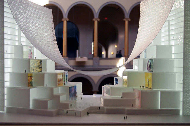
BIG's Magic Carpet:


(Top photo: John Hill, renderings via Design Boom)
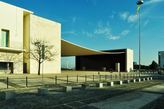
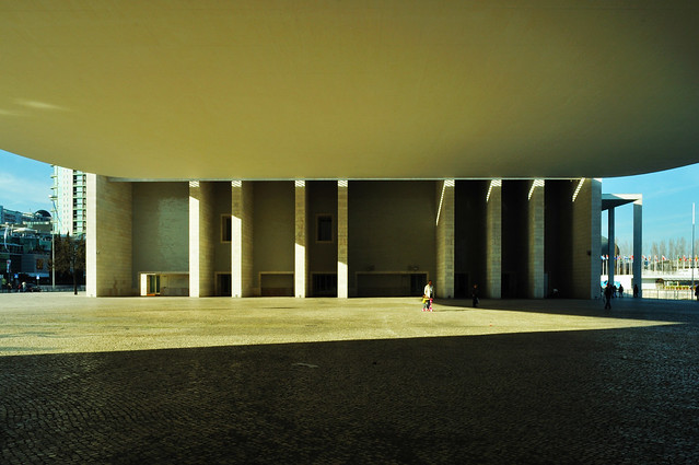
The first project that springs to mind, mainly because of a similar draping of super-thin concrete, is Alvaro Siza's pavilion for Expo 98 in Lisbon, Portugal. Expos are often venues for temporary architecture, but Siza's pavilion remains to this day. Perhaps this is because it represented the home country, but I like to think it is due to the simple yet mind-boggling (still!) design of the suspended concrete roof.
Alvaro Siza's Portuguese Pavilion for Expo 98:


(Photos: Flavio/Flickr)
A project that came three years after Expo 98, but was never realized, is OMA's design for LACMA, which is now being carried out by Peter Zumthor in a much different manner. Koolhaas and the Gang proposed a huge translucent roof over LACMA's jumble of existing buildings. OMA treated the existing as a "Pompeian Base" with new layers over it, rather than simply adding more buildings or demolishing them to make way for something new, as Zumthor is doing.
OMA's LACMA Extension:


(Images via oma.eu)
A project that is being realized, and is one of the most anticipated openings of 2015, is Jean Nouvel's design for the Louvre Abu Dhabi. His design, which dates back to 2007, puts about 250,000 square feet of exhibition space and other functions under a lattice-like dome that will create "a haven of coolness." The building is located on Saaydiyat Island, which will be home to more cultural institutions by big-name architects; the flattened dome makes a statement from the water. But it's the space underneath that is most amazing, with dappled light and cooling breezes coming across the water.
Jean Nouvel's Louvre Abu Dhabi:


(Renderings via Louvre Abu Dhabi website, construction photo via gulfbusiness.com)
The last two Supershade projects have been completed within the last five years. First is Michel Rojkind's project for the National Film Archive and Film Institute of Mexico, which is made up of old and new buildings and a plaza capped by a larger perforated canopy. The outdoor space functions like a lobby and a shelter for other programs (concerts, theater, exhibitions, etc.).
Rojkind Arquitectos's Cineteca Nacional Siglo XXI:


(Photos: Paul Rivera)
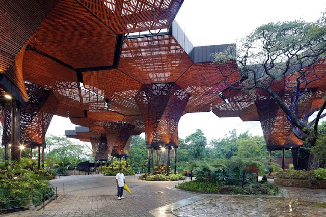
Last but not least is the New Orquideorama for Medellin´s Botanical Garden, designed by PLAN:B and JPRCR. Their design of the wood-slat canopy echoes the surrounding trees, rising from "trunks" and branching out in hexagonal pieces that shelter visitors.
PLAN:B Arquitectos' + JPRCR Arquitectos' Orquideorama:


(Photos: Cristobal Palma)
0 comments:
Post a Comment