Saturday, 31 May 2014

Book Review: Two Magazines

Boundaries 9: Do It Yourself Architecture
July-September 2013

MONU #20: Geographical Urbanism
April 2014

As more and more magazines of various ilks cease publication each year (87 in 2013 according to one source, though over 100 started in the same period) or fold into all-digital versions, it's always good to see titles going strong, particularly in the realms of architecture and urbanism. Even with the difficulties in running print media, two titles that continue their own unique and uncompromising paths of exploration are Boundaries out of Italy, which is "entirely devoted to sustainable architecture and cooperative projects, focusing particularly on places where new developments and ideas in architecture are arising," and MONU out of the Netherlands, the self-described Magazine ON Urbanism "that focuses on the city in a broader sense, including its politics, economy, geography, ecology, its social aspects, as well as its physical structure and architecture." Here I feature recent issues of each magazine.


The photograph accompanying Luco Sampo's editorial to issue 9 of Boundaries shows two men in Burundi sawing a large tree trunk long-wise down the middle, a seemingly insurmountable task aided by leaning it at an angle upon an armature of smaller timber and by one pretty impressive saw. The photo is very telling relative to the issue's theme, not just because the two men are "doing it themselves," but because the enormous expenditure of labor is front and center. And while the idea of D.I.Y. (even in the sense of weekend projects in American suburbs) is importantly based on the end user doing what the end user wants, as opposed to it being done by somebody else, I'd argue that labor is key in the endeavor.

The investment of labor in constructing a building – be it sawing tree trunks, ramming earth, stacking stones, filling sandbags, or one of the many other acts depicted in the issue – is a source of pride, but it is also the best means for understanding how a building works, how it can be lived in to its best potential. That thinking applies to single houses but also community buildings like libraries and schools, and the latter thankfully predominates here in the issue great selection of projects, extending the idea of "building = experience" to the community level, further binding people together through their shared labor.


Given the cover photograph by Edward Burtynsky, imagery is just as important for MONU, even as much of each issue is given to writing, particularly of the scholarly and lengthy sort. Editor in Chief Bernd Upmeyer uses photographs and other illustrations to accompany the essays, projects, interviews and other features, sometimes as full-bleed backgrounds to the words. One example of this is Upmeyer's interview with critic Bart Lootsma, where the latter's full-page photos of the mountains around his apartment in Innsbruck, Austria, prompts a discussion about geography and identity, marketing, and "natural vs. artificial geography."

This last consideration about the natural and the artificial can be seen as the idea driving the issue, evidenced by Burtynsky's photos of prominent natural features balanced by large-scale human marks on the landscape, and the other contributions to varying degrees. In another interview, with Italian urban planning professor Bernardo, the flexibility of natural geography and its "improvement" through artificial means is explored. Many other highlights of the issue focus on histories of particular places, be it Mexico City (by Felipe Orensanz), Quito (by Lucas Correa-Sevilla and Pablo Pérez-Ramos), Butte City, Montana (by Sean Burkholder and Bradford Watson), and even Niagara Falls (by Kees Lokman). The diversity of positions parallels this diversity of geographical locales, making this a rewarding, if at times challenging, issue to read.
Thursday, 29 May 2014

A Visit to the 9/11 Museum, Part 1

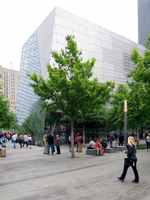
On opening day, May 21, I visited the 9/11 Memorial Museum in Lower Manhattan. I snapped lots of photos and spent a few hours there, much longer than I anticipated. Therefore, photos and impressions from that visit are split into two posts: Part 1 is the pavilion, designed by Snøhetta, and Part 2 is the below-grade museum, designed by Davis Brody Bond.
9/11 Memorial Museum
[All photos by John Hill]

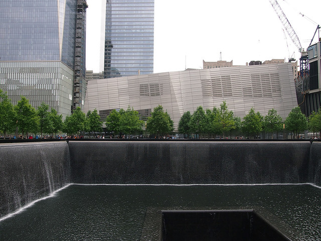
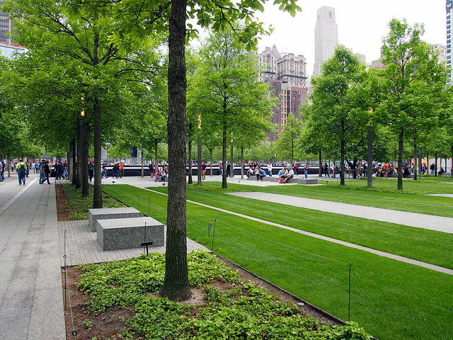
Even before stepping foot inside the pavilion on opening day, the changes at the World Trade Center site are obvious. Instead of getting a timed ticket and going through airport-like security to access the memorial, with its twin pools and grove of trees designed by Michael Arad and Peter Walker respectively, the perimeter of the site is partly open at its perimeter to allow unencumbered access to the memorial. While this situation allows the memorial to be more integrated into its Lower Manhattan surroundings, the ticketing and security screening are shifted to the museum proper.

9/11 Memorial Museum

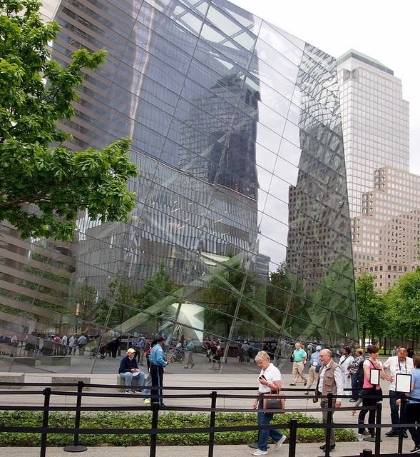
Unlike the below-grade museum, New Yorkers and other visitors to the city have had time to get acclimated to Snøhetta's jagged, glass-and-metal entry pavilion, what is really the only element on the 16-acre site reminiscent of Daniel Libeskind's winning master plan entry.

9/11 Memorial Museum

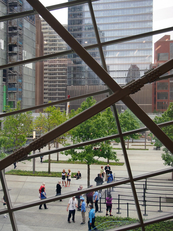
Yet even with a good deal of glass facing the memorial pools, the pavilion reflects the surroundings during the day, forcing people to press their noses against the glass to attempt to see what's inside (something that Snøhetta's Craig Dykers has repeatedly said in articles as liking).

9/11 Memorial Museum

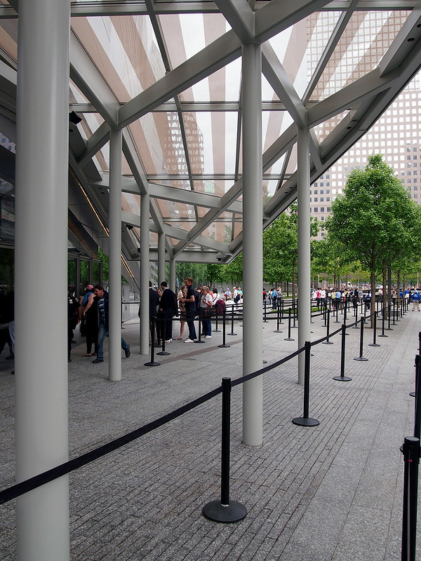
The entrance to the museum is located on the north side of the pavilion, where the crowd control starts. My ticket is set for 10am, and while the ropes portend a long wait, the walk through them and the security screening in the lobby is speedy and much less stressful than the similar custom of trying to catch a plane.

9/11 Memorial Museum

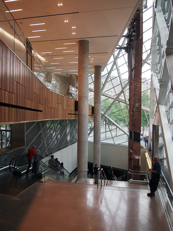
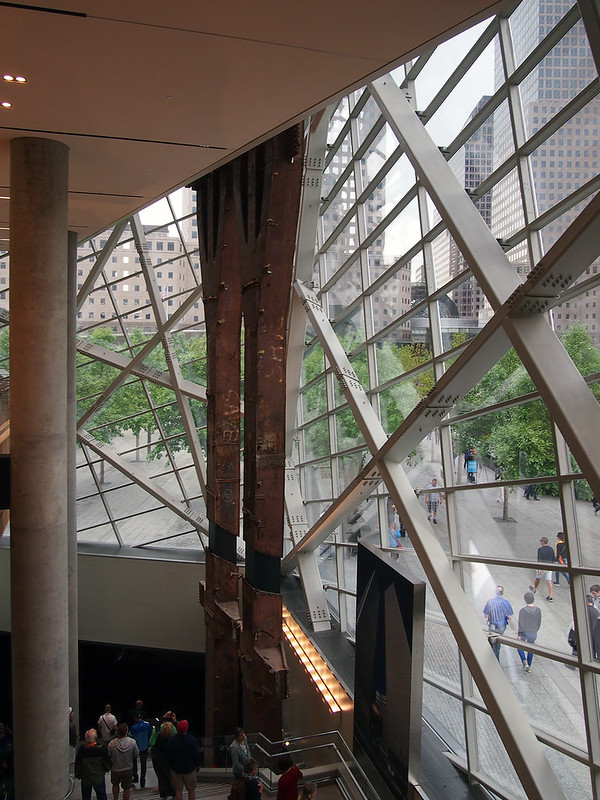
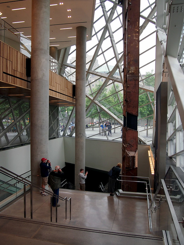
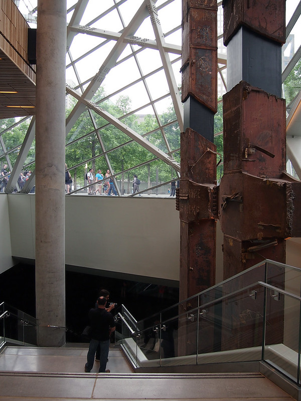
Once through the security lobby at the west end of the pavilion, one's direction and gaze is shifted eastward, toward the glass corner, the rusty tridents from the Twin Towers, and the memorial beyond. The glazing, view and artifact from the original World Trade Center combine to create a strong draw, first to the east and then down into the darkness of the museum.

9/11 Memorial Museum

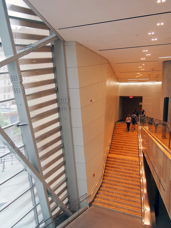
But the wood slats covering the mezzanine's spandrel (the most overtly Scandinavian part of the design) and the wood steps rising to the east offer the visitor the option of ascending rather than descending. Upstairs are bathrooms, a cafe, and an auditorium showing a 10-minute film with (I hear, as I didn't watch it on my visit) politicians and others speaking about their roles and reactions on September 11, 2001.

9/11 Memorial Museum

I observe that most people walk down rather than up, but I head up the stairs to get a vantage of the corner from the mezzanine:

9/11 Memorial Museum

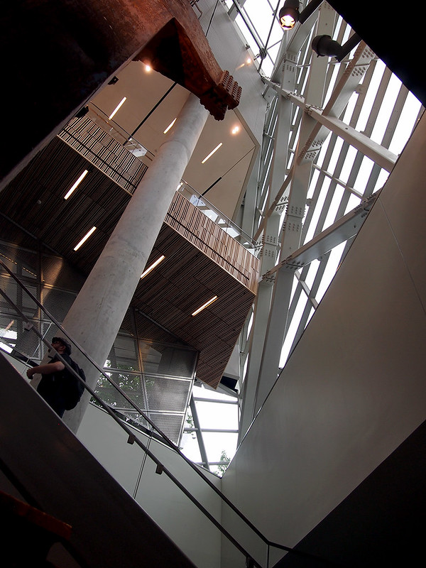
From this level, Snøhetta's angles clearly counter the gridded horizontals and verticals of the surrounding buildings:

9/11 Memorial Museum

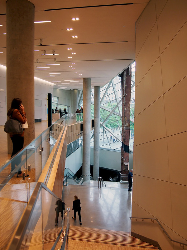
But after a few minutes looking out the glass and reading a sign about the Twin Towers tridents – also overhearing the barista telling a customer in the corner cafe (visible at the end of the mezzanine in the below photo) that they don't take tips – it's time to descend from the pavilion's high point to the underground museum.

9/11 Memorial Museum

Each step that one takes down the stairs (or each second the escalator descends), the darkness of the underground museum becomes larger...

9/11 Memorial Museum

And larger...

9/11 Memorial Museum

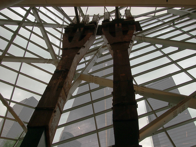
But before being enveloped by the dark, it is necessary to stop and snap what will likely become (if not already) the most photographed sight within the 9/11 Memorial Museum: looking up at the tridents with 1WTC beyond:

9/11 Memorial Museum

The tridents do many things in their current context: Physically, they anchor an important corner of the pavilion; they are an immediate reminder of what stood on the site until 2001; and they reach down to the lobby level of the museum, in effect bridging the above and below realms and leading us down into the literal and figurative darkness.

9/11 Memorial Museum

Part 2 will be posted in a few days.

Wednesday, 28 May 2014

Book Review: 2 Books Exploring Environment

The Air from Other Planets: A Brief History of Architecture to Come by Sean Lally
Lars Müller Publishers, 2014
Hardcover, 248 pages

Manhattan Atmospheres: Architecture, the Interior Environment, and Urban Crisis by David Gissen
University of Minnesota Press, 2014
Paperback, 240 pages


For the 2014 Venice Biennale, director Rem Koolhaas is asking visitors to consider the Fundamentals of architecture. One aspect of the exhibition that opens on June 7 is Elements of Architecture, which "will pay close attention to the fundamentals of our buildings, used by any architect, anywhere, anytime: the floor, the wall, the ceiling, the roof, the door, the window, the façade, the balcony, the corridor, the fireplace, the toilet, the stair, the escalator, the elevator, the ramp..." I'm thinking of this much-anticipated (and equally hyped, one could say) exhibition in the context of these two books because all of these elements are material entities, but Lally and Gissen are more interested with environmental "materials" – air, energy, sounds, etc. – rather than the traditional architectural palette. Which raises the question: Where does the palette of architectural elements end? And how can architects manipulate those elements outside the traditional ones to improve the environments where we live, work and play?

While Koolhaas himself has examined the role of air conditioning on architectural spaces, when we consider the environmental (meaning the substances in and around a building, not "green" concerns) implications of architecture the book that most obviously springs to mind is Reyner Banham's classic The Architecture of the Well-tempered Environment. Considering the technological advances that have taken place since the book's publication in 1969 (not to mention the concerns of climate change that architects sometimes address), the timing seems ripe for new explorations about how architecture is literally formed, and if a revolution in architecture based on mechanical and other innovations, as portended by Banham, will take place. Lally's book looks ahead enthusiastically to scenarios where architecture is more than floors, walls, and roofs of solid materials, while Gissen's book looks back to a particular place and period – 1970s and 80s New York City – to analyze how large interior environments were restructured for the city's late 20th-century evolution.

The Air from Other Planets is like two books intertwined into one: A monograph on the work of Sean Lally's firm Weathers, and a speculative theory of how architecture can some day be made from energy as well as solids. Lally's projects veer from installations that look at the effects of humidity, for example, to proposals for buildings where space is defined by air currents rather than walls; needless to say, the latter proposals are yet to be realized. Lally's position has one foot in the realm of science fiction and the other in architectural history, hinted at by the subtitle of the book, a Brief History of Architecture to Come. His forward/backward approaches synthesize in the book – and are found at the root of Weathers – as a belief in the the power of architecture and the architect as an agent of change. While Lally looks to science, technology and other fields for justifying that his ideas can happen, considerations about the clients, manufacturers, and other entities that would partake in the realization of such visions is nonexistent, as if the architect willing them through designs and arguments is enough. But those entities outside the architect are a core part of Gissen's book.

As mentioned, Manhattan Atmospheres looks at a particular time in New York City's recent history, a time that coincides with crises that led to the urban environment's deterioration. Graffiti-covered subway cars and burning buildings in the Bronx are the cliche images of New York's problems in the 1970s, and Gissen's four case studies – the Washington Bridge Extension Project, corporate atria like the Ford Foundation, the Metropolitan Museum of Art's Temple of Dendur Room, and trading floors in buildings like the World Financial Center in Battery Park City – are constructions that are positioned relative to the larger environmental degradation in the city. The spaces Gissen thoroughly and most fascinatingly examines are seen as cleaner alternatives to the outside environment, each in a different way. The Dendur Room, for example, offers a controlled environment for a temple from a much different climate, while the trading floors must contend with the heat created by people as well as computers, the latter enabling the speedy transactions that have created 21st century New York City to a large degree.

The word and concept that pervades Gissen's book is "socionatural," which is the social construction of nature. The Ford Foundation is the most overt example of such a construction from the quartet, since it involves the transplantation of tropical plants into the year-round warm environment of the 12-story-high space, in effect creating a pleasing space for the people working adjacent to the atrium, a corporate benefit that is also open to the public. But each space in Gissen's analysis – part architectural history, part critical geography – constructs nature in some manner; or more accurately filters out the city's contaminants outside of their buildings to make the city an amenable host to certain functions. The architect is an important part of these creations, but so is the mechanical engineer, the landscape architect, the client, and the city itself.

What Gissen's analysis means for New York and other cities today and in the future is a matter of interpretation. One could venture to the extreme position that Lally might take; that formerly enclosed environments could merge with the city through barriers created by energy fields. Or perhaps the grooming of the city's spaces through pedestrianization and developer-friendly parks like the High Line have succeeded the internal environments in the city's continued evolution as a place created by and for those with money. Yet Gissen is more optimistic, envisioning that socionatural environments can be part of creating a city that is desired. If this is the case, these two books are then a call for architects to take an active role in a broader definition of design – environmental – if they want to be a major part of how cities are shaped, rather than just powerless progenitors of form.

Tuesday, 27 May 2014

Make Shift Happen

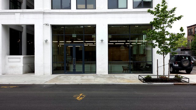
The title of this post is the punny catchphrase printed on postcards for Makeshift Society, which bills itself as "a coworking space and organization for creatives, by creatives." The first space is found on Gough Street in San Francisco, and the second one, which just opened a few weeks ago, is located in an old factory building on Hope Street in Williamsburg, Brooklyn.

Last week I got a tour of the two-story space from Bryan Boyer, a partner at Makeshift Society and principal at Dash Marshall, who worked with Rena Tom, founder and partner at Makeshift Society, on the design of the space and its furnishings.

Makeshift Society Brooklyn
[All photos by John Hill]

The space is located on the ground floor of a building less than one block from the BQE, but more importantly, it is close to three subway lines: L, G, and J/Z. The space gets plenty of sunlight through two large storefront windows facing south and windows on the both sides, overlooking a parking lot (right in the photo above) and a slender courtyard planted with bamboo.

Makeshift Society Brooklyn

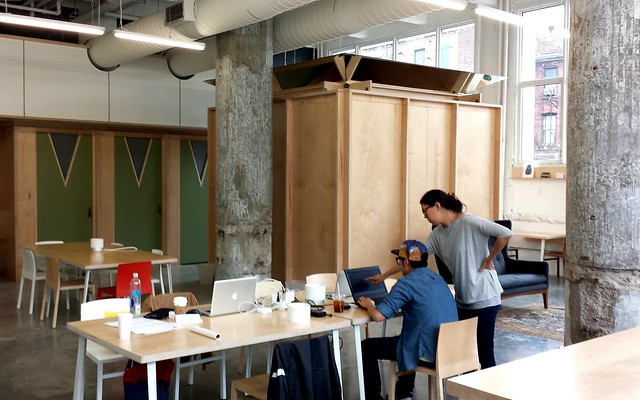
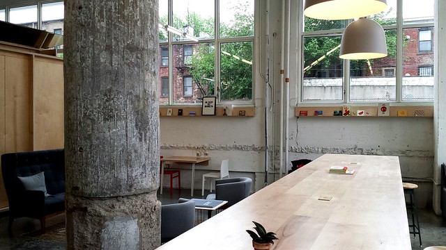
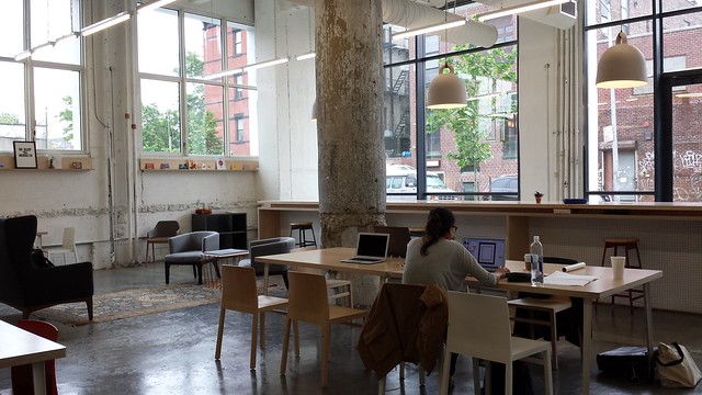
The first thing I notice stepping into the tall space isn't the rough concrete columns, or the exposed ceiling, or the wood box and green doors in the back of the space, or the really long table (23 feet, if memory serves me right) near the front; it's the noise, or lack thereof. This stretch of Williamsburg isn't particularly loud, but with the BQE close by, and other sounds of the city going on, the change is palpable. Of course, the space is being used as a workspace by only a handful of people at the time of my visit, and more people in the space would naturally equal more noise, be it clicking keyboards, sneezes, or music leaking from one's headphones. Yet there is still something about the space that is conducive to quiet, an environment suited to concentration while still being around other people, unlike, say, Starbucks.

Makeshift Society Brooklyn

The main, storefront level of the space is demarcated by two large concrete columns that separate it into six areas: left and right halves, and front, middle, and back. The large table occupies both halves of the front, accompanied by some informal seating. Work tables occupy the middle and back zones on the left, while these areas are respectively an informal lounge area and wood box on the right. Small tables, as we'll see, make the most of the space, filling in gaps that would otherwise be empty.

The combination of light wood, well chosen chairs, and custom details like the green doors with leathers straps for handles add up to a Scandinavian feeling. This is not surprising, given the time Boyer spent working in Finland. I liken the space to a makeshift UN inserted into a warehouse.

Makeshift Society Brooklyn

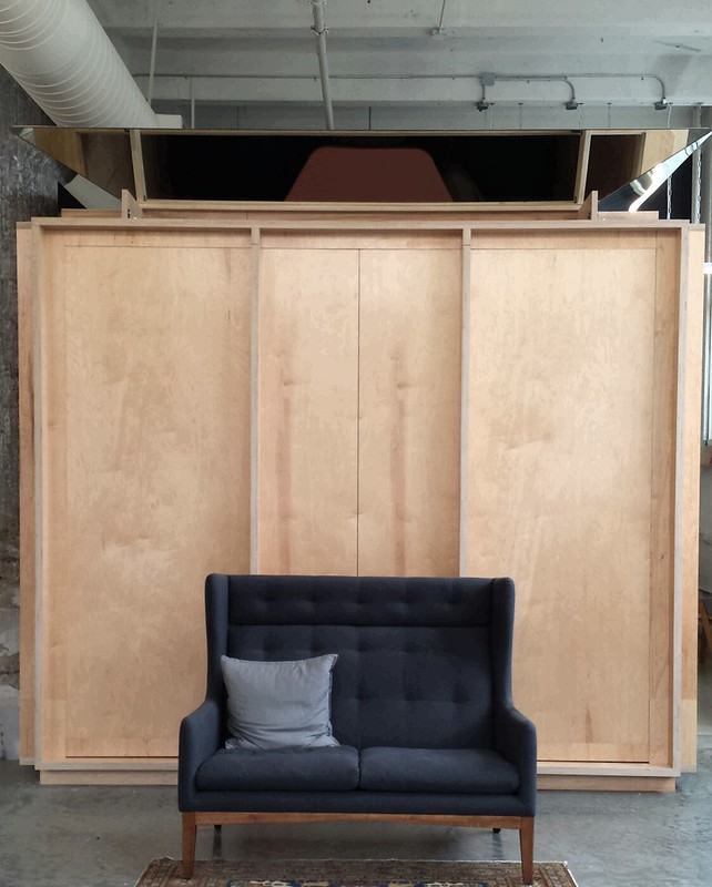
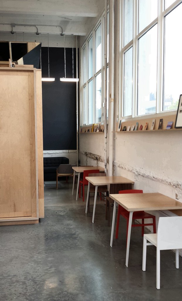
The wood box is an intriguing object that sits in the back-right part of the space. A seam down the middle and mirrored panels on top hint at what is inside, but getting inside the box requires walking around it to the door on the rear, past some two-seater tables made from scrap wood created in the process of making the box (photo below). At the very back of the space (by the black wall in the same photo) is another informal lounge area with a couch. Ultimately, the mix of tables, chairs, seating, and the size of micro-spaces within the larger storefront space gives coworkers a number of possibilities in finding comfort at Makeshift Society.

Makeshift Society Brooklyn

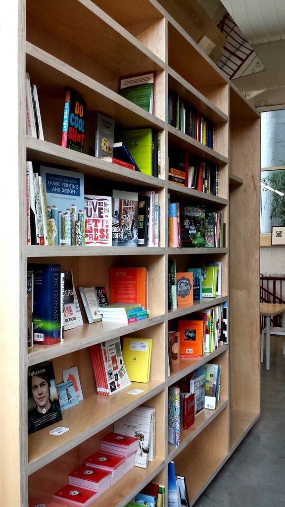
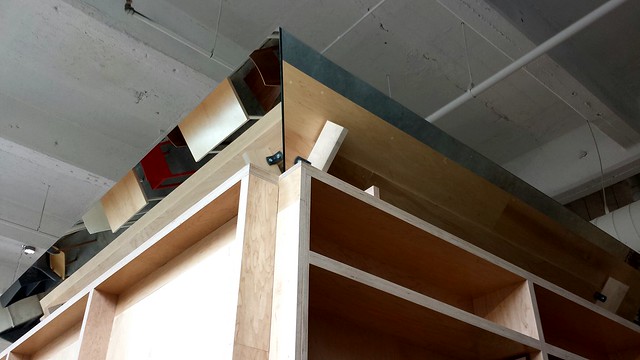
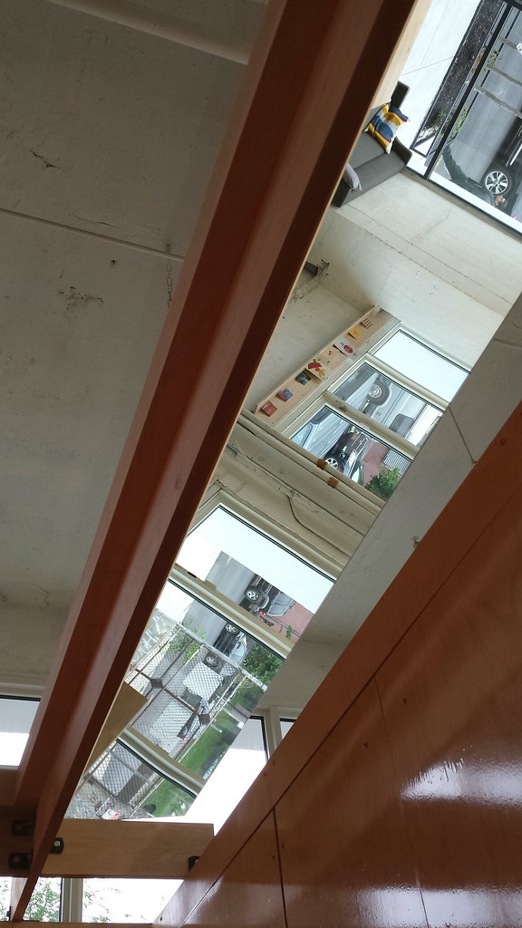
A library occupies the back wall of the wood box, next to which is a doorway to access it. From outside, the angled mirrors reflect the space inside the box, the space outside the box, or even the top of the wall, all depending on one's angle.

Makeshift Society Brooklyn

From inside the effect is more interesting, as the mirrors can reflect the street, for example...

Makeshift Society Brooklyn

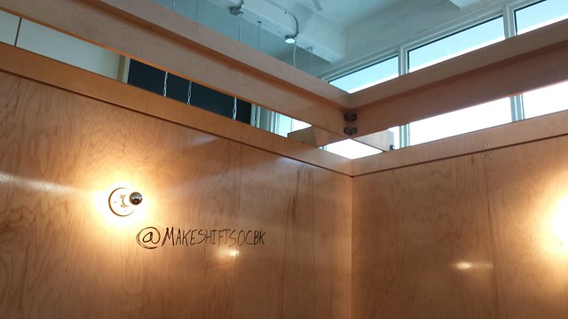
Or disappear above the wood walls that are treated with a clear coat for being used as marker boards:

Makeshift Society Brooklyn

Not pictured (so you'll have to take my word for it) is how the two panels on the front of the wood box swing into the small conference room to open it up to the front of the space. When open, the box becomes a stage for one of the many after-hours events that take place at Makeshift, such as a recent talk by Creighton Berman, the maker of a manual coffeemaker that was funded via Kickstarter.

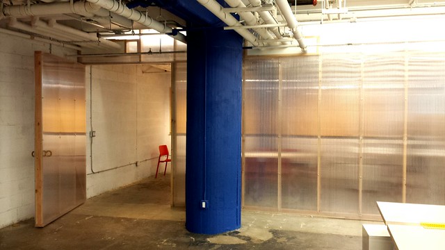
The box does not have a top, so during business hours it is not suitable for private meetings/conversations, like much of the storefront space. For those hush-hush conversations there are phone booths (with USB jacks, shelves, and a light in lieu of actual phones) behind the green doors visible in the second photo, and a conference room with full-height walls in the basement for meetings (below, the conference room is beyond the translucent plastic wall).

Makeshift Society Brooklyn

The basement is also where the kitchen area and bathrooms are located and where certain members have permanent desks and the ability to leave their belongings, such as laptops and documents. Putting the regular customers, if you will, in the basement, below the trial coworkers using day passes in the storefront space, might seem topsy-turvy. But the basement is also blessed with a good deal of natural light and even more quiet for "making shift happen."

For those in and around Brooklyn, Makeshift Society is having an open house and launch party on June 4. Click the link for more information and to get free tickets.

Saturday, 24 May 2014

Atlantic Yard Alternatives

The exhibition Five Proposals for the Future of Atlantic Yards opens at the Warehouse Gallery in Brooklyn on June 5, running for just over a couple weeks, until June 22. Per the exhibition's website: "The Atlantic Yards Site presents a major opportunity to create a  significant piece of architecture and urbanism at the center of several Brooklyn neighborhoods. Five architects will present their alternative proposals for the site. Each scheme will provide 4,278,000 square feet of housing and 156,000 square feet of retail space, equivalent to the master plan by Forest City Ratner."


Further, per the website: "The five proposals are intended to illustrate alternative architectural possibilities to the community through schemes that are equally profitable for the developer. The schemes will show that the proposed density is not inherently problematic if distributed properly on the site. The exhibition will open up a dialogue about the site’s potential, giving the community a deeper understanding of architectural and urban planning possibilities to properly develop one of the most significant large scale sites in New York City."

Below are images of four of the five proposals (I guess the fifth one is a surprise for those visiting the gallery?); click on the titles to read about the schemes and see more images.

Matthias Altwicker's and Farzana Gandhi's Flexible City:


OPerA Studio Architecture's The Garden in the Machine:


Amoia Cody Architecture's Vertical Lots:


Joshua Zinder Architecture and Design's Quilted City:

Thursday, 22 May 2014

Book Review: Drawing Ideas

Drawing Ideas: A Hand-Drawn Approach for Better Design by Mark Baskinger and William Bardel
Watson-Guptill, 2013
Hardcover, 304 pages


Creativity and design are riding a high these days. In various forms they are seen as the means for solving many of the world's problems, be it an app for this or that, a way to get clean water, or how to build a cleaner car. Much of the hype over creativity and design is hyperbole, and just as much of it is framed in the context of helping business, specifically helping the bottom line. I'm skeptical about the hype as well as design being relegated to business interests, but nevertheless I believe that creativity (the core of design, if you will) is something that should be fostered in children and adults alike for many reasons: in solving problems, in embracing art and culture, in heightening intelligence and emotional understanding, and on and on.


The above thoughts were going through my head as I tried to find a means of discussing what Mark Baskinger and William Bardel have created in Drawing Ideas. Clearly they are talented folks, capable of leading workshops that spur people in offices to "unlock [their] potential for brainstorming creativity through better drawing skills," but my yellow flag of skepticism is raised by the book. Yes, their drawing skills are evident throughout most of the book (accompanied by drawings from other designers in various fields), though as an architect I'll admit their styles are a bit removed from what I like. Nevertheless their drawings of objects, figures, and other elements accompanied by illustrations and text convey clearly what they are aiming to do; and in this case they are aiming to give the reader a means of planning, structuring and depicting ideas.


The book is billed as "a hand-drawn approach for better design," but the audience isn't limited to designers, many of whom probably learned a good deal of the book's contributions in school and practice. Much of what Baskinger and Bardel discuss applies to people in a wide range of businesses who are interested in being able to draw what they are thinking. While the authors' style and means of explaining their methods are very business-like, I must give credit where it is due. For one, their visual explanations are so well done that they can stand alone, separate from the text that accompanies them. Two, setting style aside (sorry, I learned to not like markers, which are used profusely in this book), the focus on drawing by hand is commendable, considering that the hand has a much more direct link to the brain, where the ideas are stored, than the mouse, trackpad, or keyboard. And three, they leave the creativity up to the reader, giving him or her the tools for getting those ideas on paper and sharing them with other people.

Tuesday, 20 May 2014

2014 Wheelwright Prize

Last year's Wheelwright Prize traveling fellowship was notable for being open for the first time in its nearly 80-year history to graduates outside of the Harvard GSD, regardless of the fact that recipient Gia Wolff graduated from the Ivy League school in 2008. This year's prize continues the new tradition of being open beyond the confines of Gund Hall, but it differs in that a shortlist of finalists* was announced a few week's before last night's award to Barcelona-based architect Jose Ahedo. Beating the six finalists, as well as the roughly 195 other eligible entries, Ahedo wins the $100,000 travel grant with his proposal "Domesticated Grounds: Design and Domesticity Within Animal Farming Systems."

The proposal sounds anything but sexy, but Ahedo's first independent project -- Blanca from the Pyrenees, a 13-building dairy complex -- shows the potential for some smart and visually appealing design in an area often left to anybody but architects. Additionally, in last night's award presentation at the Harvard Club in New York City, Ahedo (who grew up on a dairy farm in Spain, by the way) wowed the small crowd with diverse examples of farming practices in China (Hainan's aquatic farms), Germany (the fascinating Halligen "islands"), and other places on his itinerary that combine traditional and technological agriculture in varying proportions.

Per a press release, "the jury praised Ahedo’s proposal for its integrated approach to a broad range of issues, and for his clarity in identifying architecture and design’s potential to shape more sustainable models of production for a global mega-industry." Yet as was mentioned last night, the jury also appreciated the personal nature of the proposal, given Ahedo's farming background and his desire to make sense of it in a much broader context. I'm looking forward to hearing how his research and work evolves after his travels.

*The other finalists for the 2014 Wheelwright Prize:

• Ana Dana Beros, MArch 2007, University of Zagreb: Independent architect, curator, editor, and cofounder of ARCHIsquad (Zagreb, Croatia).
• Alison Crawshaw, MArch 2004, Royal College of Art: Founder of Alison Crawshaw Architecture (London).
• Masaaki Iwamoto, Master of Engineering 2008, University of Tokyo: Partner of Vo Trong Nghia Architects (Ho Chi Minh City, Vietnam).
• Jimenez Lai, MArch 2007, University of Toronto: Principal of Bureau Spectacular and assistant architecture professor at the University of Illinois at Chicago (Chicago).
• Sean Lally, MArch 2002, University of California, Los Angeles: Founder of the firm Weathers and assistant architecture professor at the University of Illinois in Chicago (Chicago).
• Kaz Yoneda, MArch II 2011, Harvard GSD: Founder of the Architecture and Space Design Unit at Takram Design Engineering (Tokyo).

(Photo: Jose Ahedo, third from left, with jury members, L-R: Shohei Shigematsu, Linda Pollak, Jorge Silvetti, Sílvia Benedito, Mohsen Mostafavi, Pedro Gadanho. Jury member Iñaki Abalos was not present at last night's event.)

John Jay Walkthrough

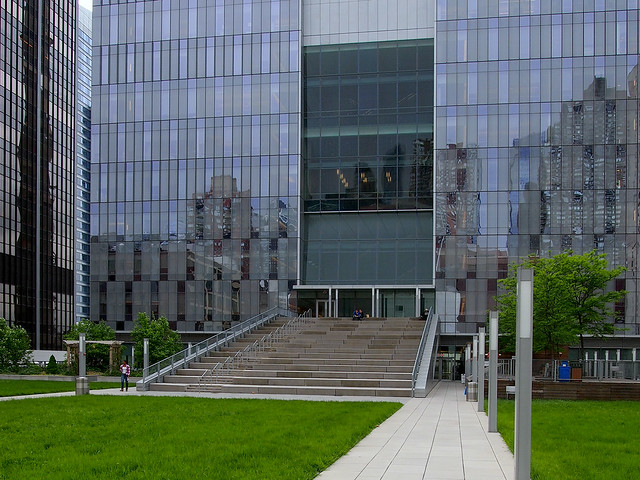
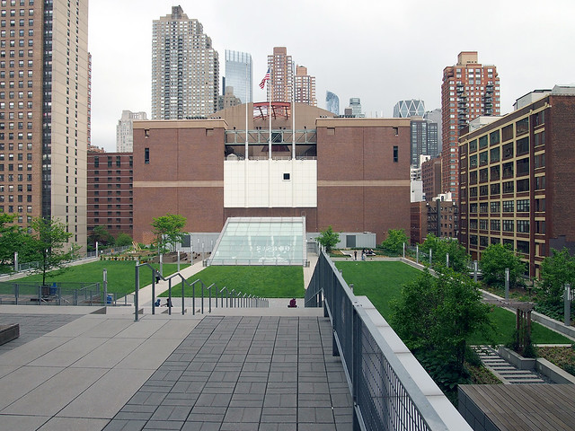
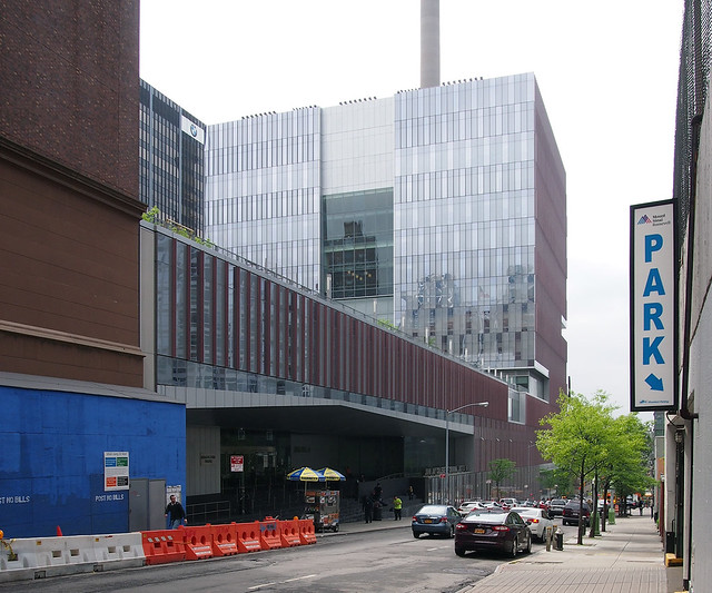
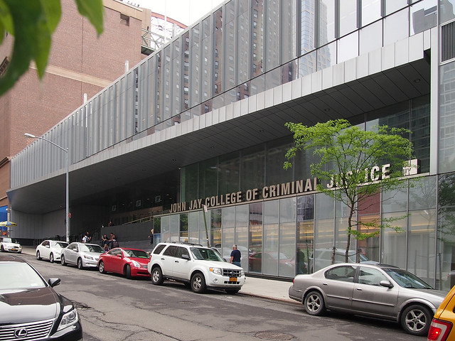
Here are some of my photos of the John Jay College of Criminal Justice in New York City by SOM. The building is a cube-like addition on 11th Avenue that is connected to the existing school on 10th Avenue via a long concourse that is capped by a green roof.

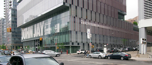
The west-facing elevation on 11th Avenue, at West 58th Street:
John Jay College

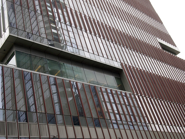
A close-up of the addition's elevation on West 59th Street:
John Jay College

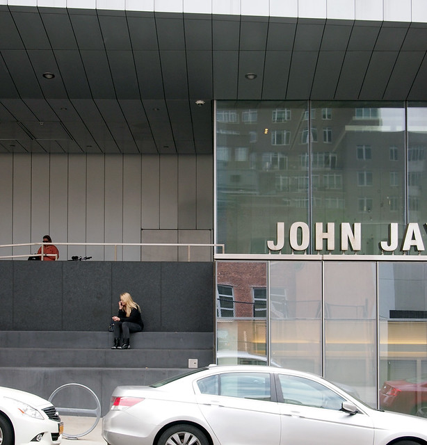
Looking west along West 59th Street; the main entrance is in the foreground:
John Jay College

Another view of the main entrance:
John Jay College

A close-up of the main entrance:
John Jay College

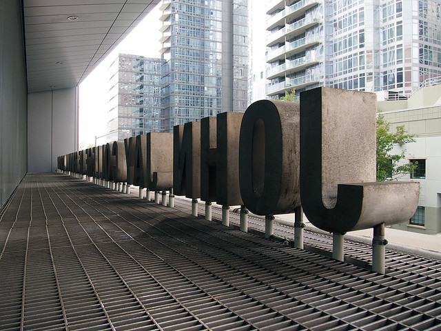
The main-entrance signage from the other side:
John Jay College

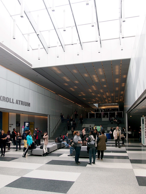
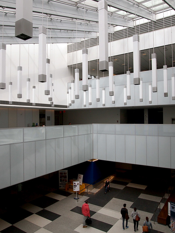
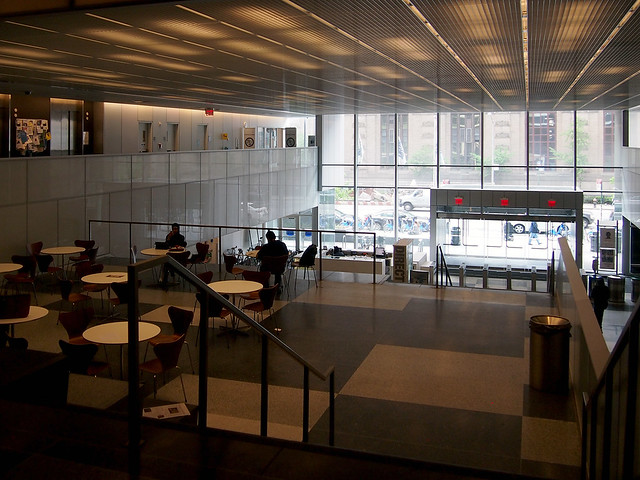
The main entrance drops people into this light-filled space at the eastern end of the concourse:
John Jay College

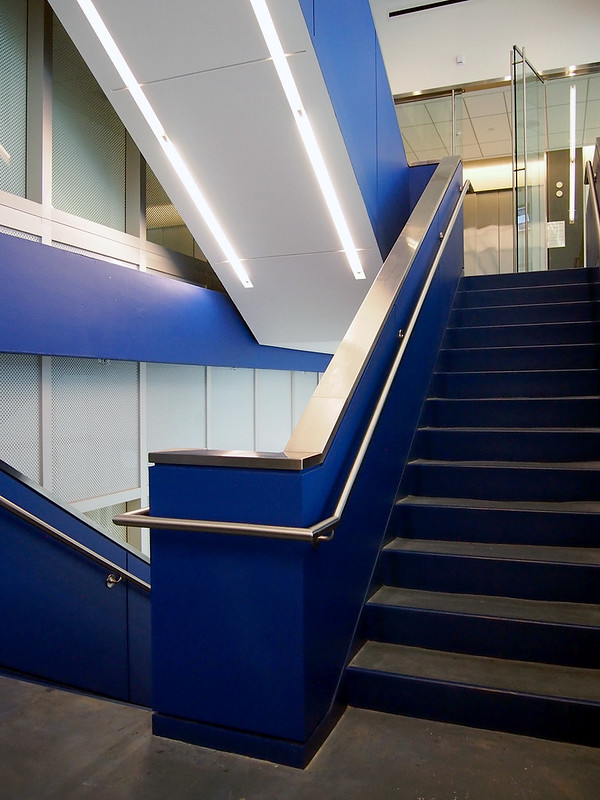
A view of the skylight from the mezzanine:
John Jay College

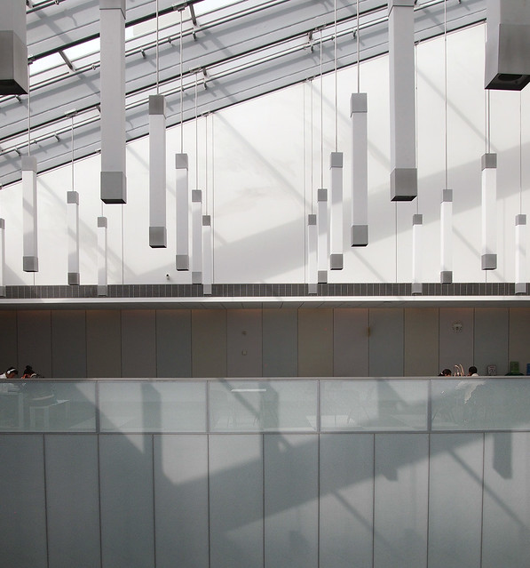
And a close-up of the lighting below the skylight:
John Jay College

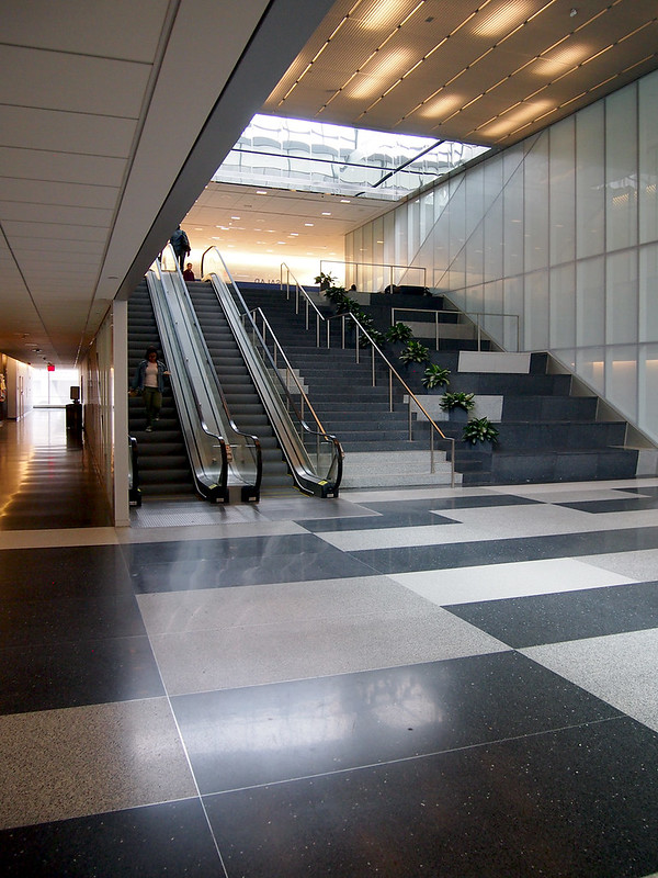
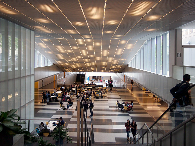
Moving west along the main level of the concourse:
John Jay College

A little bit more west:
John Jay College

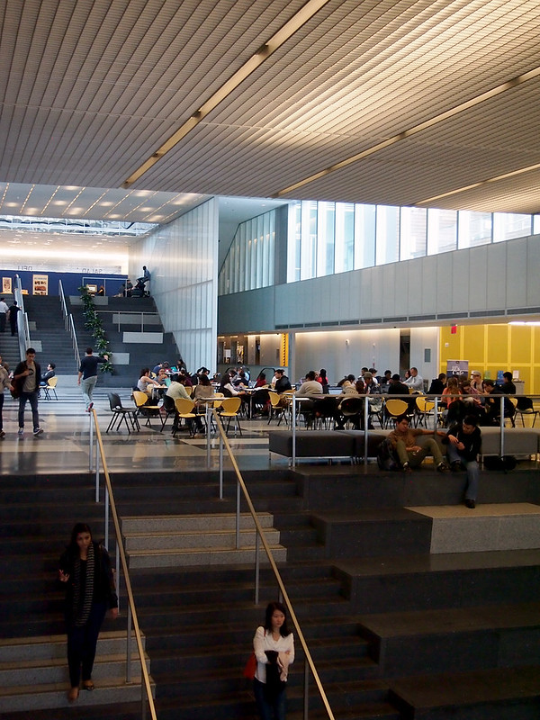
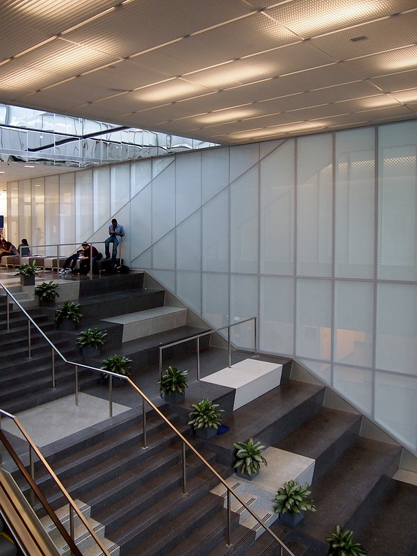
The steps and seating at the western end of the concourse:
John Jay College

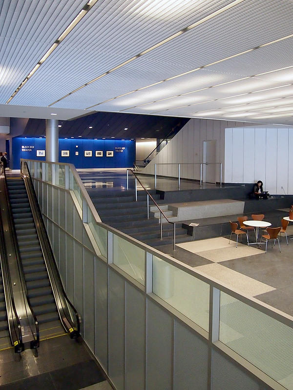
A view from atop those steps, looking east:
John Jay College

The 11th Avenue entrance; this seating area is where The Good Wife filmed a scene (with the school posing as an FBI building):
John Jay College

The 11th Avenue entrance, looking the other way (this entrance is entered below the big "JAY" lettering visible in the first photo):
John Jay College

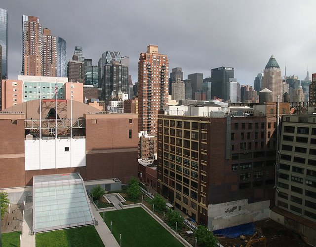
Up on the green roof above the concourse, looking west toward the addition:
John Jay College

Atop the steps visible in the previous photo, looking east:
John Jay College

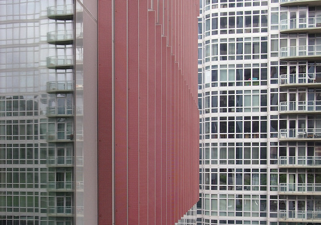
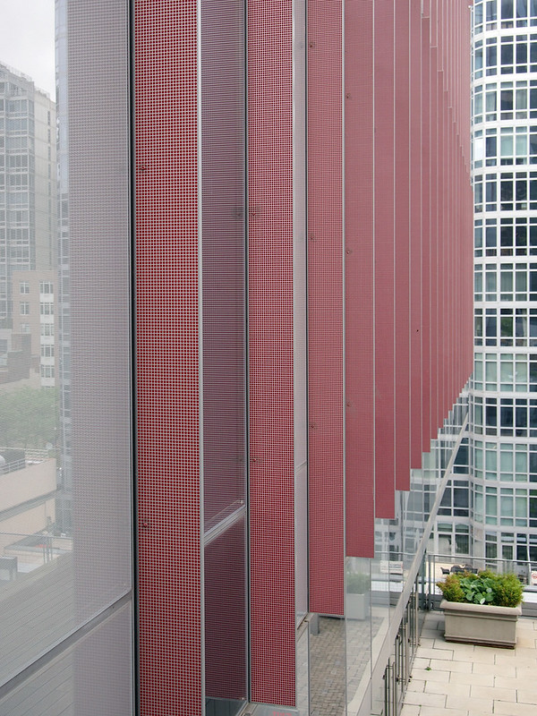
Turning left 90-degrees from the previous photo to look at the fins on the addition:
John Jay College

The red is made up of a grid of small dots:
John Jay College

Heading up the 8th-floor lounge in the addition:
John Jay College

The east-looking view from the lounge:
John Jay College

(Many thanks to Holly K. for the tour of John Jay!)