Showing posts with label book-review. Show all posts

Wednesday, 29 July 2015

Book Review: OfficeUS Atlas

OfficeUS Atlas edited by Eva Franch i Gilabert, Ana Miljački, Ashley Schafer, Michael Kubo
Storefront for Art and Architecture, Lars Müller Publishers, 2015
Hardcover, 1,250 pages


The 2014 Venice Architecture Biennale was one of the most anticipated since it started in the 1970s. Rem Koolhaas served as director and he aimed to unify the various national pavilions under one theme: "Absorbing Modernity 1914-2014." In most years the national pavilions do their own thing, often exhibiting the work of native architects; that is already the case with 2016 for the United States, which decided to focus on Detroit even before Alejandro Aravena was named director. But Koolhaas demanded more time and got it so he could leverage a bit more control and make the Biennale a bit more unified. For the most part it worked, with for the most part each country covering 100 years of architectural production. For the U.S. Pavilion, curated by Eva Franch i Gilabert, Ana Miljački, and Ashley Schafer, the theme was OfficeUS, which focused on American firms building overseas.


The U.S. Pavilion was the equivalent of information overload, since just about every wall of the "U"-shape building in the Giardini was covered with papers on American architects that the curators researched. These architects ranged from the obvious, like SOM and KPF, to smaller firms that would seem to be less likely to build overseas. But given the time frame covered in the exhibition, OfficeUS followed a number of changes in overseas, or imperial, architectural production. What was a rarity 100 years ago is now common practice, given the ease of telecommunications, travel and collaboration.


OfficeUS Atlas follows OfficeUS Agenda, which was published as a catalog to accompany the exhibition. It is much slimmer (only 272 pages) and more theoretical, since it "frames the narratives that have projected the organizational structures and branded identity of U.S. architecture firms internationally from 1914 - 2014." OfficeUS Atlas, on the other hand, is a gargantuan book on par with the exhibition itself. Thankfully it is not the book equivalent of the exhibition's information overload, since the design and layout help to break up the book into more manageable chunks and make it easy to navigate. The book works in a chronological order with content divided between archive materials (articles from magazines mainly) and profiles of firms building overseas; the former has pages with black edges and the latter has white pages, resulting in a book with black-and-white stripes. The order of the book makes the changing conditions of overseas work obvious, while it also (inadvertently?) shows how architectural publishing changed over the same period. Not only are some magazines long gone, but the content has changed from more big-picture and critical stories to project-specific coverage.

The combination of archive material and firm bios (with many projects illustrated with postage stamp-sized images) make this book appealing from different angles. Unfortunately, for those interested in the book as an archive the design falters. Although a black border is given around each clipped article (partially visible in the other two images above), there is no matching border in the fold. In many cases this does not affect the readability of the old articles (it should be noted these are smaller than their original page sizes, but they are still big enough to be read easily), but in far too many cases the text and/or drawings gets lost in the fold. Not allowing a margin in the fold is an inexcusable but common occurrence in architecture publishing. I've learned to overlook it at times, but I expect more from Lars Müller, who published this book and is known for thoughtful design in his books. Perhaps there was a sense on the part of the editors/curators that the archives were there for effect, to show how much and what has been written about the theme they developed. But far too often I found myself sucked into an old article only to turn the page and be frustrated by lost words – one blemish on an otherwise excellent book and record of an ambitious exhibition.

Monday, 20 July 2015

Book Review: World Atlas of Sustainable Architecture

World Atlas of Sustainable Architecture: Building for a Changing Culture and Climate by Ulrich Pfammatter
DOM Publishers, 2014
Hardcover, 584 pages


The back cover of this hefty book purports a total of 333 projects in its nearly 600 pages. With so many projects, the question in any book is how to structure them. The words "world atlas" in the title, as well as the weather map image on the cover, point to a geographical structure, but that is not the case. Instead the projects are arranged thematically in a complex, nested array of sections, chapters, subchapters and sub-subchapters. It's a very logical structure that responds to, if anything, how architects work on projects, particularly in regard to site planning and other "big picture" areas. Nevertheless it's a bit unwieldy at times, such that sometimes the structure seems to overwhelm or take priority over the content.


Let's look at one portion from Section 1, Genius Loci - Unique Places in a State of Change (the other sections are Building in Extreme Situations; Space, Structure and the Climate Change; the Nature of Materials - and the Future of Materials Technology; and architectural Memory: Industrial Culture and Transformation Strategies). The Genius Loci section is broken down into three chapters that are numbered 1.1, 1.2, and 1.3, each of them further broken down into three subchapters. So chapter 1.2, Contextual Building Typologies in a Changing Culture and Climate, has 1.2.A, 1.2.B, and 1.2.C. But it doesn't stop there, since 1.2.A, Atria of the Future, to take one example, has three further sub-subchapters: 1.2.A/1, 1.2.A/2, and 1.2.A/3.


The sub-subchapter 1.2.A/1 is titled Atria as Communication Spaces and has two projects within, each of them numbered: 1.25 is the Genzyme Center in Cambridge, MA, and 1.26 is the Centraal Beheer office building in The Netherlands. To take Behnisch, Behnisch & Partner's Genzyme Center as an example, we see that within its description the project is keyed to another part of the book (3.3.A/1), meaning the project is found in more than one section (I'm not sure if the 333 projects are all standalone projects or involve repetitions). Given that each spread gives the section, chapter, and subchapter in the top-right corner (note that the spreads shown here don't coincide with the pages I'm discussing here), it should be easy to find the Genzyme Center. But the sub-subchapter is not indicated, so it takes a little bit of effort to find it. Given that each project has a number (1.25 for Genzyme, again), why not reference the project number rather than the section? Which is more important, the project or the thematic structure? All signs point to the latter.

Since some projects are found in more than one place, the text and illustrations for them are different, catered to the appropriate thematic section. This certainly makes sense, but if somebody wants to know as much as possible about a single project it should be a bit easier to do so. Instead it's cumbersome and, at times, frustrating. But if readers are more interested in focusing on atria as new communication spaces, for example, then the book works well for them.


 You may be asking, "With all this talk about the structure of the book, how about the content?" I'd have preferred giving more attention to the latter, but my use of the book was stymied by its structure. Nevertheless, I found the descriptions capable but a bit cursory. Those wanting to delve deep into projects of sustainable architecture (a fairly loose definition in the case of what is included here) might be frustrated in discovering information they already know about, but those who are less familiar with the projects in the book will find much to discover and appreciate; the latter is definitely the target audience, though I wish each project entry had references as a launch pad for the former.

Wednesday, 1 July 2015

Book Review: Out of the Loop

Out of the Loop: Vernacular Architecture Forum Chicago edited by Virginia B. Price, David A. Spatz, and D. Bradford Hunt
Midway Books, 2015
Paperback, 204 pages


In early June the Vernacular Architecture Forum, "the premier organization in North America dedicated to the appreciation and study of ordinary buildings and landscapes," held its 35th annual conference in Chicago, a modern city that would appear to lack vernacular buildings. Take a look at any book on vernacular buildings, be it by Paul Oliver or any other historian focused on the subject, and pre-modern buildings populate their pages, not those from a place born in the industrial 19th century. But when the definition of vernacular is broadened to encompass just about any building designed without architects – designed by and for the people – then Chicago fits in pretty well. After all, Chicago boomed so quickly and greatly in the late 19th century that there was no way architecture and planning could keep up (the famous 1909 Plan of Chicago was an attempt at doing so, but it came pretty late and was realized to only a very small extent).

This book is a companion to the conference and a guide to the city's vernacular architecture, all of it found, as the title makes clear, outside of the city's downtown. It is organized into two halves: the first part ("Building Vernacular Chicago: Forming City Neighborhoods and Forging Communal Structures") features twelve essays on various aspects of the city's built fabric, from its grid and common building types to racism and industry; and the second part ("Touring Vernacular Chicago: Neighborhood Transition and Community Identity") is made up of eight tours that range from Pilsen and Oak Park to Calumet and public housing on the South Side.

With divergent neighborhoods and topics under the "vernacular architecture" umbrella, the book offers something for everybody. I found myself drawn to the essays and tours that focused more on buildings rather than, say, social structures; the latter is found in abundance, which makes sense given that vernacular buildings arise from joint concerns and traditionally Chicago was made up of ethnic enclaves (Irish in Bridgeport, Germans in Old Town, Swedish in Andersonville). So highlights for me include Terry Tatum's "A Brief Guide to Chicago's Common Building Types," such as worker's cottages, two-flats, and bungalows; David A. Spatz's history of Chicago's expressways; Lawrence Okrent's thorough photo-tour of Little Italy; and Bill Savage's short piece on the city's 800-to-a-mile grid. Although the tours are not set up to be of use only when in the city with book in hand, I'm looking forward to using the book as such the next time I'm in Chicago, when my usual explorations of modern and contemporary architecture will be amended to embrace the vernacular in its myriad forms.

Tuesday, 30 June 2015

Book and Exhibition Review: Making and Provocations

Provocations: The Architecture and Design of Heatherwick Studio
Cooper Hewitt
June 24, 2015 - January 6, 2016

Thomas Heatherwick: Making by Thomas Heatherwick and Maisie Rowe
Monacelli Press, 2015 (Revised and expanded edition)
Paperback, 640 pages

On June 24 the third leg of the traveling exhibition Provocations: The Architecture and Design of Heatherwick Studio opened at the Cooper Hewitt in New York; the exhibition started at the Nasher Sculpture Center in Dallas last year and stopped off at the Hammer Museum in Los Angeles earlier this year. Coinciding roughly with the exhibition's opening at the Cooper Hewitt is a revised and expanded edition of Thomas Heatherwick: Making, published by Monacelli Press and released on July 7. This review takes a look at both the exhibition and book.


First I'll discuss the book, since I reviewed the first edition of the monograph in 2012. If the first Making were released closer in time to my 2011 post on architectural monographs (or vice versa, if I would have written that post later), I would have included it as an example of how monographs are not "an endangered species"; instead, it shows just how good a monograph can be when it has the right goal. It gives insight into the designer's thinking, as I wrote in my previous review: "Process is key, and it comes across both in the illustrations and the conversational descriptions that accompany the designs." The same applies here, since the monograph builds upon the previous editions (a second edition was a paperback released in 2013) by sticking with the same format, tone, and authorship; the last including Maisie Rowe, a landscape architect and Heatherwick's partner.

Just how much changed for Heatherwick Studio in only three short years can be grasped by looking at the covers of each edition: the first edition features the UK Pavilion at Expo 2010, a "hairy cube" of tens of thousands of seeds encased in acrylic rods, while the latter is graced by a detailed view of the recently completed Learning Hub at Nanyang Technological University in Singapore. The former is arguably a building – habitable but temporary and serving as a folly without any real function. The latter is definitely a building – housing circular classrooms around a central atrium. So in those few years the scale of his projects has increased, evidenced by a glance at the "Large" project category on his website: the Learning Hub, the Garden Bridge, Pier 55, Google's Mountain View Campus and Bombay Sapphire Distillery; these are the projects that have been recently completed or are occupying the studio's efforts these days.

Of these handful of projects (among numerous new ones in the book), the most controversial is the Garden Bridge, which is proposed to span the Thames River in London. It is the first project in the book's reverse-chronological order, and its location right after Heatherwick's "From I to We" introduction gives it some meaning, as if to convince opponents or doubters about the qualities of the bridge. The text does not directly address opponents, who tend to focus on the economics and politics rather than strictly the architecture, but it makes it seem as if the bridge and its design is a natural fit for its spot crossing the Thames. Such is the effectiveness of Heatherwick's book, its text and illustrations making us believe in his approach to architecture and design, which is based upon rethinking what something is, coming at it from a new direction.

Provocations
[All exhibition photographs by John Hill | See more in my Flickr set on the exhibition.]

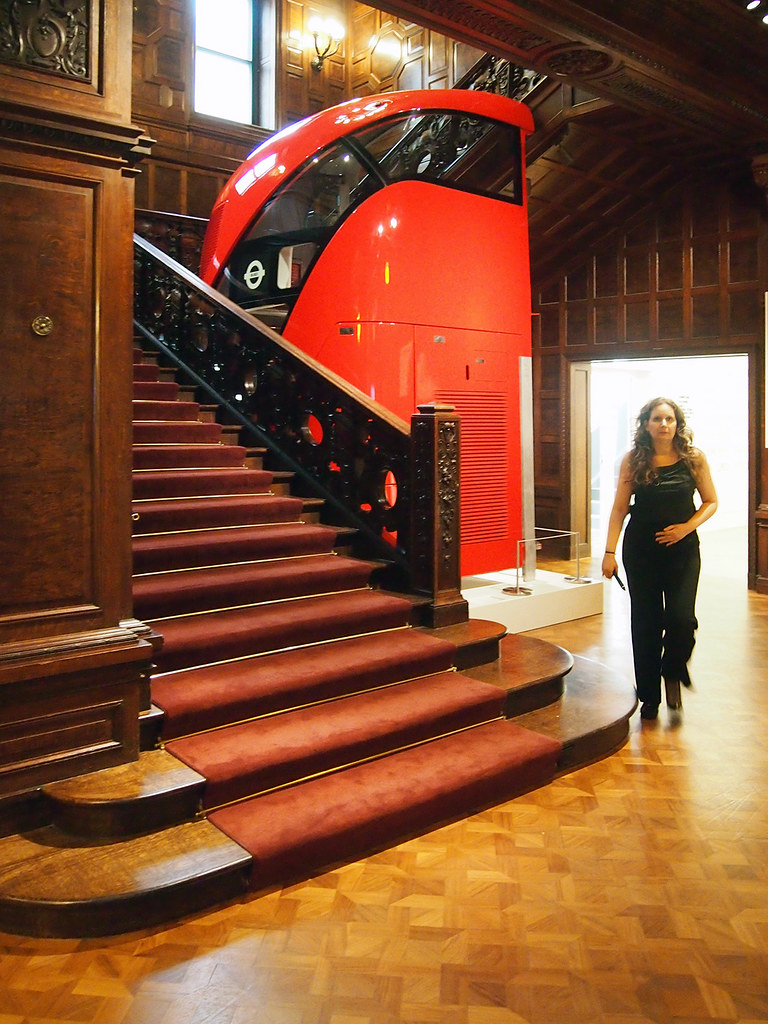
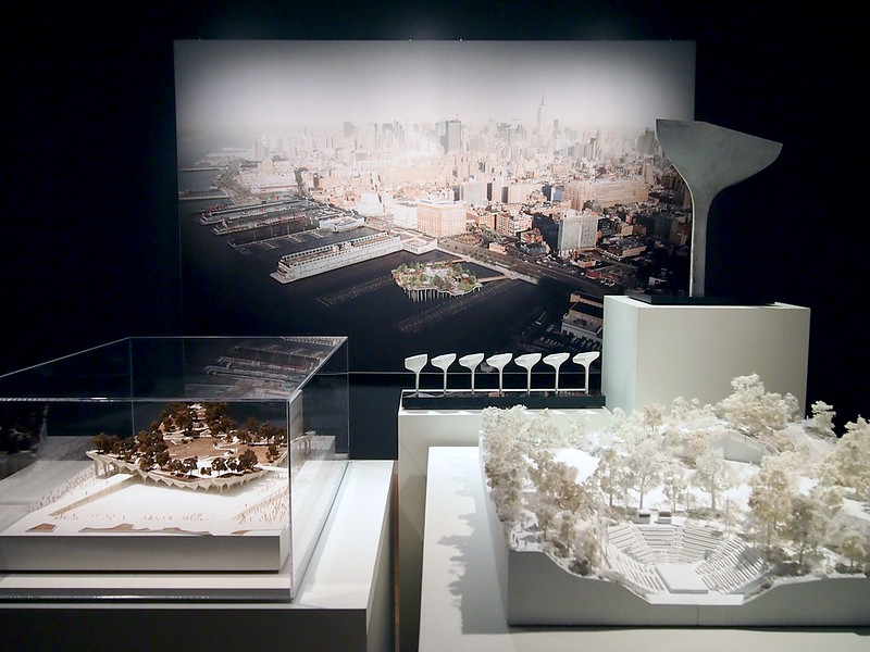
The exhibition does much of the same thing, yet with the experience of models and other three-dimensional artifacts – it's no wonder the exhibition started at the Nasher Sculpture Center, given the role of models in all aspects of Heatherwick Studio's creations, from Christmas cards to large pieces of infrastructure. Provocations is in the Cooper Hewitt's third-floor gallery, but the exhibition's presence is signaled much sooner: a full-scale section of the double-decker bus Heatherwick designed for London (800 are set to be rolled out by 2016) sits by the open stair adjacent to the ticket counter. Even though the interior of the bus is roped off, it's great to see the sliced-open bus and its Art Nouveau-esque stair, particularly in juxtaposition with the museum's grand old stair. The bus is a sure-fire way to get visitors excited for the exhibition.

Provocations

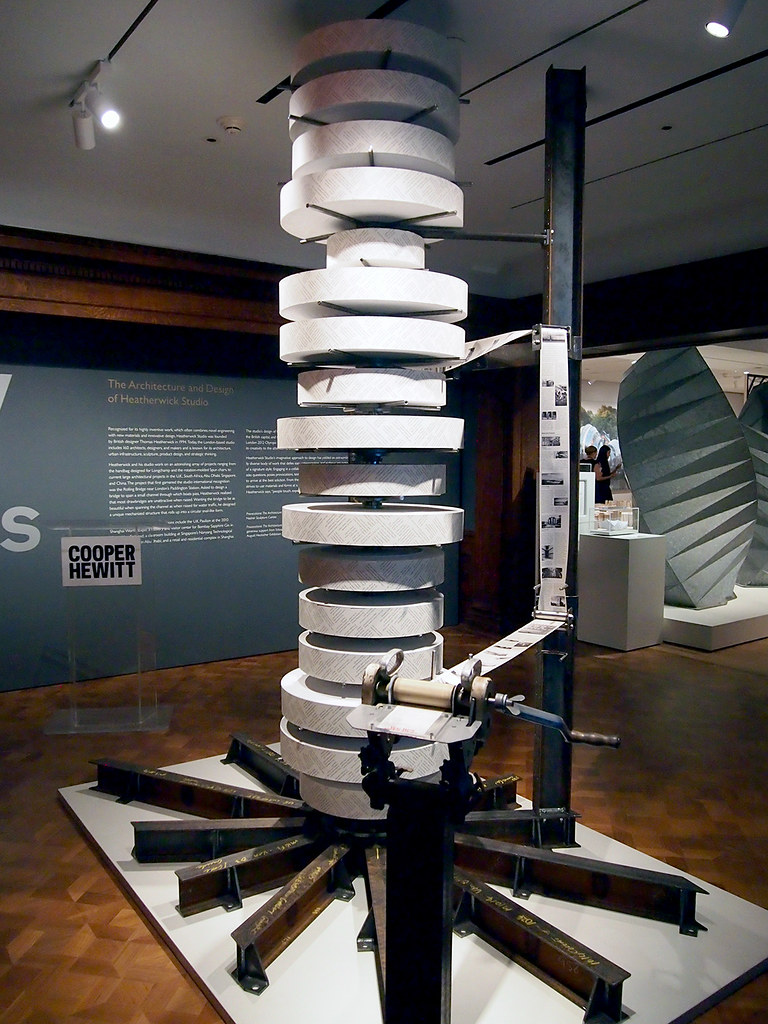
Once upstairs, visitors are confronted with an odd contraption made of steel and rolls of paper. A handle and a piece of plexiglass with the words "tear here" on it make it pretty clear what to do: turn the crank until the "tear here" on the paper lines up with the plexi: instant memento! The roughly one-meter length of paper gives a brief description of the exhibition followed by some selected projects, such as the Distillery and Garden Bridge. On the back of the paper are questions, the same ones that preface each project in the monograph: "Can a bridge be a place?" for the Garden Bridge, for example. It's common for museums and galleries to have a pamphlet or tear sheet for an exhibition, but Heatherwick provides a literal tear sheet that gets the visitor into the action. This somewhat overblown expression is aligned with the way Heatherwick reconsiders just about everything – but does he reconsider how to exhibit architecture and design?

Provocations

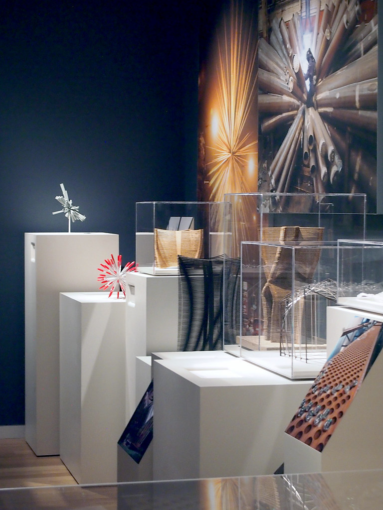
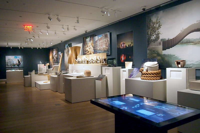
While I appreciate the layout in the museum's third floor galleries, I'd argue that the exhibition does not break any ground with displaying architecture and design. As the photo above indicates, the exhibition is made up of stands of varying heights for models, some of them in plexi cases. The walls are used almost exclusively for large-scale renderings and photographs. In essence the layout is limited to three-dimensional process atop the terrain of boxy stands and completed (or idealized, in the case of renderings) impressions on the walls. While not groundbreaking, it works fairly well – minus one thing: the Cooper Hewitt pen.

Provocations

In the foreground of the photo above is one of the interactive tables sprinkled about the museum. Here visitors can use the pens they picked up at the entrance to "interact" with the exhibition and the museum's collection. Visitors take the pen and click the "+" on the back of it with a matching "+" by the piece they want the pen to remember for later. The problem at Provocations is that the interactive "+"s are limited to signs, like the one below, that lay out the plan of the exhibition but are found in only a few places around the exhibition. Therefore, one cannot click the pen when looking at a model or a photograph; it can only be done after finding the layout sign and then orienting oneself to the appropriate number.


The pen problem aside, Provocations is a not-to-miss exhibition, especially for the models and the new projects; Pier 55, the last project in the counterclockwise layout is great to see. The book, on the other hand, is highly recommended for the words that Heatherwick and Rowe use to explain and persuade.

Provocations

Friday, 26 June 2015

Book Review: 30 Years of Emerging Voices

30 Years of Emerging Voices: Idea, Form, Resonance by Architectural League of New York
Princeton Architectural Press, 2015
Hardcover, 304 pages


There is a certain ebb and flow to architecture, by which I mean the culture at large – practice, publishing, awards, exhibitions, conferences, etc. In one of these areas – awards – each year sees, to name a few, the naming of a Pritzker Prize laureate in early spring, a bevy of AIA awards leading up the annual convention in late spring/early summer, the WAF awards in October, and a cluster of "best-ofs" near the end of the year. About a month before the world is inundated with Pritzker hype the Architectural League of New York announces the winners of its annual Emerging Voices awards, which are given to typically eight architects/firms from Canada, Mexico and the United States. Although Thom Mayne is, I think, the only winner who has gone on to win the Pritzker, the League's award could be considered one place to look for future laureates.

This book collects thirty years of winners, giving each of them one page packed with a handful of photos/projects and a narrow column with their education, teaching positions (when applicable), notable honors, website, and an update on their practice. The last is particularly valuable for the earlier winners, who have in most cases executed a number of buildings since winning, evidenced by the photos. The one-page format is straightforward and egalitarian, giving each architect the same exposure within the chronological timeline from 1982 to 2014. (Flipping through the book reminds me of PSA Publishers' newyork-architects book from 2002 that, although marketing rather than awards, has a similar one-page format and focus on quality architecture.)

Breaking up the over 200 pages of winners are six commentaries, which address five-year chunks of the awards: Suzanne Stephens takes the first five years, followed by Henry N. Cobb, Thomas de Monchaux, Paul Makovsky, Alexandra Lange and Alan G. Brake. Although the five-year periods are basically arbitrary (five six-year chunks would work just as well, really), they allow these critics and architect to make some sense of their half-decade and together they express the changes happening within the profession and the culture of architecture over the last thirty years. Lange's piece, for example, looks to a more recent event (Denise Scott Brown's call for a retroactive Pritzker) as a means of analyzing how winners in 2004-2008 were primarily collaborative rather than single-architect (in name) firms.

In addition to the six commentaries, the book has essays by Ashley Schafer, Reed Kroloff and Karen Stein, and an introduction and afterword by Rosalie Genevro, who has served as the League's executive director for over twenty years. But it's the one-page profiles of the winners that people will gravitate to. Though compact, they are a delight to look at, be it for reminiscing on certain years, for seeing what certain architects – some of them more forgotten than others – have done over the years, or just for admiring the great work produced by the winning architects and seeing how architecture has changed over the last thirty years.


Update: On Saturday, July 11, Open House New York and the Architectural League of New York are holding OpenStudios: Emerging Voices, "an unprecedented opportunity to visit the studios of more than forty of the most inventive and exciting design practices working in the city today," all of them previous Emerging Voices winners. Visit OHNY for more information and to register.

Monday, 22 June 2015

Book Review (sort of): Solid Wood

Solid Wood: Case Studies in Mass Timber Architecture, Technology and Design by Joseph Mayo
Routledge, 2015
Paperback, 346 pages


Last week I spoke with Joseph Mayo about his new book, putting together a piece over at World-Architects that highlights a few buildings featured as case studies in Mayo's book. An excerpt:
While obviously geared toward architects, given the voluminous technical advice in its pages, Solid Wood is hardly an esoteric read. Following an introductory section where Mayo gives a short history of building in wood, speaks about the carbon-sequestering benefits of mass timber construction, details various solid wood materials and concepts, and addresses concerns of building with wood (structure, fire, etc.), he then presents the case studies in eight geographical chapters: England, Norway, Sweden, Germany, Austria, Switzerland, North America, and New Zealand and Australia. For each case study he clearly describes each project's details, aided by numerous illustrations: photographs of the completed buildings, construction photographs, floor plans, detail drawings, and diagrams. Too many books limit themselves to the first (glossy photos of finished buildings), so Solid Wood is a valuable book for architects interested in designing with wood.
Head over to World-Architects to read "Designing with Solid Wood."


Wednesday, 17 June 2015

Tuesday, 16 June 2015

Book Review: Saarinen Houses

Saarinen Houses by Jari Jetsonen, Sirkkaliisa Jetsonen
Princeton Architectural Press, 2014
Hardcover, 224 pages


I have never been to Finland, so the only Eliel Saarinen house I've seen in person is his own residence on the campus of the Cranbrook Academy of Art outside Detroit. It was probably fifteen years ago that I saw it, and even though I was more excited by the prospects of the newer campus buildings by Tod Williams and Billie Tsien, Steven Holl, and Rafael Moneo, the tour of the Saarinen House was a highlight of the visit. Though pleasantly integrated into the campus landscape, and with its own garden courtyard, it was on the inside where the house shone. Each room was distinct and designed down to the fraction of an inch, from its scale and proportions, to its windows and furnishings, much of the last built-in. It was clearly a home as work of art, a phrase used by Jari Jetsonen and Sirkkaliisa Jetsonen in the introduction to their collection of houses by both Saarinens: Eliel and his son Eero.

Jari is a photographer based in Helsinki and Sirkkaliisa is an architect who teaches in Helsinki and St. Louis, so it's not surprising that most of the houses in the book – 12 of 17 – are found in Finland and designed by Eliel, either on his own or in partnership with Hermen Gesellius and Armas Lindgren. Therefore the book presents buildings little published elsewhere, much less in one place. The whole undertaking benefits from Jari's photography, which gives the book a visual consistency with, somewhat surprisingly (like my first encounter with the house at Cranbrook), rich and diverse colors, from the tile roofs and blue interior walls of Hvitträsk (1902) to the conversation pit inside Eero's Miller House (1957) in Columbus, Indiana.

The Miller House, for Cummins Engine Company head J. Irwin Miller, was designed with Saarinen's lead designer Kevin Roche and architect and textile designer Alexander Girard. The authors call the result of their collaboration "one of the finest postwar dwellings in the United States." One then has to wonder where Eero may have gone with residential architecture if he had not died four years after the completion of that house at the age of only 51. Might he have designed a dozen more houses, like his father had, instead of just a few? If so, where would he have taken the modern "home as a work of art"? We will never know, but his houses were evidently an extension of his father's attention to detail throughout the whole living environment, something that comes across by grouping their houses in one book.

Wednesday, 10 June 2015

Book Review: MONU #22

MONU #22 - Transnational Urbanism
Reviewed by Iulia Hurducaș


[All photographs are courtesy of MONU Magazine.]

Continuing the conversation on urbanism, this issue of MONU Magazine picks up on a topic opened in MONU #8 on border urbanism. Transnational Urbanism expands the topic of trans-border relations between cities close to nation state borders, to interrogate the flux of exchanges that crisscross a multiplicity of borders. As MONU has accustomed its readers, architects, urban planners and designers, policy makers, sociologists, educators, photographers and filmmakers take part in the conversation. They make up a transnational community of researchers spanning from Rotterdam, the headquarters of MONU, to the United States, and East Asia, passing through Eastern Europe, Africa, and the Middle East. As Merve Bedir stresses in her essay, they themselves live intense transnational lives.


I am a regular reader of MONU ever since my work colleagues got me a subscription for my birthday a couple of years ago. But when I got my copy of MONU #22 for reviewing, instead of zapping through it, like I normally do, I started reading it like a book and letting myself be guided by the editorial skills of Bernd Upmeyer. And what I discovered along the way was the conversation between the articles, as each of them builds on a thread launched by a previous one.

To begin with, as MONU’s trademark and opening piece, the interview in #22 is with sociologist Jean-Louis Missika, assistant mayor of Paris. He depicts an image of the global that comprises the world in itself. While Paris’s elected challenge is to provide shared infrastructure and housing for the global city’s mobile dwellers, Agatino Rizzo’s proposition for building a sustainable global city in between Malaysia and Singapore is to offer public space able to downplay social inequalities.


What we read through the pages of this issue is the incredible porosity of borders, as even the most impenetrable of them, like the one between North and South Korea are crossed by cooperation and negotiation efforts that ultimately link joint economic, touristic, and knowledge spaces. Of course, as Yehre Sul shows, such projects are always at risk of being temporarily shut down by unpredicted incidents, or "the fog of international policy." We can equally read how conflict pushes established trade routes between countries officially at war underground, and reconfigures trade landscapes, as Arab traders reorient themselves to China after 9/11 and China’s joining the WTO. Caught up in between are Syrians and other asylum seekers whose trajectories are highly controlled and regulated. In spite of this, but also because of it, transnational friendships leak out of detention regimes, as Kolar Aparna’s research illustrates.


Stories of work-migration present us the Philippine work-migration industry, and former Mozambican guest workers in the former German Democratic Republic caught in limbo as the fall of socialist regimes in the early nineties has only revealed their work as paying for their country’s debt. Splinters of the colonial gaze and the construction of "otherness" are shown to construct also "other" spaces, like the segregated spaces of Philippine workers in the Arab Emirates. Such gazes obscure sight and push urbanism into ‘magical’ interpretations, like the one offered by half architect – half media philosopher Thomas Mical. However, it is the constant effort of translation that constitutes "the challenge of transnationalism," as Kolar Aparna writes.

Speaking from a European perspective, and the debate on closing the gates of "Fortress Europe," the articles in MONU #22 open up ways for understanding. In particular, one question is raised concerning African migration: how does it articulate with massive development projects around Africa’s mineral resources?


Architects and urban planners and designers are gaining momentum in border studies. Next to MONU #22 on Transnational Urbanism, a recent conference at the Sheffield School of Architecture on Border Topologies in October 2014 is proof of the professions' deep engagement with this topic. While MONU is definitely oriented towards the architectural profession, the current number tackles a trans-disciplinary theme, and that is what makes it such a good read, not only for architects. It represents a fresh alternative to a standard academic journal, as much of the articles are indeed by architects involved in academia. However, the freshness is in the practice, as Bernd Upmeyer’s editorial skills of construing a conversation from the different articles are definitely an architect’s trademark.


Iulia Hurducaș is an architect and urban designer. After studying architecture and urbanism in Cluj, Romania, and Hamburg, Germany, she worked for the Romanian-German architecture practice Planwerk, in Cluj. She is currently pursuing a PhD at the Sheffield School of Architecture in the UK on the topic of transnational urban transformations.

Thursday, 4 June 2015

Book Review: Portraits of the New Architecture 2

Portraits of the New Architecture 2 by Richard Schulman
Assouline, 2015
Hardcover, 170 pages


As the title to this coffee table book makes clear, it is the second Portraits book by photographer Richard Schulman; the first was released in 2004. Paul Goldberger, in his introduction, states Schulman didn't intend that book to be the first in a series, and when my sister got me the book for my birthday a decade ago, I can't say I considered it the first installment of a series either (in my review, though, I did say a future update would be good, to make up for a geographical bias). But it makes sense to do it again. The format – portraits of well known architects paired with photographs of one of their recent buildings – is a unique and compelling way of presenting contemporary architecture and the personalities creating it.


A good deal has changed in the eleven years since the first Portraits, be it in terms of architectural form making, how information about architecture is disseminated, and the architects designing the buildings that get the most media attention. In regards to the last, even though some of the architects in Portraits 2 – Tatiana Bilbao, Bjarke Ingels, nARCHITECTS, SO-IL, WORKac, etc. – are too young to have been considered for the first book, there are older generations in the same pages: David Chipperfield, Fumihiko Maki, Paulo Mendes da Rocha, Rafael Moneo, Moshe Safdie, and Alvaro Siza, to name a few. This diversity indicates that Schulman takes a broad approach to presenting architects and their buildings, and that the roughly 30-50 spots in each book is not enough to cover all of the worthy architects. Perhaps a third installment will arrive sooner than 2026.


Although much has changed in the decade since the first book, Schulman's style of photography is relatively consistent; it's not unchanged, but with the portraits in particular his distinct approach to lighting, framing, and composition is apparent. As in the first book, Schulman likes strong shadows, colored lights, and settings conducive to comfort – many of the architects are filmed in their offices, at home, or inside one of their buildings. Most of the portraits are full-body or waist-up shots, and most of the architects are found indoors, so exceptions to these tendencies stand out: a close-up of Tatiana Bilbao pressing her forehead to a window to look down and Fumihiko Maki standing on a Manhattan rooftop, as two examples.

But when so many photographers (professional and amateur alike) are washing out shadows with too much white light, I most appreciate Schulman's dark shadows, more evident in the portraits but present as well in the shots of buildings. There is something to be said for using shadows to emphasize a shape or a space, whatever the case may be, and to let the shadows describe something to the viewer in a way that doesn't reveal everything. Ultimately the book – its portraits, individual buildings, and short, two-paragraph descriptions by Schulman – does a similar thing: it gives a taste of the architects and their creations, all the while using his photographs as a link between the two.

Wednesday, 3 June 2015

Book Review: Conversations with Architects

Conversations with Architects: In the Age of Celebrity by Vladimir Belogolovsky
DOM Publishers, 2015
Paperback, 584 pages


Curator and author Vladimir Belogolovsky did not set out to make a book on the celebrity phenomenon in architecture, as the name to this collection of 30 interviews with well known architects might indicate. Rather, as part of his work as a curator and a curiosity he partly attributes to the late John Hejduk, the conversations that took place starting in December 2002 were about various aspects of architecture and its profession, only occasionally about "starchitecture." Sure, the names are big ones, as evidenced by a quick glance at the cover, but this has more to do with particular projects, exhibitions, or other circumstances that led to the conversations, rather than Belogolovsky having sought out celebrity architects just for being such.

Nevertheless, Belogolovsky does not shy away from the elephant in the room, since architects have to deal with the celebrity phenomenon just like any profession, and putting all these architects into one book would eventually lead to that theme coming to the fore. As Belogolovsky spells out in his introduction, he started interviewing architects when they gained the national and international spotlight thanks to the competition for the World Trade Center master plan in late 2002. In his mind, the publicity around the competition put architects and architecture in the public eye more than ever before. The book is then a way of exploring the theme of celebrity, at least inadvertently or from another angle, rather than head on. Whatever the case, the interviews are a delight to read, thanks to Belogolovsky's probing questions and his curiosity as to an architect's motives. The best conversations are the long ones where the architects are open and when the two are able to delve further into specific projects or ways of thinking.

In addition to the interviews with architects, the book has conversations with Charles Jencks and Kenneth Frampton, both serving to provide context, like the author's introduction. Following the 30 interviews is a section with quotes by "missing architects," those who weren't interviewed or whose interviews didn't make it into the book (since 2002, Belogolovsky has interviewed over 100 architects). This short section – followed by a color page of magazines featuring architects on their covers, most of them non-trade magazines like Fast Company, Time, and Wired – extends the reach of the celebrity theme, as does the index, which includes other big-name architects who are mentioned in the interviews. Based on number of mentions in the index, the most popular celebrity architects are, in descending order, Zaha Hadid, Rem Koolhaas, Le Corbusier, Peter Eisenman, Frank Gehry, Daniel Libeskind, Mies van Der Rohe, and Frank Lloyd Wright. These names make clear that the celebrity phenomenon is not new, even though the prevalent digital and print media make it appear to be a contemporary creation.

Tuesday, 26 May 2015

Book Review: Architectural Styles

Architectural Styles: A Visual Guide by Owen Hopkins
Laurence King, 2014
Paperback, 240 pages


In the introduction to his visual guide to architectural styles, Owen Hopkins lets the reader know that architectural "style" is a 19th century creation, something that enabled architectural historians to chart developments in the appearances of buildings over time. But 220 pages later, in the book's postscript, he asks, "In the face of ever-increasing architectural variety...what possibilities are there for 'style'?" In both instances, Hopkins appears to be arguing against the validity of architectural style and the need for a book documenting one. Yet alas, he has written a book on such a topic, and with its focus on the visual, the book is a good introduction for students of architecture and laypeople with an interest in architecture, and a handy reference for architects who have forgotten what they learned in their history classes.


In the book's chronological format, there is an obvious move from simplicity to complexity, from "one" classical style to a plethora of styles, or, more accurately, a plurality of architects creating their own styles. The book starts with a chapter on the Classical and then moves on to eight more chapters: Early Christian, Gothic and Medieval, Renaissance and Mannerism, Baroque and Rococo, Neoclassicism, Eclecticism, Modernism, and After Modernism. The name of the last chapter reiterates the idea that style is historical; it is used to talk about what happened in the past, rather than what is happening now, or at least in the recent present. Charles Jencks may argue that just about everything post-Pruitt Igoe is Postmodernism, but Hopkins breaks down the last chapter to also include Regionalism, Deconstructivism, Eco-architecture, Expressive Rationalism, and Contextualism. He does the same for each chapter, elucidating the nuances within a style that arose from geography and time.


As can be seen in the spread above, within each chapter and "sub-style" Hopkins highlights key terms that accompany a photo of a building. This is the format used throughout, which certainly emphasizes the visual, but also brevity. This is architectural history for people who scan their content, be it by scrolling through web pages, flipping through magazines, or "reading" the environment around them. There isn't anything necessarily wrong with this approach, but at times I wish Hopkins went further in his visual approach, like he did in Reading Architecture, which includes numerous drawings, many with labels, and photographs labeled as a means of visual storytelling. Perhaps the difference is due to the page size, as Styles is smaller than Reading, making it a compact guide. Whatever the case, Architectural Styles will not replace more thorough histories of architecture, but it does a good job in making architectural history more accessible and understandable to a wider audience.

Sunday, 24 May 2015

Book Review: Local Architecture

Local Architecture: Building Place, Craft, and Community by Brian-MacKay-Lyons, edited by Robert McCarter
Princeton Architectural Press, 2015
Hardcover, 224 pages


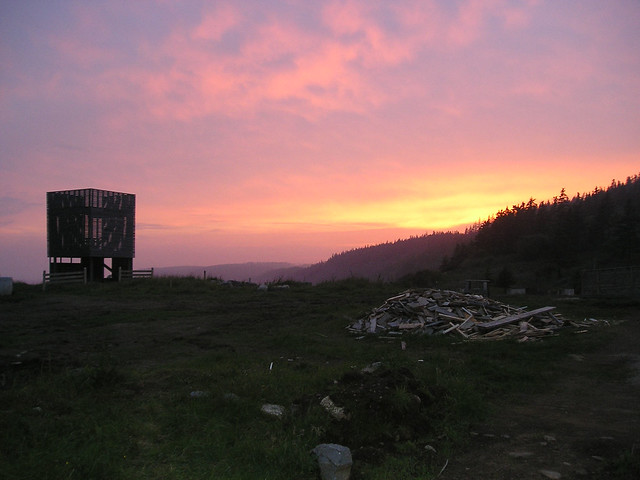
Ghost, a laboratory run by Canadian architect Brian MacKay-Lyons where architecture students would design and build small structures on land owned by the architect in Nova Scotia, started in 1994 with "a resurrection of a house silhouette in a cow field, an apparition, a ghost raised from earlier times." In 2011, twelve Ghosts later, it went on hiatus. To mark what might be seen as the completion of an experiment started by MacKay-Lyons, a principal at MacKay-Lyons Sweetapple Architects, Ghost 13 was a three-day symposium, themed "Ideas in Things," held on the same property in June 2011. This book documents the symposium and its who's-who list of architects respected for, as the title attests, creating architecture that responds to place, craft and community. Although the book does not summarize the twelve Ghost pavilions (a 2008 book documents the first nine), it does summarize the ideas behind the undertaking.

sunset
[Photo of Ghost 6 by archaalto]

The book has three parts. First are the three symposium keynotes by Kenneth Frampton, Juhani Pallasmaa, and Glenn Murcutt. Each one is valuable: Frampton for critically looking as his idea of critical regionalism; Pallasmaa for exploring a "call for a sustainable metaphor," or something that make sustainability more than just a functional notion; and Murcutt for honestly answering the questions from Pallasmaa about his background and approach to architecture (the questions were submitted by symposium participants and selected by MacKay-Lyons and Robert McCarter). Second are projects by symposium speakers: Marlon Blackwell, Wendell Burnette, Vincent James, Rick Joy, Tom Kundig, Patricia Patkau, Dan Rockhill, and Bridgitte Shim, to name just a few. This section takes up the most pages, adding plenty of eye candy to the otherwise word-heavy content. Third and last are essays by symposium critics Peter Buchanan and Robert McCarter (Tom Fisher supplies the book's introduction), as well as Ingerid Helsing Almaas, Christine Macy and Essy Baniassad.

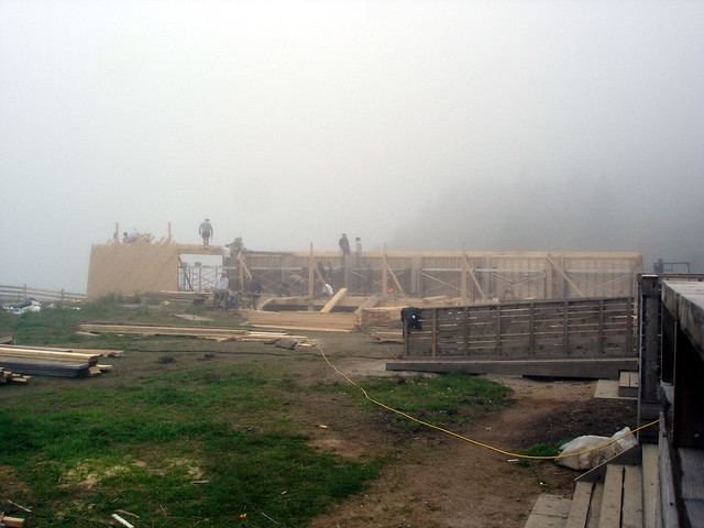
the haar
[Building Ghost 8 | Photo by archaalto]

The ideas prevalent in Ghost 13 are not just the givens of place, craft and community; they are education (what MacKay-Lyons calls "the elephant in the room" during the symposium) and making. The "Ideas in Things" theme implies that a thing must be made for the idea to be expressed, experienced, tested, learned from, etc. It's no wonder then that the projects that make up the middle portion of the book are all built – no speculative renderings, just photographs and architectural drawings. None of this is too shocking or groundbreaking; MacKay-Lyons even says in his afterword that the symposium might be seen as "preaching to the choir." But what I wish came across more in the book was the experience of the symposium, which sounds like an amazing time for those presenting as well as those attending. Much of that must have come from the place itself, the property of the Ghosts that so eloquently expresses in built form what the symposium, and this book, was trying to say in words and images.

Wednesday, 20 May 2015

Book Review: Fuksas Building Update

Fuksas Building Update by Massimiliano & Doriana Fuksas
Actar, 2015
Hardcover, 250 pages


First off, I should admit that I don't have nor haven't seen the first Fuksas Building, published by Actar in 2011, which this book updates. So I can't really comment on how well this book extends the content of that monograph, nor if it is worth having in addition to that book. Second, I should admit that I have a love-hate relationship with Fuksas's work, which I have seen little of in person (the Armani Fifth Avenue springs to mind), but which, like other architects these days, has some interesting qualities at a small scale that don't necessarily work when blown up larger. The glass roof funnels of the New Milan Trade Fair, for example, are appealing (if a repeated element for Fuksas), but not at what looks to be a half-mile length of the concourse. The buildings of Massimiliano and Doriana Fuksas are increasingly larger (heck, they just finished an airport in China), but I'm not sure their architecture responds accordingly. Nevertheless, I like the brevity of the spread before the first chapter, Buildings, which is found in lieu of a traditional, multi-page introduction:


This statement made me wonder if in fact they don't have a style. At first I agreed, since the three projects mentioned and linked above are a pretty diverse bunch. Regardless, they are recognizable as Fuksas projects, along the lines of Renzo Piano's buildings being recognizable as his own even though he doesn't have a signature style in the vein of, say, Richard Meier, to cite the most obvious example. Like Piano, Fuksas's buildings have a "style" at the level of detail, element and surface: undulating glass roofs, blobs with perforated surfaces, and cantilevered glass boxes, to name a few. Also, the husband-wife duo really like to juxtapose hard-edge boxes with soft forms and surfaces, such as inside the Armani Fifth Avenue and in the  New Rome-Eur Convention Centre and Hotel, which is highlighted in the Construction chapter:


The other chapters in the book, in addition to Construction, which only has the one project, are: Building, with eight buildings, most of them completed in 2012 and 2013, and documented through photographs and brief text; Project, which has five projects briefly explained through renderings; and Drawing and Detail, which has construction documents (plans, sections, details, etc.) for nine projects, seven of them from the Building chapter. Drawing and Detail is easily the most valuable part of the book for architects, since it includes the types of drawings and information that are otherwise overlooked in monographs. It's great to see, for example, sections through the "blob" inside the boxy EUR project, even if the individual sections are at a small scale (below). Since the drawings reference the built work at the front of the book, other architects can grasp how the projects moved from drawing to building, one thing that makes this book an appealing one, especially for fans of Fuksas's style-free architecture.


Sunday, 17 May 2015

Book Review: The Japanese House Reinvented

The Japanese House Reinvented by Philip Jodidio
Monacelli Press, 2015
Hardcover, 288 pages


In the introduction to Philip Jodidio's new book highlighting fifty recent Japanese houses, the author mentions that Japan and the United States share a preference for single-family houses over apartments. While not a surprising statement, the similarities end there, since each country's geography, culture, economics and other factors have created widely divergent contemporary designs. Japan, in particular, is full of houses that scream "Japan," most of them found in the tight confines of Tokyo, like the project gracing the cover (Atelier Tekuoto's "Monoclinic"). But, as Jodidio's selection of houses shows, there is more to single-family residential architecture in Japan that idiosyncratic vertical houses in tight confines, even as some of those are found in these pages.

One of the numerous US-Japan differences in single-family houses is size, with those in the United States averaging around 2,600 square feet, exactly double Japan's average of 1,300 square feet. It's not surprising to find numerous houses in this book that are under that average, many with three digits rather than four. But there are a surprising number of large houses, from a 2,000-square-foot house in Osaka designed by Tadao Ando to a 13,475-square-foot (nope, that's not a typo) house in Tokyo designed by ARTechnic Architecture. Before you start thinking that I'm gung-ho for Japanese houses being as big as American ones (I'm not), it is interesting to see how large houses in Japans are designed.


[Shigeru Ban: Villa in Sengokuhara]

One house that can serve as an example is Shigeru Ban's 4,875-square-foot Villa in Sengokuhara, which is like a letter P in plan with squared-off, metal-clad walls on the exterior and rounded glass walls facing the interior courtyard. It's definitely not a house that could be pulled off in expensive Tokyo, much less Kyoto or Osaka; the rural setting in Hakone, Kanagawa Prefecture, is ideal for the extra-large house. Even though the house is large on square footage (the site area is nearly 20,000 square feet, or almost half an acre), the "rooms" that ring the courtyard are well-scaled, thanks to the narrow width of the plan. Instead of Great Rooms, as many bloated US houses like to incorporate, the grandness of the design comes from the openness of the rooms through sliding glass walls to the courtyard at its center. (As a point of contrast, Jodidio includes Ban's Yakushima Takatsuka Lodge, a small lodge of only 355 square feet.)


Two other large houses in the book suit my fancy, but for what they do with their size, not simply for being large. TNA Architects' Gate Villa, like Ban's Villa in Sengokuhara, is large (4,080 square feet), but its outdoor space is about three times as large. The house is based on a 23-foot-square grid – 4 modules by 5 modules – but only 7 of the 20 modules in the grid are used for enclosed space; the other 13 are open spaces that range from one module to six contiguous modules. The other house is Mount Fuji Architects Studio's Shore House, smaller at 3,210 square feet, which has a roof terrace for outdoor space but makes a double-height space lined with open shelves the main feature. Perhaps it's just the bookworm in me salivating, but that house is just one of the many marvelous designs found in this book, all thoroughly Japanese but more varied that what we've come to expect from the plethora of books on the island's contemporary houses.

Wednesday, 13 May 2015

Book Review: Extrastatecraft

Extrastatecraft: The Power of Infrastructure Space by Keller Easterling
Verso Books, 2014
Hardcover, 252 pages


Recently, the Center for Architecture hosted two book talks organized by the AIANY Oculus Committee that I attended: one on Keller Easterling's Extrastatecraft, and on on Justin McGuirk's Radical Cities. Though both have subjects quite separate from each other, they share some traits, including their publisher, Verso, known for intellectual, left-wing titles. And while Easterling's and McGuirk's book have these qualities in common, they are both surprisingly readable, regardless of their complex and ambitious topics. Here I discuss Easterling's book, and in a future post I'll discuss McGuirk's book.


On March 16, Easterling spoke at the Center about her book, which follows Enduring Innocence (MIT Press, 2005) and Organization Space (MIT Press, 2001). Generally, all three books explore how physical (buildings, landscapes) and abstract (companies, governments) entities are structured and how they work. The emphasis is on the infrastructure that underlays anything modern: buildings, industries, corporations, public spaces, anything that structures our daily lives. Extrastatecraft can be seen as the culmination of these explorations, focusing on free trade zones, broadband communications, and quality management standards.

Easterling spoke about each area in her talk, but "the zone" prevailed over the others, partly because she devoted more time to it, but mainly because free trade zones are absurd creations that have flourished despite their inability to deliver what they promise; regardless, they have become default conditions of economic development. Her book dissects the workings of zones and the other components of extrastatecraft, what she defines as "a portmanteau meaning both outside of and in addition to statecraft" in which state, non-state, military, market, non-market organizations "have now attained the considerable power and administrative authority necessary to undertake the building of infrastructure."

Her goal is to provide a "manual" for "hacking" the infrastructure toward more equitable ends, such as social justice and labor rights. But who is to say that hackers following her impetus would be so just? The thrift of examples embodying her principles (apparent in both the book and in the Q&A section of the book talk) is just one indication that the application of her research and writing is still to come. What she has done in her work (much of it firsthand) is illuminating, to say the least, and certainly a call to question the developments (some of them shown below in a slideshow that ended her talk) that proliferate and turn parts of our world into ccokie-cutter enclaves geared to profit and very little else.


Tuesday, 21 April 2015

Book Review: Lighting Design & Process

Lighting Design & Process by Office for Visual Interaction
Jovis, 2014
Hardcover, 216 pages


I'll admit that when it comes to light, I veer toward books that focus on natural light, such as titles like Henry Plummer's Nordic Light and Mary Ann Steane's The Architecture of Light. As an architect I understand the important of artificial lighting for interiors and exteriors, even though I believe the best buildings exploit natural light's qualities to their fullest. People cannot exist today without artificial lighting, and therefore it should be an integral part of the design process. One problem for me is that books on lighting design, rather than those on natural light, tend to be overly technical, with an emphasis on general conditions rather that specific applications. This is the case with a book by ERCO I featured five years ago, but a book by Herve Descottes of L'Observatoire International, which I briefly reviewed three years ago, points in the other direction, toward accessible case studies that explain how general principles of light are applied to specific projects. Light Design & Process by Jean M. Sundin and Enrique Peiniger's Office for Visual Interaction (OVI) falls into the latter camp, and they do an excellent job of showing how lighting designers work to create solutions that can be dramatic, subtle or even invisible.


[Scottish Parliament - Cafeteria ceiling]

The book starts with an introduction by Dietrich Neumann, editor of the book The Structure of Light: Richard Kelly and the Illumination of Modern Architecture. It then launches into the most in-depth project, the Scottish Parliament designed by Enric Miralles Benedetta Tagliabue with RMJM. Nearly 50 pages are devoted to the project's many spaces and lighting applications – exterior walls and walkways, public areas, lighting cast into concrete, the debating chamber and lighting for television broadcasts, to name a few, though my favorite is the exposed conduit lighting in the cafeteria. Just as the building is composed of numerous buildings, each unique yet exhibiting the hand of its designer, the lighting is diverse, working with the architecture to elevate it accordingly.


[Book spread on New York Times Building]

Most of the projects – many of them are notable buildings with notable architects – are given anywhere from 2 to 12 pages, but another project given a good amount of real estate (nearly 30 pages) is the New York Times Building designed by Renzo Piano. Like the Scottish Parliament, the Times Square high rise has many different applications of lighting, from illuminating the building's exterior, its public spaces and offices, to the theatrical lighting of the TimesCenter auditorium. In this project as in others, the reader is treated to numerous photos of the finished building, but also photos that document the process, and many sketches and other drawings that do the same. It's one thing to write that the uplights are yellow as a reference to the city's ubiquitous taxicabs; it's another to tell that story visually through photos of cabs and a local taxi shop painting a sample luminaire, plans, elevations and detail drawings, and photos revealing how the lamps were aimed so as to not throw light past the building's top; the last is important given that uplighting is an obvious source of light pollution in cities. Therefore the book tells the stories of the projects as much, if not more, through images as through text.


[Book spread with OVI's sketch for Zaha Hadid's Rosenthal Center for Contemporary Art]

Other projects in OVI's monograph consist of completed buildings but also historic preservation and a number of in-progress projects. All together, they act as an argument for integrating the lighting designer into the process at an early stage, so the lighting strategy plays as much a role as form-making, and in some instances influences the form of the building. In all my years of experience in practice, I can think of only one or two projects where this happened, one in which lighting was an integral part of the building's nighttime identity and one with a building type that required a lot of specialized lighting. But all too often the lighting designer is brought in well after most of the decisions are done, then just asked to figure out the spacing of lights and provide a spec list. Sure, not all buildings are the Times Building or the Scottish Parliament, but architects should certainly strive for results as extraordinary – and illuminating.

Sunday, 19 April 2015

Book Review: Three Mies Books

Last Is More: Mies, IBM, and the Transformation of Chicago by Robert Sharoff, photographs by William Zbaren
Images Publishing, 2014
Hardcover, 160 pages

Mies by Detlef Mertins
Phaidon, 2014
Hardcover, 560 pages

Mies van der Rohe: A Critical Biography, New and Revised Edition by Franz Schulze and Edward Windhorst
University of Chicago Press, 2013
Hardcover, 512 pages


Ludwig Mies van der Rohe (1886-1969) is one of the triumvirate of 20th century architects (the other being Le Corbusier and Frank Lloyd Wright) who continue to be the subject of books long after their passing. They are the most influential architects of the modern age, with each afforded the occasional reassessment due to exhibitions, preservation battles and other contemporary happenings (Le Corbusier's recent labeling as a "militant fascist" is an example on the negative spectrum of this). Even with so many books devoted to them, each architect has been misunderstood over time, but none more than Mies, who is often blamed for every mediocre glass box that litters cities in the United States and beyond. Such blame is unfair, so it's good to have books, like these three, that effectively argue for the lasting qualities of his (then) unique approach to architecture.

Unique approaches can be found in these books: Sharoff and Zbaren (authors of the "American City" series that includes St. Louis Architecture) have created a case-study of the IBM Building, considered Mies's last commission, and his work in Chicago, while doubling as a coffee table book with its large format and generously sized photographs; Detlef Mertins, whose book was published three years after his 2011 death, has crafted a thorough historical monograph that is given the Phaidon touch, meaning it was made big and illustrated profusely; Franz Schulze has updated his equally thorough biography with Chicago architect Edward Windhorst to address new information and positions on the architect since its initial 1985 publication (the two MoMA/Whitney shows, Mies in Berlin/Mies in America, in particular), and to incorporate newly released information, such as transcripts from the trial with Edith Farnsworth.

That Mies is a continuously appealing subject for writers and architects is due not just to the buildings he created. It also arises from his personal life, a two-act, made-for-TV story (not as dramatic as Wright, but close) that started in Germany and saw him leave his family and war-torn Europe for the United States, where he changed the course of modern architecture. This appeal arises from the influence he had and continues to have on architecture, not just in terms of mundane glass boxes, but through the school he set up (Armour Institute of Technology, now Illinois Institute of Technology or IIT) and in the beautiful modern buildings created by architects who embraced his artistic approach to architecture and attention to details. The three books – Mies van der Rohe, Mies, Last Is More – break down respectively along these three subject lines: Mies's life, his buildings, and his influence.

Of the three books, I'd recommend Schulze and Windhorst's Mies van der Rohe to those with little familiarity of Mies and those who know his buildings but not his story. It has the greatest proportion of depth to readability. It is a smooth narrative that occasionally veers off course when discussing Mies's buildings – the "critical" approach is laudable, but many of the buildings get bogged down in dry descriptions that could be aided by more illustrations on more than one occasion. But when the authors tell the story of Mies's life, which of course encompasses his architecture, not just the personal parts outside of it (the relationships, the health problems, and so forth), and discuss the details of Mies's buildings (many carefully illustrated) the book is excellent, explaining not only the what but also the how and why of his buildings.

Schulze and Windhorst delve into detail on the most important Mies buildings (ignoring or just briefly mentioning ones carried out primarily by his associates, such as 2400 Lakeview), which is a trait that is shared by Detlef Mertins in his historical monograph. He also tells the story of Mies's buildings chronologically, going into depth on nearly 20 projects, both built and unbuilt, but when he discusses them his historical skills shine, aided by numerous photographs and drawings. Given the length and size of the book, it's not one to be read from front to back like Mies van der Rohe (it can be, but it's not for the faint of heart); instead one can delve into any of the five sections or the chapter project histories as desired. With Mertins' depth of scholarship and dense but readable style of writing, each chapter functions like a case study in its own right. Beyond the particulars of the significant projects, though, Mertins does an excellent job of elucidating the ideas behind Mies's buildings, the philosophical positions that led to his architecture of order and clarity.

Just as Mertins' book is separated into five sections, so is Last Is More by journalist Robert Sharoff and photographer William Zbaren. But the similarities end pretty much there, as the duo presents Mies in a much easier to digest manner, starting with a quick history of the architect in twenty pages. The IBM Building – now home partly to the Langham Hotel, which prompted the creation of this book – is the subject of the second chapter. The first chapter and the subsequent ones – on buildings in Chicago inspired by Mies, on early Chicago landmarks, and on the Langham itself – serve to situate the IBM Building in a larger, albeit still local, context. It's a unique approach that benefits greatly from Zbaren's great photos, which give the book a visual consistency, even when it is presenting Wright or Sullivan, rather than Mies. While the quick history and compact chapters might leave some wanting more information on the larger-than-life Mies, they need look no further than the other two books reviewed here.