Monday, 17 November 2014

Today's archidose #797

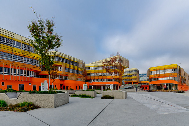
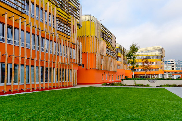
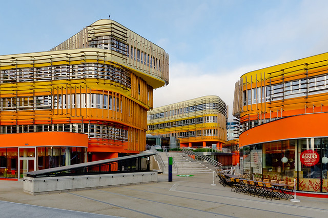
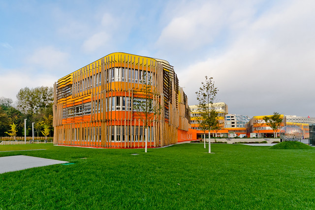
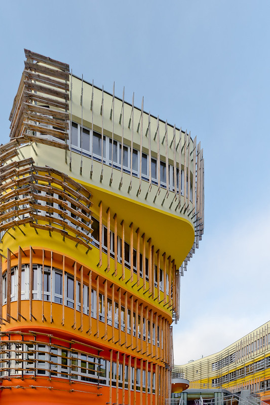
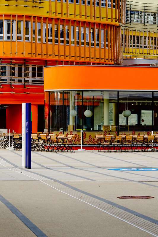
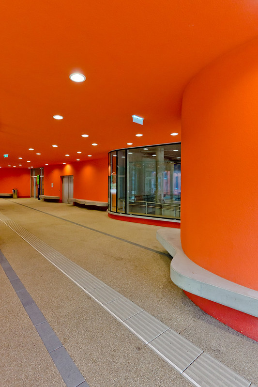
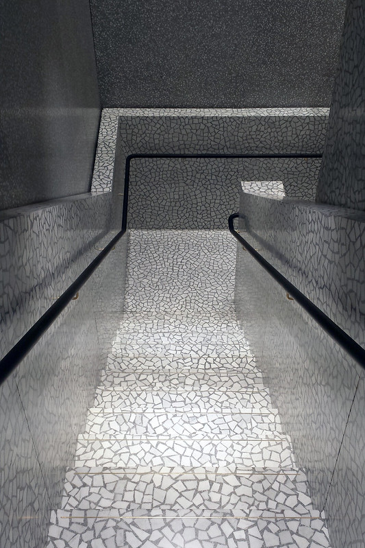
Here are some photos of the Departments Of Law And Central Administration, Vienna University of Economics and Business (2014) in Vienna, Austria, by Crab Studio (Cook Robotham Architectural Bureau), photographed by Sebastian Deptula.

D3 AD

D3 AD

D3 AD

D3 AD

D3 AD

D3 AD

D3 AD

D3 AD

To contribute your Flickr images for consideration, just:
:: Join and add photos to the archidose pool
To contribute your Instagram images for consideration, just:
:: Tag your photos #archidose

Friday, 14 November 2014

Book Review: Nordic Light

Nordic Light: Modern Scandinavian Architecture by Henry Plummer
Thames & Hudson, 2014
Paperback, 256 pages


Last year I included Henry Plummer's Cosmos of Light, a record of three religious buildings designed by Le Corbusier, in my list of notable books of 2013 at Designers & Books. I must admit that even though Plummer contributes both the words and the photographs, be it Cosmos of Light or Nordic Light, the subject of this review, it's the photographs that sway me toward a deep liking of his books. While Plummer's love of what he is documenting in words and images is clear, I find his text flowery, full of adjectives that are trying really hard to convey the qualities of light that come across in particular buildings or places. But I'd argue that his photographs convey those qualities so much better; such is the skill of his shooting, particularly his framing and his patience in waiting for the right light. The cover of Nordic Light – Kaija and Heikki Sirén's Student Chapel in Otaniemi, Finland (1957) – makes this much clear.


[Juha Leiviskä's Myyrmäki Church in Vantaa, Finland, 1984]

In this coffee table book, available both in hardcover and paperback, Plummer documents 45 buildings in Scandinavia, with 14 in Denmark, 22 in Finland, 5 in Norway, and 4 in Sweden. The buildings are split into nine thematic chapters that describe how the architecture in these northern countries responds to the conditions of sunlight: whiteness, rhythm, journey, carving, forest, transparency, tranquility, diffusion, and darkness. While these chapters are listed in the table of contents, the buildings are not, meaning the book is a voyage of discovery more than a reference for highlighting particular buildings. This goes hand in hand with Plummer's patient and almost meditative way of photographing and discussing the projects. Not surprisingly, as is hinted in the cover photo and two other photos included here, Plummer has something for churches, which populate the book in large numbers. This makes sense, given that churches are an architectural typology ripe for exploring the literal and metaphorical role of light, and therefore they are perfect for Plummer's studied lens.


[Matti Sanaksenaho's St. Henry's Chapel in Turku, Finland, 2005]

Wednesday, 12 November 2014

Today's archidose #796

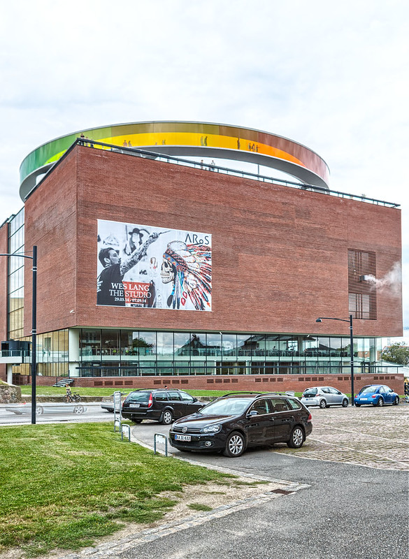
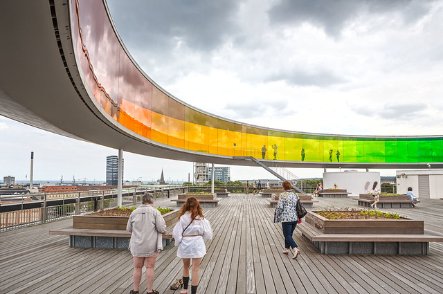
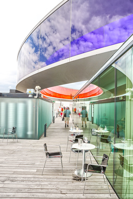
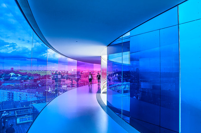
Here are some photos of the ARoS Art Museum (2004) in Aarhus, Denmark, by Schmidt Hammer Lassen Architects, capped by Olafur Eliasson's Your rainbow panorama (2011), and photographed by Sindre Ellingsen.

Aros art museum

Aros art museum

Aros art museum

Aros art museum

To contribute your Flickr images for consideration, just:
:: Join and add photos to the archidose pool
To contribute your Instagram images for consideration, just:
:: Tag your photos #archidose

Monday, 10 November 2014

The Next Glass Walkway?

First in the recent trend of glass walkways came the Grand Canyon Skywalk (2007):

[Photo from Grand Canyon National Park]

Then The Ledge at Willis Tower's Skydeck (2009):

[Photo from Skydeck website]

And this year came the Eiffel Tower:

[Photo from Tour Eiffel]

And the Tower Bridge:

[Photo from Tower Bridge Exhibition]

So what will be the next trendy, vertigo-inducing glass walkway attraction?

A logical site would be the Gateway Arch in St. Louis:

[Background image from Together We Roam]

But why not an Amazon warehouse?

[Background photo from Newsweek]

Or even the Oval Office?

[Background photo from White House Museum]

What would you want to see from above through a glass walkway?

Today's archidose #795

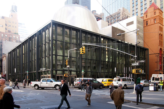
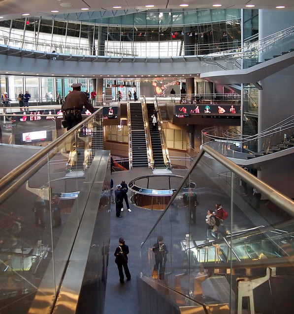
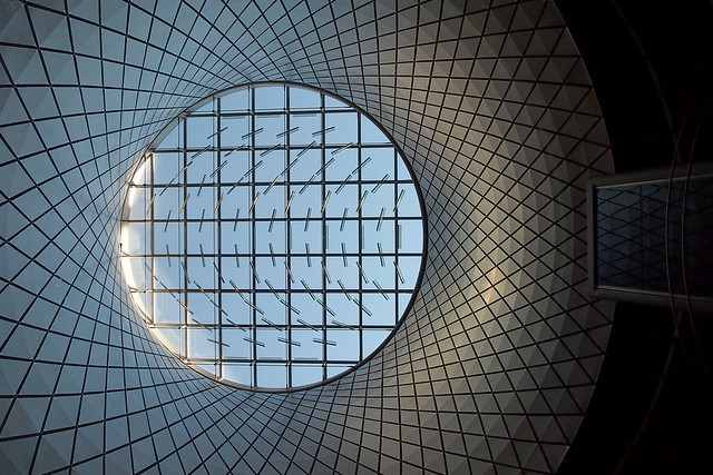
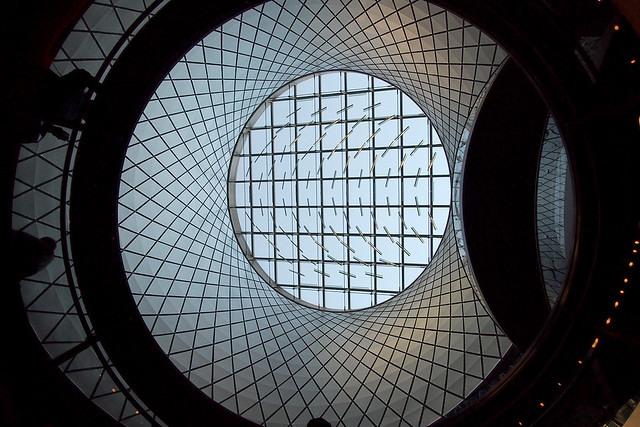
Here are some of my photos of Fulton Center (opened November 10, 2014) in New York City by Arup and Grimshaw Architects with the "Sky Reflector-Net" by James Carpenter Design Associates.

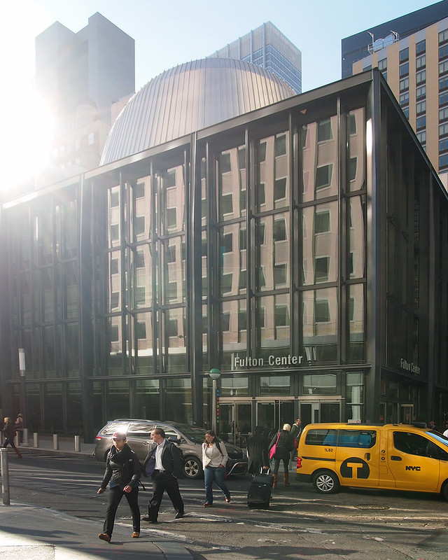
Corner of Fulton and Broadway with Corbin Building (corner of John and Broadway) on the right:
Fulton Center

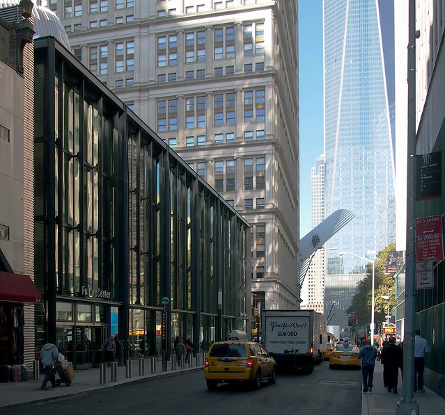
Looking west down Fulton toward the World Trade Center site:
Fulton Center

Entrance at Fulton and Broadway with atrium drum popping above the glass-box parapet:
Fulton Center

The gap between the glass box and the atrium:
Fulton Center

Looking toward the atrium from near the entrance along Broadway:
Fulton Center

Getting closer to the atrium:
Fulton Center

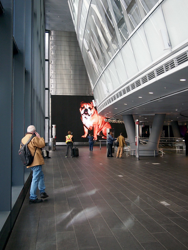
A view across the atrium to the Broadway/Fulton entrance with the lower edge of the Sky Reflector-Net visible:
Fulton Center

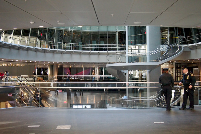
Looking up at the atrium oculus from one level below the street (bottom of escalators in above photo):
Fulton Center

The same view from two levels below the street, looking through a circular opening in the floor above:
Fulton Center

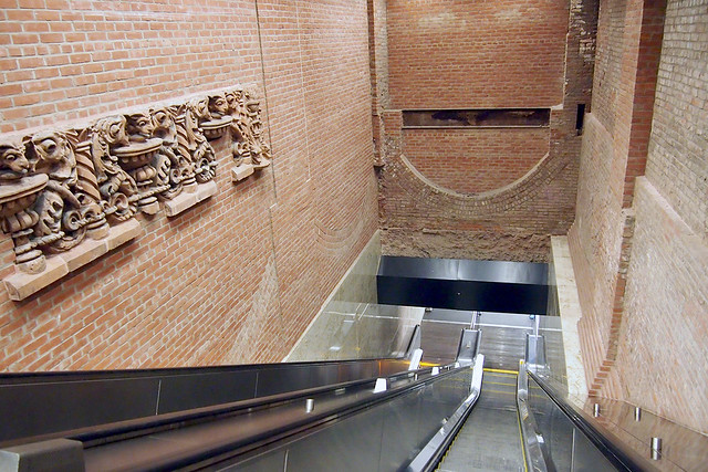
An escalator cuts through part of the old Corbin Building to give access to...
Fulton Center

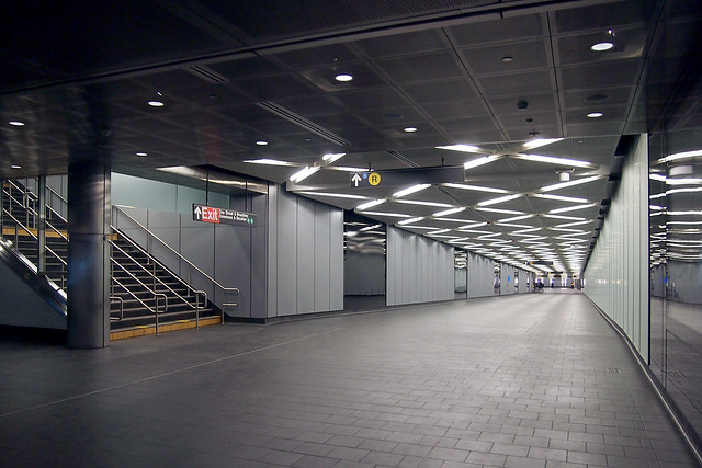
...the Dey Street Concourse that connects Fulton Center to the R Train:
Fulton Center

To contribute your Flickr images for consideration, just:
:: Join and add photos to the archidose pool
To contribute your Instagram images for consideration, just:
:: Tag your photos #archidose

Saturday, 8 November 2014

Today's archidose #794

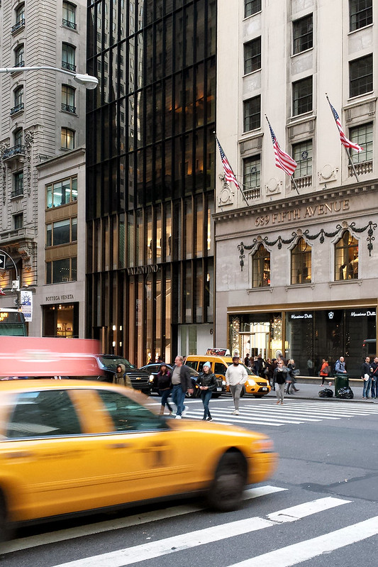
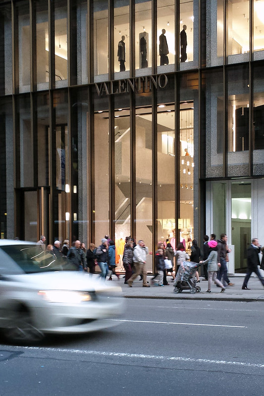
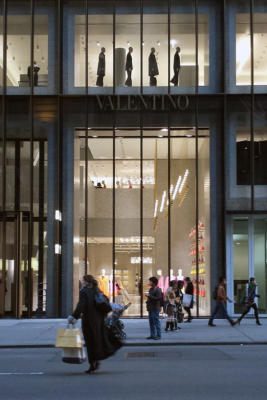
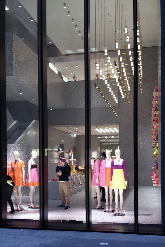
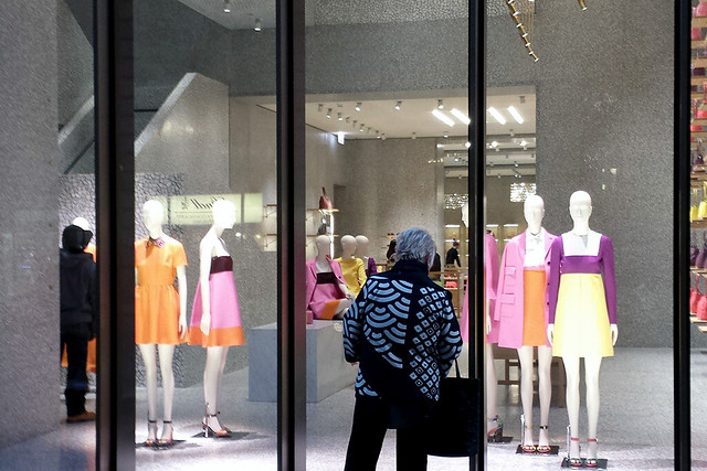
Here are some of my photos of Valentino New York Flagship (2014) by David Chipperfield Architects: "The Valentino New York Flagship Store is situated on Fifth Avenue in the former Takashimaya Department Store, designed by John Burgee and Philip Johnson, which opened in 1993."

Valentino

Valentino

Valentino

Valentino

Valentino

Valentino

Valentino

To contribute your Flickr images for consideration, just:
:: Join and add photos to the archidose pool
To contribute your Instagram images for consideration, just:
:: Tag your photos #archidose

Friday, 7 November 2014

Move the Lucas Museum?

As most people probably know by now, on Monday MAD Architects released its design of the Lucas Museum of Narrative Art, planned for a site on Chicago's lakefront between Soldier Field and McCormick Place.

Here is one of the three renderings released:


The proposed site plan, with Lucas Museum as #5:


Not surprisingly, critics have had a fun time tearing apart the design of MAD's Ma Yansong, saying:
  • "the museum proposal is needlessly massive...a fumbled essay in 'blog architecture,' leaden and lumpy" (Blair Kamin)
  •  "a gooey, mountainous slug of a building with two squinty windows and a silvery halo, making it look like a sainted Jabba the Hut" (Justin Davidson)
  • "much needs to be worked out to keep this challenging work from being just weird" (Edward Keegan)
  • "an alien land mass, ringed with a rather tacky Space Mountain-inspired top"(Martin Pedersen)
  • "a pile of Chicago snow with a hubcap on top...Hollywood kitsch pretending to sophistication" (Chicago Sun-Times editors, apparently since they don't have an architectural critic)

But buried beneath these and other fairly shallow critiques are concerns about the proposed building's location. The given site is currently a parking lot, but more importantly it falls within the parkland east of Lake Shore Drive that many Chicagoans define as sacred. To the Friends of the Park, Blair Kamin, and other staunch defenders of the lakefront, there shouldn't be any new buildings east of LSD (heck, there shouldn't be Soldier Field, Field Museum, McCormick Place East, etc.), so the problems with MAD's design are exacerbated by this location – no design would be good enough for the site in their eyes.

So if the issue is, as they say, location, location, location, should the museum be moved? And if so, where? Kamin seems to be the only one making a suggestion, arguing for the old Michael Reese Hospital campus about 1.5 miles south, but I'd argue for simply throwing the building to the west side of Lake Shore Drive, per my quick and dirty Photoshop site plan below:


As illustrated above, MAD's design is flipped about LSD and moved north a couple blocks, placing the floating disc on axis with the proposed bridge to Northerly Island (a part of the Lucas Museum plan that will be spearheaded by Studio Gang Architects). Moving it there, in its current form or not, would have some benefits:
  • It would deck over part of the Metra tracks with the building and parkland, long a goal of the Central Station development but one that hasn't happened due to expense and other practical reasons.
  • The design could incorporate an improved Metra platform/station design into it.
  • It would connect the lakefront to Central Station and other South Loop neighborhoods via a bridge on axis with the proposed bridge to Northerly Island; this would be an improvement over the spindly walkway over the Metra tracks and the underpass at 18th Drive.
  • Since the building is located west of LSD, where height is less of a concern, the increased elevation created by decking over the Metra tracks shouldn't be a problem.
  • The parking lot site east of LSD could become a mix of garage and parkland...anything better than the surface lot it is now (sure, this isn't dependent upon where the museum would move to, but something should be done here).
I realize that this move does not take into account a number of factors (impact on adjacent residential buildings, future Central Station plans, dealing with the freight line that bends by the site, etc.), but I like the idea of keeping the museum in the area but setting aside the grumbles with being on the sacred lakefront property. A few more steps to the west and north is not that big a deal in my mind, considering that it could be dealt with via a bridge that melds into the mountain-like design, thereby maintaining a connection to the lakefront and Northerly Island. Mainly I'm proposing this because I'm a bit disappointed in the reaction of critics, who are taking some predictable potshots at the design without offering much in the way of helpful alternatives.