Monday, 4 August 2014

The Post Is Hating Contemporary Architecture

The New York Post published a couple pieces over the weekend that openly criticize projects dedigned by famous architects. First is an editorial on the Eisenhower Memorial in Washington, DC, designed by Frank Gehry. The yet-to-be-built project has been mired in approvals and budget cuts, and hampered by some neotraditional opposition with the Eisenhowitr family on its side. But for the Post the Memorial is marked by "a design process flawed from the outset," leading to a design that "ignores Ike’s achievements as both general and president," and ultimately "obscure[s] rather than enhance[s Ike's] historic achievements."

More premature criticism (before the project is completed) comes from Steve Cuozzo, in an opinion piece where he blasts Santiago Calatrava's Transportation Hub under construction (my photo is from Friday) at the World Trade Center as a "4 billion boondoggle, ... a hideous waste of public money." More than the admittedly bloated budget, Cuozzo hates what the design looks like: he calls it "The Calatrasaurus" with "scary 'wings'" and describes it as "LOL-ugly." This is hardly nuanced architectural criticism.

A couple statements stand out in Cuozzo's piece: "a self-indulgent monstrosity wildly out of proportion to everything around it, and 100% aloof from the World Trade Center’s commercial and commemorative purposes." And: "today’s 40,000 daily PATH riders make do very well with the current temporary station." I'd argue respectively that, while the skeletal form contrasts with everything around it, the building bridges between the voids of the Memorial and the tall skyscrapers above (it's actually close in scale to the St. Paul's Chapel across Church Street); the site is in need of some relief from commerce and commemoration; and just because the temporary terminal served its purpose, that doesn't mean it should do so indefinitely or not be replaced with something more uplifting.

If anything, Couzzo's commentary shows how much the tide has turned against Calatrava. Even he was enthusiastic about the design, praising its "lyrical buoyancy" and "optimistic and resilient aesthetic." But lots of bad press about the PATH station and projects in Spain have made architects and the general public critical of Calatrava's projects, especially when the budgets balloon.

I bring up these two articles* because buildings by Gehry and Calatrava, and other famous architects for that matter, deserve some scrutiny, if anything so people are not so easily swept away by their name brands, but this is not the way to do it. Architecture opinion pieces deserve some intelligent thinking and clear statements rather than superficial judgments wrapped in hyperbole (this applies more to the piece on Calatrava than Gehry). Of course, should I really expect such thoughtful commentary from the Post? 

*Since I'm writing this post on Blogger's bare-bones mobile app, which doesn't appear to allow links within the text, here are the links to the articles discussed above:

"We Still Like Ike": http://nypost.com/2014/08/02/we-still-like-ike/

"New York’s $4B shrine to government waste and idiocy": http://nypost.com/2014/08/02/new-yorks-4b-shrine-to-government-waste-and-idiocy/

Sunday, 3 August 2014

Design Imitates Film

Earlier today I was digging around this blog's drafts and I came across an unfinished post from late 2011 with just a couple photos, one a still from Jacques Tati's 1958 film Mon Oncle:


And one of Domeau Pérès's TATI - Canapé vert de Madame Arpel, a limited-edition sofa obviously modeled on the above piece of furniture in Villa Arpel:


I had spotted the sofa design at The Criterion Contraption, which points out how Tati "returns to shots of characters pretending to enjoy sitting in painfully uncomfortable chairs." This discomfort is not lost on Domeau Pérès, which describes the sofa (via Google Translate) as "the opportunity to work on discomfort ... a kind of self-criticism of [the modern design] profession." Only eight were made, and I'm sure whoever bought them cherishes their uncomfortable green sofas as much as Madame Arpel did in the film.

Revisiting this obvious instance of design imitating film – five decades later, to boot – seems fitting, now that France's national pavilion at the 2014 Venice Architecture Biennale is anchored by a large model of Villa Arpel from Tati's film:


Too bad curator Jean-Louis Cohen didn't put one of the sofas in the pavilion.

Email Subscription Problems

Update 08.03: Looks like this is the issue: Email service providers can't send to / from Yahoo addresses, which took effect on April 15 of this year. Since I had the email "from" address in Feedburner configured to archidose[at]yahoo[dot]com, many people (including myself) were not receiving this blog's subscription emails for the last few months. I just switched the "from" address to my gmail account, so let's hope that does the trick.

It appears that the email feed for this blog has not been performing properly lately, so I'm trying to get it working again. If you notice anything odd with your email subscription/rss feed it is due to me working to correct things. Hopefully the email feed will be working again soon.

Saturday, 2 August 2014

Today's archidose #772

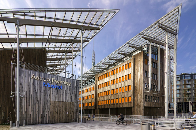
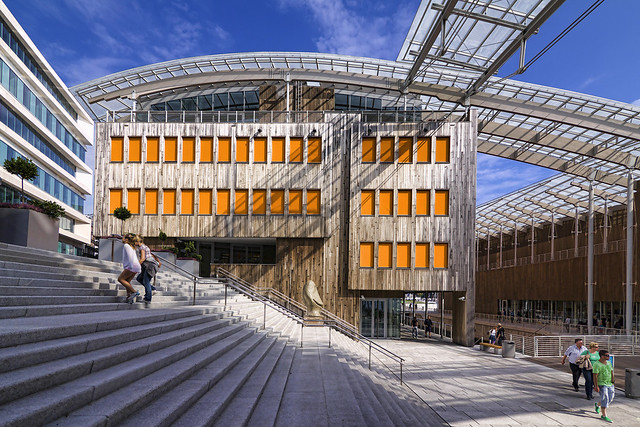
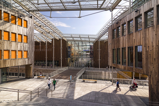
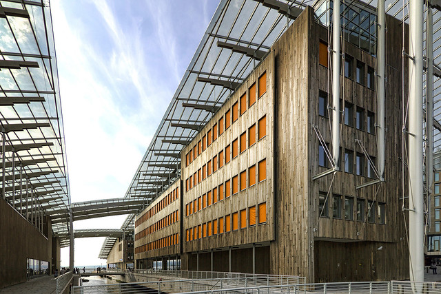
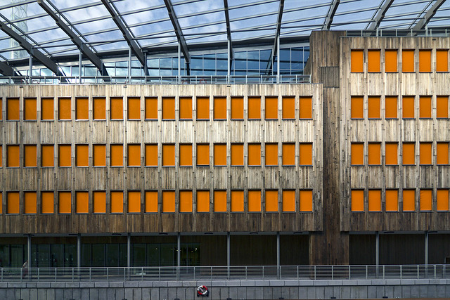
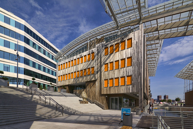
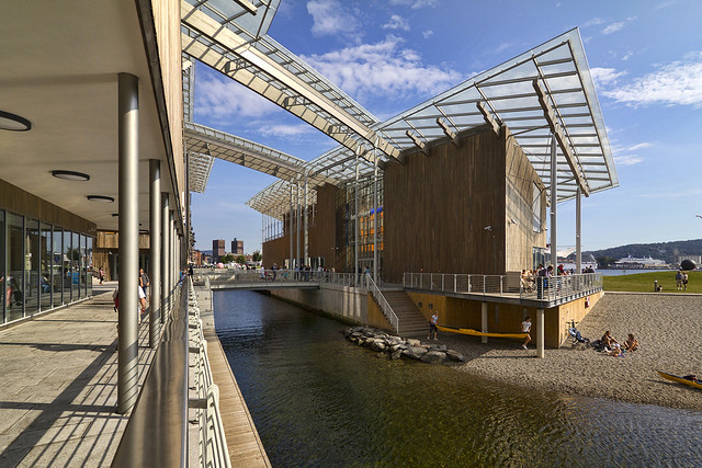
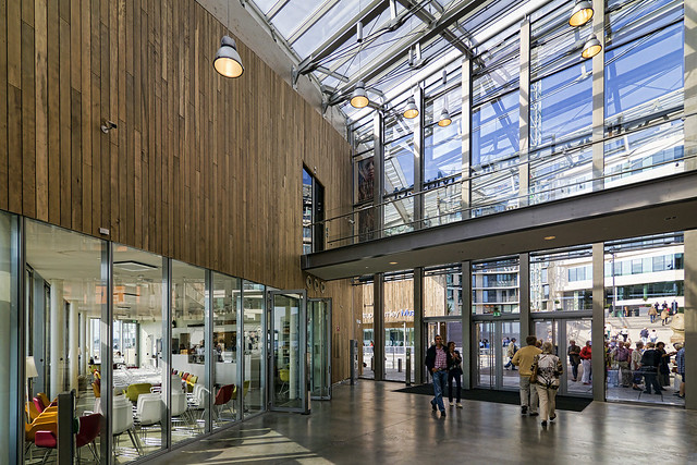
Here are some photos of Astrup Fearnley Museum of Modern Art (2012) in Tjuvholmen, Oslo, Norway by Renzo Piano Building Workshop, photographed by Wojtek Gurak (see also his photos of Schmidt Hammer Lassen's Handelsbanken, also in Tjuvholmen).

Astrup Fearnley Museum

Astrup Fearnley Museum

Astrup Fearnley Museum

Astrup Fearnley Museum

Astrup Fearnley Museum

Astrup Fearnley Museum

Astrup Fearnley Museum

Astrup Fearnley Museum

To contribute your Flickr images for consideration, just:
:: Join and add photos to the archidose pool, and/or
:: Tag your photos archidose

Friday, 1 August 2014

Book Review: Eastwest

Eastwest: Nabil Gholam Architects edited by Warren Singh-Bartlett and Ana Corberó; main text by Warren Singh-Bartlett and Nabil Gholam; essays by Kenneth Frampton and Gökhan Karakus
Oscar Riera Ojeda Publishers, 2014
Hardcover, 496 pages


Even before cracking the spine on this monograph on Lebanese architect Nabil Gholam (NGA), it's clear that the book is something special. Yes, it is a large book, but beyond size alone the cover gives this impression, as it is made up of no less than three layers: blue velum comprises the outermost layer, with the title and the name of the firm embossed in silver; the second layer is a stiffer dust jacket printed with a checkerboard of images (mountains, bricks, a rainbow on a carpet, leaves, faces, sketches, etc.) on both sides, with more personal ones on the inside; the last layer is the hardcover itself, a shiny silver surface with blue text (the inverse of the vellum) that reflects a rainbow to the reader depending upon the angle of view. Immediately these physical layers reveal that NGA's architecture has layers, a complexity hiding behind the modern exteriors.


[Clouds – Faqra, Lebanon]

This superficial interpretation is corroborated by historian Kenneth Frampton, who says in his introductory essay that NGA's work "defies easy classification...it may be regarded as a competent, late modern global practice ... [that is] capable of creating works that possess a uniquely grounded, local character at a variety of scales." This ability to create a grounded, local character is most immediately evident in the Clouds, a housing estate of eleven villas in Faqra, Lebanon (above spread). Called "rock nesting" in the book (each project is further titled by a 2- or 3-word phrase by the architects), the villas are perched upon stone-walled terraces that raise the wood volumes high enough to give the residents distant views.


[Platinum Tower – Beirut, Lebanon]

So if the clouds project is representative of NGA's ability to embrace and exploit the natural features of a place, what about the late-modern globalism that Frampton refers to? The title of the monograph offers a hint: "Eastwest" picks up on on Gholam's background – born in Beirut, educated in Paris and New York, taught in southern China, worked in Barcelona before starting his practice back home in 1994 – and how this crisscrossing of the globe has impacted what the 50-strong NGA produces. One way Gholam's east-west-east movement has influenced their designs for Lebanon and other Middle Eastern countries is through a modern architecture that embraces local elements. For example, the Platinum Tower (above spread) that NGA designed with Ricardo Bofill (his old Barcelona employer) resembles a 21st-century residential high-rise in cities as distant as New York, but its corner loggias are so generous – a response to climate and the way people live in the city – that it could not exist in another such place as is. Further, the backlit glass gives the tower overlooking the Beirut marina a distinctive stacked-cube appearance that has made it a local landmark.


[Skygate – Beirut, Lebanon]

Across its nearly 500 pages, the monograph moves from one such project to the next, from house to tower, from small-scale to large-scale, from built to unbuilt. There is an apparent ease with which NGA shifts scales, typologies, geographies, and materials (thankfully stone is as prevalent in his design as glass). In some cases a motif or large-scale gesture reappears, bridging different projects and different places. One example is the corner notch found at the top of the Jeddah Tower (below spread) as well as taking a bite out of the Doha Oasis. But these occasional gestures do not result in a distinctive Gholam-style. Instead, working within an orthogonal modernist palette (with the occasional oval or other curve), NGA crafts designs that respond carefully to program and context. This monograph captures that skill, though with so many unbuilt projects in the mix, I look forward to the next one when Gholam and company has built that much more.


[Jeddah Tower – Jeddah, Saudi Arabia]

Wednesday, 30 July 2014

Today's archidose #771

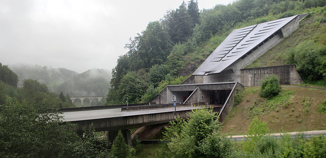
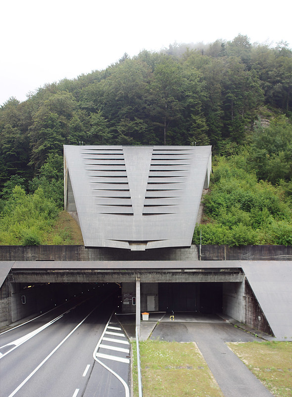
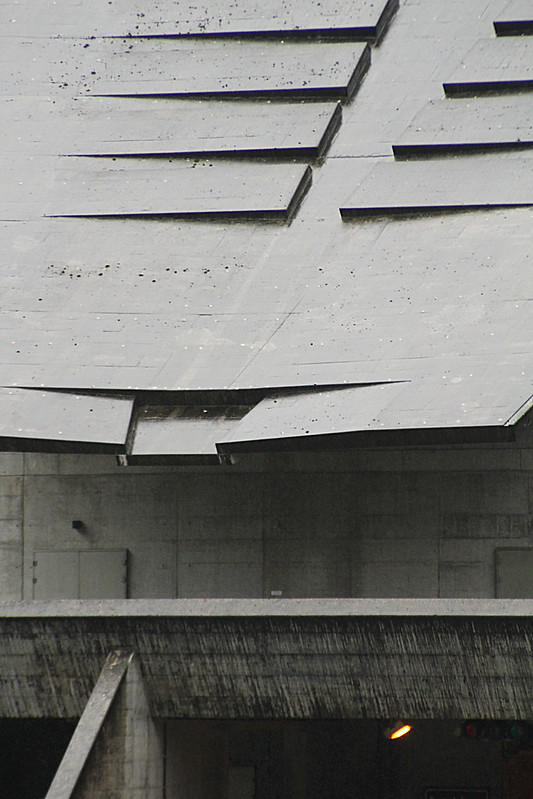
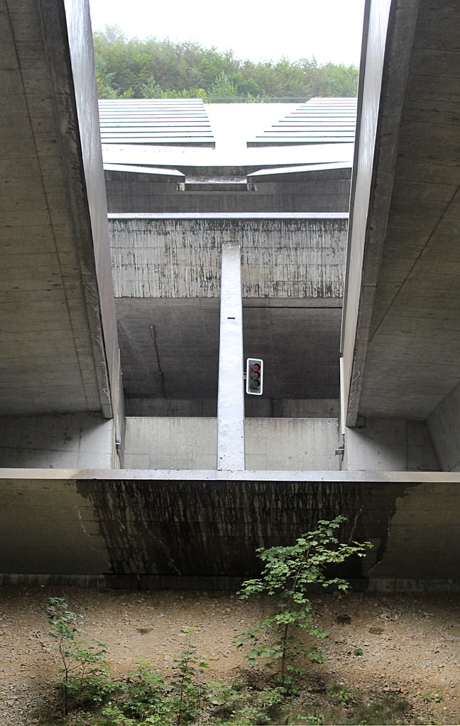
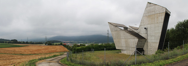
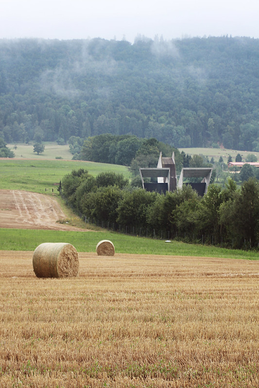
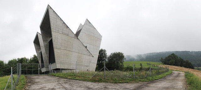
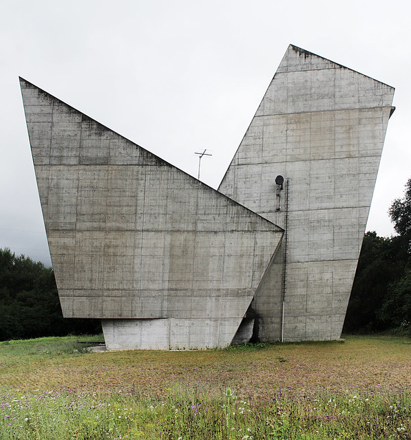
Here are some photos of Highway A-16 Tunnel Section 4-5-6 (1998) in St. Ursanne, Switzerland by Renato Salvi and Flora Ruchat-Roncati, photographed by Trevor Patt.

IMG_2395-96

IMG_2433-35

IMG_2402

IMG_2373

Update 07.31: Photos of the Glovelier entrance, also photographed by Trevor Patt:

IMG_2537-39

IMG_2486

IMG_2531-33

IMG_2522-24

To contribute your Flickr images for consideration, just:
:: Join and add photos to the archidose pool, and/or
:: Tag your photos archidose

Tuesday, 29 July 2014

New Blog: Unpacking My Library

Last week I started a new blog, titled Unpacking My Library. It's basically a weeding out of books from my ever-growing library by writing briefly about one of them every day. The latest post from the new blog will show up in the left column here. Read more about the Unpacking My Library blog below.


[Unpacking My Library, the book; the first post on my new blog]

About Unpacking My Library:
Although the title of this blog is taken from Walter Benjamin's well-known essay from Illuminations, "Unpacking My Library: A Talk about Book Collecting" (PDF link), my goal is personal rather than intellectual.

I have a lot of books (over 1,200 cataloged on LibraryThing) but not enough room for them, so to help me determine what books to keep and what books to give away (or sell) I'm going through my books one by one to try to determine the value each holds for me.

So at the rate of roughly one book per day I'll be highlighting one book from my library with a photograph, a description of where I got it, some words on its value (or lack thereof), and a star rating. Books will be labeled by subject, publication date, author and other keywords, but suffice to say most of the books are on architecture and related subjects.

So hopefully this exercise will help determine if a book is worth keeping or passing on to another reader for their own library. And hopefully whoever happens to read this blog will discover some books of interest in the process.