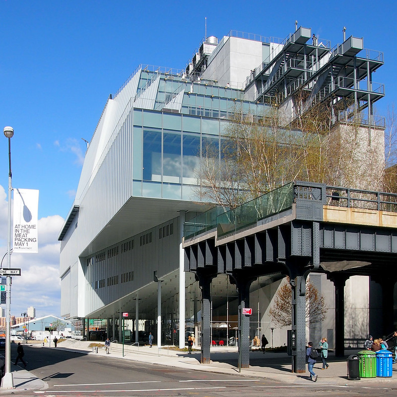
[Looking west at the Whitney from Gansevoort Street | All photographs by John Hill]
The Whitney Museum of American Art opens on Friday, May 1, nine years after the institution announced it would be moving to the Meatpacking District adjacent to the southern end of the High Line. That same year, 2006, construction started on turning the disused railway into an elevated park (phase 1 opened in 2009), which accelerated the area's transformation from its industrial namesake to a popular area for retail, fashion houses, restaurants and offices. The Whitney will surely have a substantial effect on the area's continued evolution, but one sign of the changes hit me on the way to the museum last week for a press preview.

[The Gansevoort Market]
There, in an unassuming storefront on Gansevoort Street, one block east of the Whitney and High Line, is a new food hall with pastries, a Greek yogurt bar, a taco bus, and an outpost of Sushi Dojo. Open since October 2014, the Gansevoort Market (named for the city's official moniker of the landmark district - PDF link) is yet another element in the displacement of industry toward high-end goods, services and apartments catering to residents and tourists with plenty of money to spend. Ironically, a sign of the area's former self can be seen from the quasi-industrial stairs linking the Whitney's three tiered terraces.

[Weichsel Beef as seen from a terrace of the Whitney]
Just north of the museum is Weischel Beef, which almost certainly will become the site of a Whitney expansion in two decades time. (According to Architectural Record, "the city owns a two-story wholesale meat center [to the north of the museum] and has given the Whitney the right of first offer when that building's lease comes up in 15 years.") For now, the meatpacker is just one of many sites to be glanced at from the terraces, which also includes the High Line, the Standard Hotel and the skyline of Midtown.

[Looking south at the Whitney from the High Line]
Yet before even entering the new Whitney, designed by Renzo Piano Building Workshop in collaboration with Cooper Robertson, many conclusions are being drawn from glimpsing the building from the north, from the High Line, a side that will be covered up at some point in the future, be it by the Whitney or a developer. From here, the building is a jumble: windows of varying sizes, exhaust piping rising up the side, large rooftop chillers, a stepped concrete wall topped by exposed stairs. It's hard to like the building from this side, but it's not worth writing off the building solely based on how it looks on the exterior.
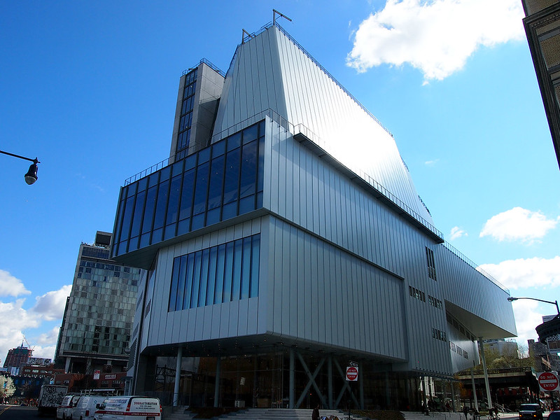
[The Whitney as seen from the west]
The west side of the building does not offer much more hope, but from here we can start to see why the building looks the way it does. While the north side reveals the stepped profile that allows for both sculpture terraces for the museum and more natural light for the elevated park, the west side reveals the concrete core rising eight stories into the air and a couple large expanses of glass facing the Hudson. The core – what Piano calls "the spine" – holds the stairs, elevator and services, but it is also the main structural element for the building, enabling the glassy first floor with lobby, cafe and bookstore. The spine also splits the building into two halves, with galleries on the south (right) and offices, labs and other non-public areas on the north.
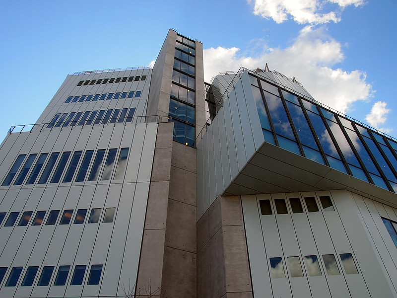
[Detail view of west elevation]
The large windows, on the other hand, arise from the fact the museum is a vertical one, such that all of the galleries can't be flooded with light from above as in other Piano buildings (only the Whitney's 8th floor is given that). So light must be brought in from the sides, and Piano did it at the east and west to allow the windows to frame views of the city on the east and the Hudson on the west, while also giving passersby views into the museum's galleries. The offices and other non-public spaces are found behind the rectangular windows with rounded corners cut into the light-blue steel panels.
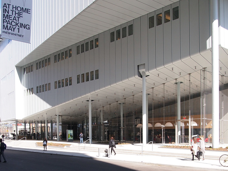
[View of the glassy first floor from Gansevoort Street]
That the Whitney is more than just a clunky exterior starts to become apparent when walking toward the entrance on Gansevoort Street. All glass and slender columns, the first floor is a beckoning space glazed on three sides, its walls ascending toward the High Line in an effort to lure people from the free park to the museum charging a $22 admission fee. Even though the admission tops MoMA's $20 mark, I should point out the ground floor, which consists of one small gallery on is north side, is a publicly accessible, freely open space, something that surely came from Piano's Italian sensibility. To the east of the glass walls is a small outdoor space that further links the museum with the High Line's southern entrance.
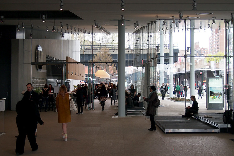
[Looking toward the High Line from the lobby]
The reason for the rising prow of the floors cantilevered above the lobby and Danny Meyer's "Untitled" cafe is obvious when seen from the inside – the glass perfectly frames the High Line. But it works both ways, so strollers on the High Line can look into the lobby and be enticed by the crowds in the cafe and lobby.
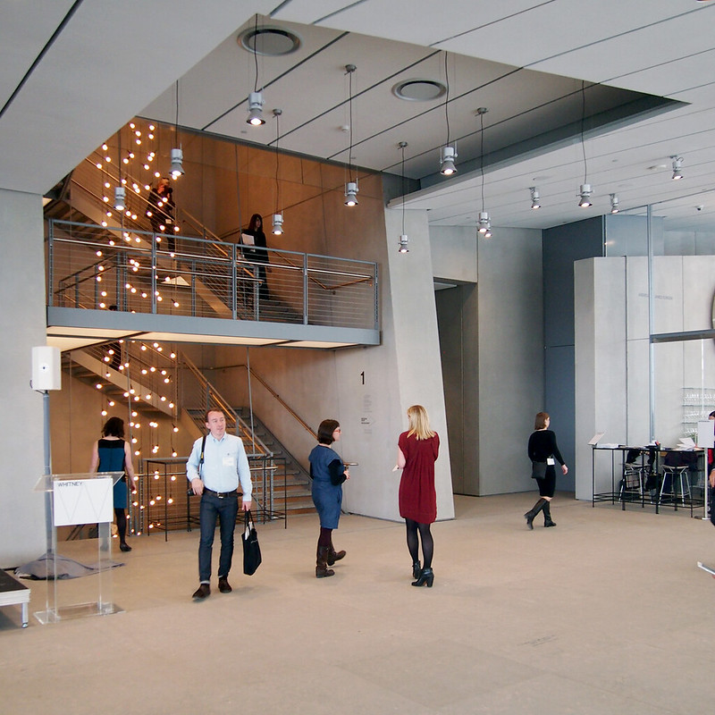
[Open stairs seen from the lobby]
Those plonking down the admission fee have two options on ascending to the 5th floor gallery: take one of the four elevators or take the stairs. The elevators are given the most real estate of the concrete spine facing the lobby, but the open stair beckons with a light installation streaming down its whole length, form the 5th floor to the basement (oddly, those wanting to walk up higher than the 5th floor have to transfer to the exterior stairs at the terraces or an interior fire stair on the west side of the spine). Comparisons have been made between this stair and the one in the Whitney's 1966 Marcel Breuer building on the Upper East Side, which the Whitney has leased to the Metropolitan Museum of Art for eight years, namely that these stairs do not have as much character as the Breuer stairs, meaning visitors may be less likely to use them in lieu of the elevators. I'll agree they lack the character of Breuer's intimate stairs, but the combination of stair and light installation makes the new stair the most Instagram-ready site in the building.
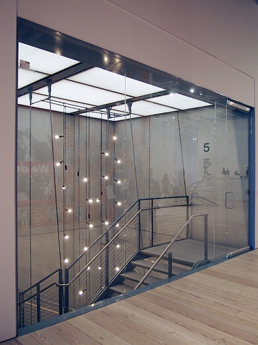

[The stair terminating at the 5th floor, and the artwork in front of the stair and elevators]
Arriving at the 5th floor means stepping into the largest gallery space in New York City, at 18,000 square feet. This gallery is the driving case for the new museum, since it allows for the display of extremely large artworks, and it notches the Whitney above the galleries in Chelsea that have been offering the same thing. I can see the "largest gallery" race continuing as galleries attempt to grab that designation back, but for now the Whitney has it, though it is hardly exploiting the potential in such a large floor plate. For its inaugural exhibition, America Is Hard to See, which culls around 600 works from its permanent collection and puts them on display in all of the galleries throughout the museum, the 5th floor is surgically cut up with walls rising to the ceiling grid outfitted with built-in tracks for supporting walls and lights. Only an enfilade running east-west across the gallery gives an indication of the floor's enormous scale.
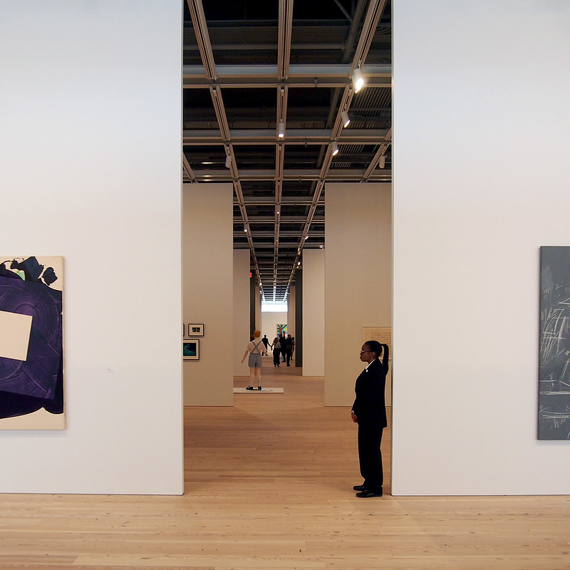
[The 5th floor gallery]
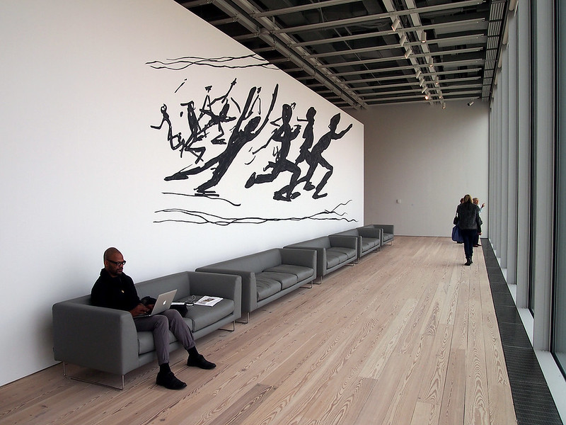
[The space behind the window at the western end of the 5th floor gallery]
But the Whitney – a hulk on the outside and galleries boasting of size on the inside – is not all "bigger is better." At the ends of the 5th floor galleries, for example, are smaller spaces outfitted with couches that invite museumgoers to sit down, take a break and look out at the city for a little while. Those who want to go outside to get a more immediate interaction with the city can walk out to the large terrace adjacent to the 5th floor, which sits atop the High Line maintenance building (also designed by Piano, with Beyer Blinder Belle) or head up to the 6th floor, the first of three tiered terraces with sculptures overlooking the High Line.
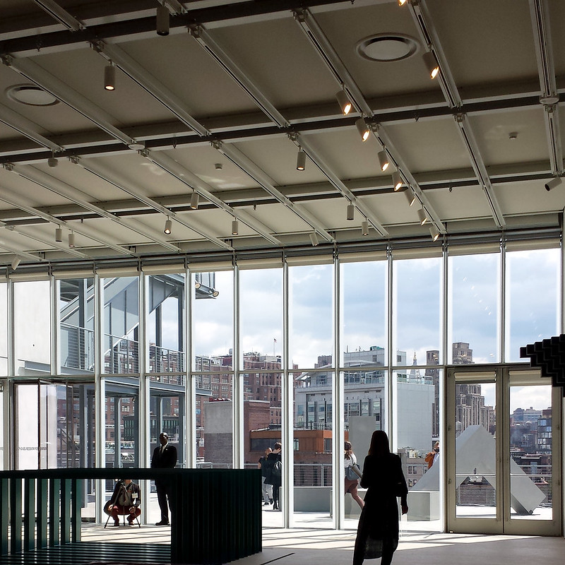
[Terrace and cityscape seen from one of the gallery floors]
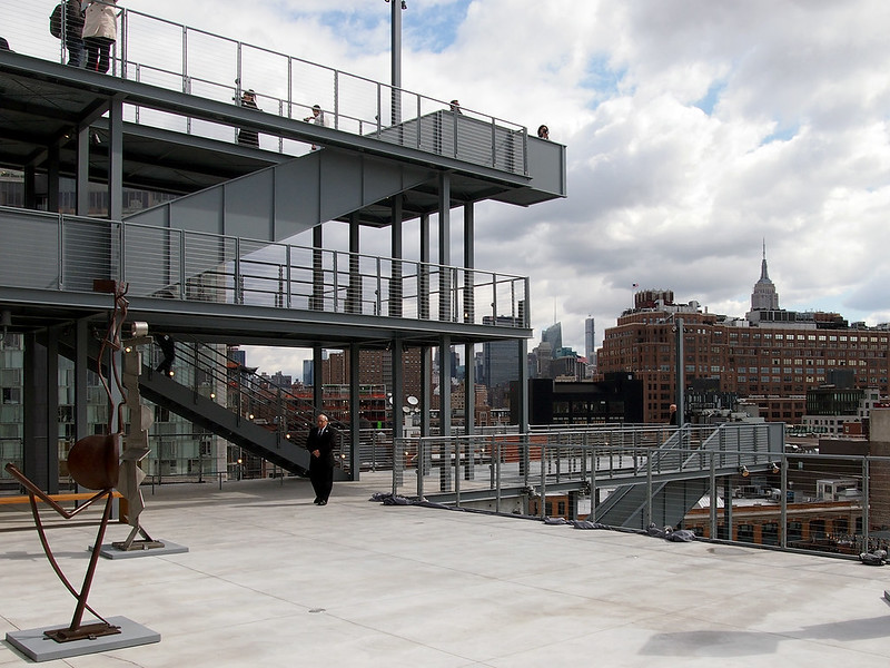
[A sculpture terrace overlooking the city]
Like the lobby and the galleries, the terraces are something that work when you are on them, even though they appear ill-considered from a distance. The stairs, positioned atop the building's dividing spine, effectively link the terraces, while even incorporating Titanic-like lookouts. It's clear that the curators do not know yet how to use these spaces, as right now the sculptures are randomly strewn across them, not taking advantage of their unique location overlooking the High Line and the city. Over time this will surely change, but for now the potential of these spaces is evident if not exploited.
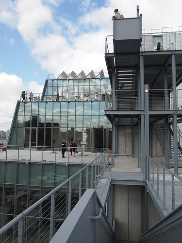
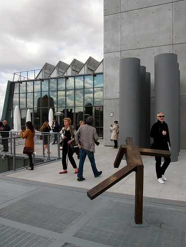
[The stairs linking the terraces, and the 8th floor terrace with the north-facing skylights poking above the railing]

[The 8th floor gallery space]
But where to end a tour of the museum? And how to sum up the building, when so much has been written about it before the Whitney has opened its doors to the public? In addition to another Danny Meyer-run cafe, the 8th floor is where we find Piano's signature skylights. Yet instead of something elegant and sculptural, like the Menil or just about any other North American museum he's done since then, they are straightforward, north-facing clerestories that are hidden above the ubiquitous grid that makes the flexibility of moving walls and lights the most important facet of the galleries. I'm more inclined to end this tour/review with two views of the museum, one inside and one outside.
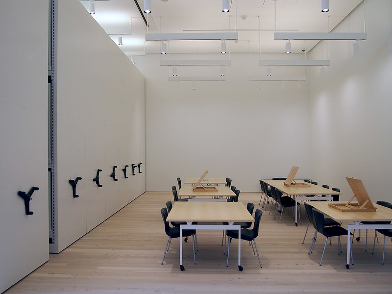
[The Works on Paper Study Center, open to the public by appointment]
Many critiques of the new Whitney have compared Piano's design with the Breuer building that the Whitney left last year. I find the need to compare the two buildings understandable but unfair. Should an architect be under any obligation to carry over certain qualities from an institution's old home to a new one? Or should they break from the old with a fresh start? The comment on the stair earlier is just one indication that it is hard to completely break from the old, which in this case just happens to be a building that was unloved at first but gained a larger appreciation in the ensuing decades, where I seen Piano's building going as well. If comparisons must be made, then they should acknowledge all of the new spaces the museum now has at its disposal, beyond the expanded gallery space. In addition to a 170-seat theater, there are classrooms and a study center that are all firsts for the Whitney. The study center, as one example, is more straightforward than the galleries and other public spaces in terms of design, but it is a functional space that melds storage needs and those of education. After seeing the lobby, art galleries and terraces on the press preview, the study center and adjacent conservation labs were a welcome respite that revealed where some of the real work of an arts institution happens, and where architecture is still important, if understated.

[The Whitney seen from the east at Gansevoort and Hudson Streets]
The last view of the building is this distant one from the east, from two blocks away where Gansevoort Street intersects Hudson Street. From here the new Whitney partially reveals itself, hidden behind an old brick building and peeking above lower buildings. The building has a strong presence from this perspective, a presence that tells me it fits right in by being a jumble of different volumes and surfaces – angled walls, large projecting windows, tiered terraces, exposed stairs, exhaust pipes, and a concrete core rising above all. The new $422 million Whitney embraces the cacophony of Manhattan as it continues to transform itself from a place of industry to one where culture and technology take precedence. Perhaps people who don't like the building from the outside don't like what the building is saying about the city – that it is big, messy, constantly changing, and expensive.
0 comments:
Post a Comment