Friday, 12 September 2014

Fall Architectural Walking Tours

The weather is beautiful in New York City in the fall, a great time to see the city on some architectural walking tours. Below are descriptions and dates of the tours I'm giving through the 92Y. Click on the links to purchase tickets.

Saturday, September 20 at 11am
Saturday, October 25 at 11am
Columbus Circle and Lincoln Square
Look at and go inside some recent buildings in the West 50s and 60s, from the Hearst Tower and the transformation of Lincoln Center to the Apple Store.
New Sod


Saturday, September 27 at 11am
The High Line and Its Environs
Trek the High Line – Phase 3 opening on September 21! – taking in the park and the surrounding buildings and step off to get a closer look at select buildings.
High Line Section 2


Saturday, October 18 at 11am
Architectural Walking Tour of Brooklyn via the G Train
Hop on and off the G train from Carroll Gardens to Clinton Hill and Williamsburg, taking in townhouses, campus facilities and other buildings along the way.
Junction

Today's archidose #782

Here are some photos of Metropolis (2006) in Copenhagen, Denmark, by Future Systems with Danielsen Architecture, photographed by Ximo Michavila.

Danielsen Architects. Metropolis #1

Danielsen Architects. Metropolis #7

Danielsen Architects. Metropolis #8

Danielsen Architects. Metropolis #9

Danielsen Architects. Metropolis #4

Danielsen Architects. Metropolis #3

Danielsen Architects. Metropolis #6

Danielsen Architects. Metropolis #2

To contribute your Flickr images for consideration, just:
:: Join and add photos to the archidose pool
To contribute your Instagram images for consideration, just:
:: Tag your photos #archidose

Wednesday, 10 September 2014

Today's archidose #781

Here are some of my photos of 35XV, a building designed by FXFOWLE Architects now under construction on West 15th Street in New York City.

35XV

35XV

35XV

35XV

35XV

35XV

To contribute your Flickr images for consideration, just:
:: Join and add photos to the archidose pool
To contribute your Instagram images for consideration, just:
:: Tag your photos #archidose

Tuesday, 9 September 2014

Firm Faces #20: LWPB Architecture

This week's Building of the Week – a feature I curate at American-Architects, where each week a recent building from a different state is highlighted – is the Patience S. Latting Northwest Library in Oklahoma City designed by LWPB Architecture. While researching the firm and their projects for the "50x50" feature, I couldn't help noticing the way the firm faces are represented:

[Screenshot from LWPB Architecture website]

Moving the mouse across the screen (sorry, doesn't work on mobile devices) results in the people moving back and forth, retracting of the screen like two-dimensional cutouts on a virtual Rolodex:

[Screenshot from LWPB Architecture website]

The technique is reminiscent of Diller Scofidio + Renfro's flip-up project grid on their website, which was designed by Pentagram:

[Screenshot from DS+R website]

When the mouse cursor overlaps with a person on LWBP's website, a speech bubble of sorts pops up with their name (who new Norman Foster worked in Oklahoma?) and clicking on each person brings up a postcard-like view with some of stats on them:

[Screenshot from LWPB Architecture website]

While LWPB's means of illustrating the firm's principals and employees is clever and memorable, its reliance on Flash points to the question: Can this sort of thing be programmed into the HTML environment, so as to be visible and usable across devices and platforms? I'd assume not in its current form, but perhaps in other ways that retain the fun way of showing the firm's faces and therefore the firm's personality.

Monday, 8 September 2014

Monika Sosnowska. Tower


[Photo via 860-880 Lake Shore Drive]

Mies van der Rohe's 860-880 Lake Shore Drive apartments, shown above around the time of their completion in 1951, are two of the most influential towers in 20th-century architecture. Predating by seven years his Seagram Building in New York City, 860 and 880 consist of uniform facades with small, vertical I-beams in front of steel plates and clear glass.


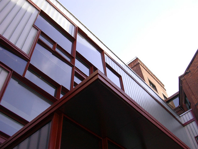
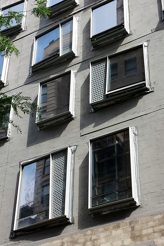
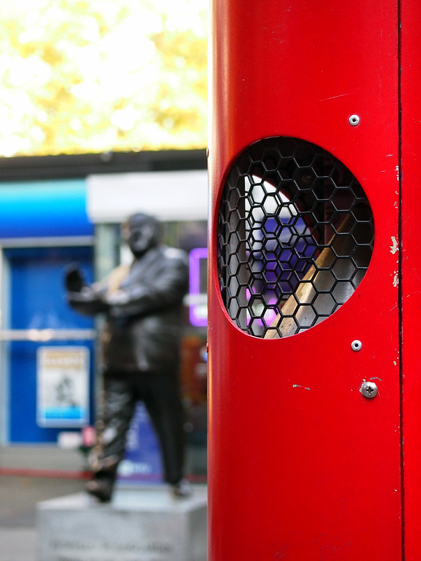
[Facade detail | Photo via 860-880 Lake Shore Drive]

A basic expression of floor-to-ceiling glass and decorative steel meant to evoke the structural frame behind it subsequently became the go-to design for Mies and other architects in the 1960s and later, especially for office buildings. Today's urban environments of glass skins (now taut, with silicon joints rather than decorative projections) would be unthinkable without this trailblazing pair.

Monika Sosnowska Tower
[All photographs of Tower by John Hill]

860-880 are the source, and modern architecture is the subject, of Polish artist Monika Sosnowska's Tower, on display until October 25 at Hauser & Wirth on West 18th Street. The artist has taken the facade – everything in front of the structural steel, fireproofing and floors – built it at full scale and then distorted it beyond recognition. Well, almost beyond recognition.

Monika Sosnowska Tower

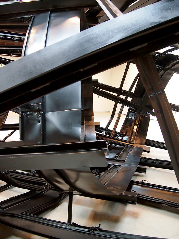
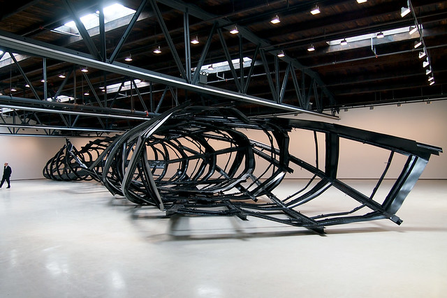
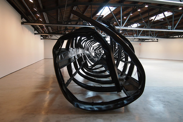
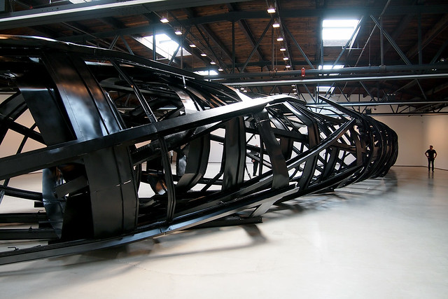
Walking into the large gallery space, the first view of Tower is the one above; the 110-foot-long piece is so big that I could not capture it in a single photo. My first thought was "beached whale," and while I can't say if the artist intended such a resemblance, the form and the inversion of the subject (from vertical to horizontal) does give the impression that modern architecture is dead or dying, much like a whale washed ashore is dead or dying.

Monika Sosnowska Tower

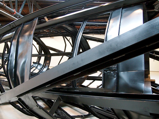
Tower's modules are those of the original facade, the rectangular window bays between the decorative I-beams, with a large pane of glass above a smaller, operable pane. Of course, glass is missing from the piece, but if we straighten out the bent construction in our minds, the regular, rectangular grid is there, vertical on one side (photos above and below) and horizontal on the other (top installation photo).

Monika Sosnowska Tower

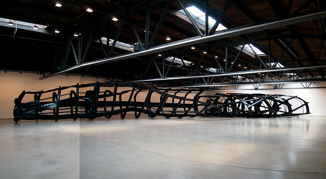
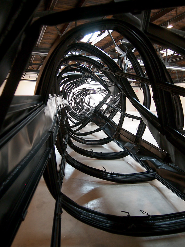
Comparing the top view of the installation to the one above – photos from alternate ends of the piece – shows the most distinctive experiences of the piece. Where the steel is coiled tightly, as in the above photo, Tower is like a tube, a restricted view where the end is barely visible.

Monika Sosnowska Tower

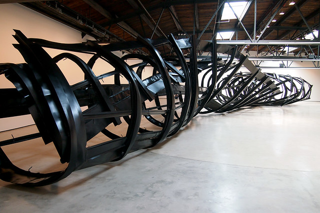
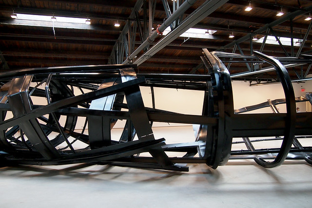
But at the other end (photo below), the steel unfurls, as if the tension of the coil at the other end could not be contained. Here, the piece exposes itself in all its gruesome complexity.

Monika Sosnowska Tower

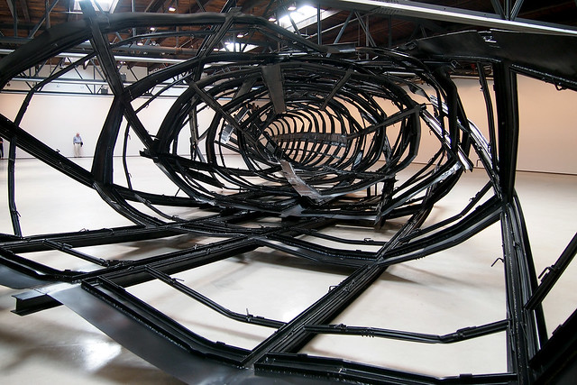
About halfway down the 110-foot length of the piece, the steel transitions from what I described as vertical to horizontal. This transition can be seen in the below photo, with the vertical windows on the right and the horizontal windows on the left (look for the intermediate mullion between large pane and operable pane to get a sense of the orientation).


Monika Sosnowska Tower

Looking at the facade detail of 860-880 near the top of the post, one question that may arise is: Why is Tower all black when Mies's original is black steel and gray aluminum? This is a good question, not only because Mies is quoted as saying "God is in the details" but because the pair of towers were replicated at 900-910 Lake Shore Drive with some minor changes, one of them being an all-black metal exterior. So with Tower's all-black appearance, Sosnowska is referencing not only the original but also its copies, be it right across the street or elsewhere around the world.

Monika Sosnowska Tower

It's easy to go on analyzing Tower in terms of the architecture of modernism (or the destruction of architecture, à la 9/11, that the mangled form also brings to mind), but intellectual perspectives on the piece are not needed to appreciate it. The thing is so big and so gnarly that it just impresses out of its size and form: the way the pieces bend as well as the way they overlap each other; the way it occupies one half of the gallery, cutting a diagonal across the room and inviting visitors to walk around it; and the way it's hardly concerned with beauty or order.

Monika Sosnowska Tower

Tower invites speculation about how it was made. While a book specifically on the piece will be released in November, one needn't see that to know it was a complicated and intensive undertaking, akin to constructing a building, both in terms of mechanical muscle and the coordination of labor needed to move the project from scale models to full size.

Monika Sosnowska Tower

So if you're in New York City between now and October 25, be sure to head to Hauser & Wirth to take in Monika Sosnowska's Tower to experience it for yourself.

Monika Sosnowska Tower

Sunday, 7 September 2014

Sonic Forest

Christopher Janney's Sonic Forest: Civic Celebrations opened across the street from the Center for Architecture on Friday evening. The grid of interactive pylons will be up only until September 11, but for those who can't visit by then, one of Janney's permanent pieces, Reach NYC, can be experienced on the N/Q/R platforms of the 34th Street/Herald Square station. Below are some of my photos and video clips of Sonic Forest.

Sonic Forest
[All photos/videos by John Hill]

Sonic Forest

Sonic Forest

Sonic Forest

Sonic Forest

Saturday, 6 September 2014

Auf Wiedersehen, Loreley (Corrected)

Update 09-07: Per a comment on Twitter, I was mistaken in my original post at what intersection I was looking at (double D'OH!!), but nevertheless R+L's Loreley is still gone, per the corrected text below.

I'm not sure when the Brooklyn outpost of Loreley Biergarten closed, but when I happened to think I was walking by its location in the shadow of the BQE a couple days ago, it was gone. This is what it looked like when Loreley existed, in a spread from my Guide to Contmporary New York City Architecture:

[That should say 64 *Frost* Street – D'OH! | Photos by Amy Barkow]

Not only is restaurant designed by Rickenbacker + Leung gone, per this Google Street View from April 2012:


But sometime between then and September 2013, the date of this Google Street View, the restaurant changed from Loreley's innovate brick fencing to something with a wood fence, and the city put in a preliminary plaza at the triangular tip where Frost and Meeker meet:


The new restaurant, since mid-2013, is Battery Harris, a "Carribbean-inspired restaurant and bar."

Since the above view, (see my photo at top) taller buildings have taken over the low-rise buildings behind and the city has made the parklet more permanent through the extension of the curbs, but at the omission of the planters and stone benches. Although I didn't take a close look at the construction sign while passing by the other day (the BIS indicates a Place of Assembly permit filed by C. Wall Architecture, which has done plenty of restaurants, so I'd wager on another one here), whatever occupies the one-story building at the tip of the site former Loreley space will hopefully nurture the new but empty public space in front of it...and maybe they can show movies on that big blank wall facing the plaza, rather than putting up a billboard aimed at BQE drivers.